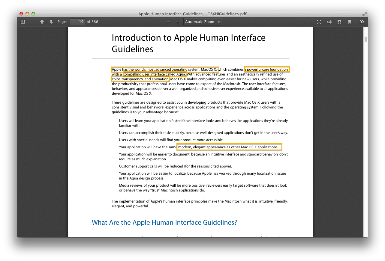
... and came across this little morsel in the OS X HIG.
I miss this Apple. The one that focused on user-friendliness, but also the Apple that cared about professional users. Aqua was by far one of the most innovative user interfaces ever made. Sure, it wasn't as "clean" as some flat UIs are today... but it was so inviting, warm, and friendly, coming from Windows or even Linux (which had a darn good UI for such a new and relatively alien OS). There were so many great features for power users that Apple removed in later iterations. AppleScripting, full Exposé, and 2D Spaces! Not to mention iWork's stunning new inspector-based UI that was incredibly powerful but so easy to use.
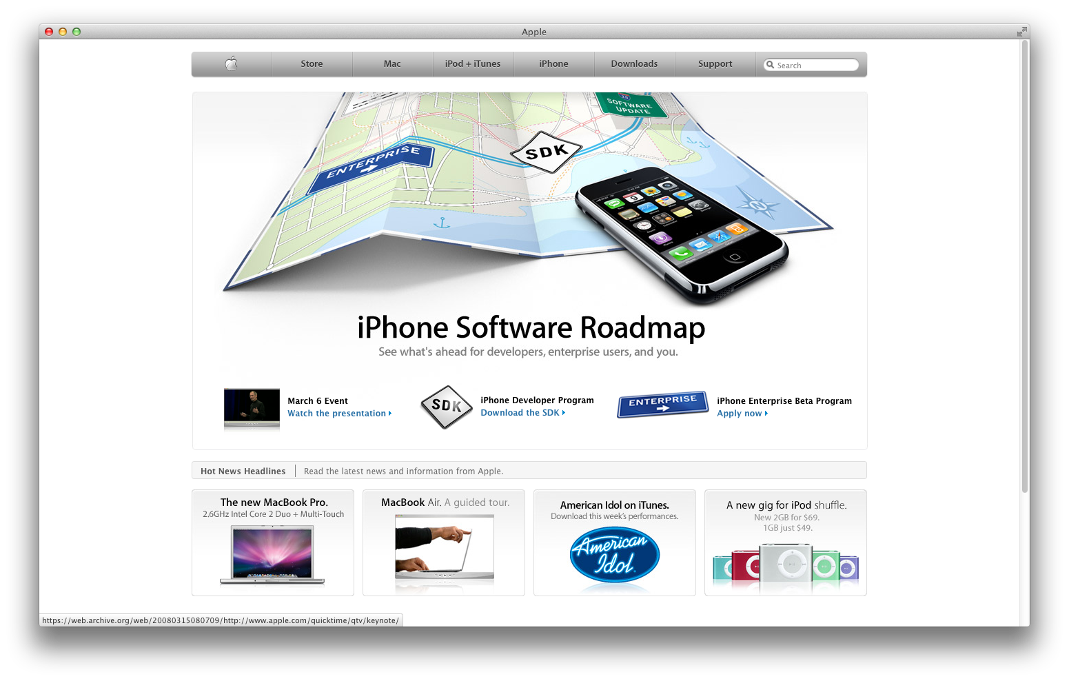
I loved Apple's esthetic during the 2007-2008 time period. The great, bold-set Myriad headings, subtle grey gradients, the little glossy accents thrown around here and there in product illustrations, and the black, white, silver theme of the website kind of illustrates this perfectly. Everything is friendly and readable.
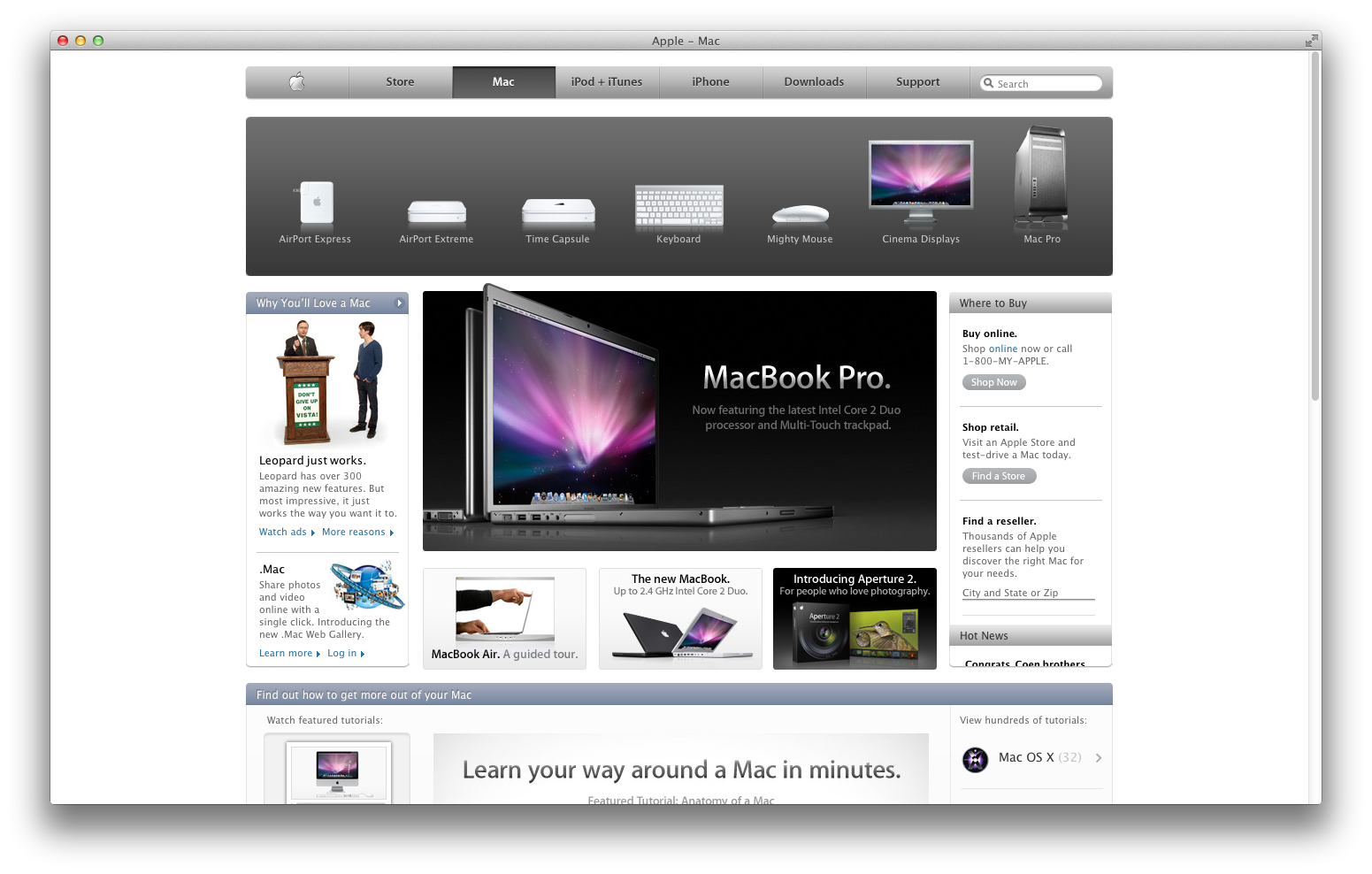
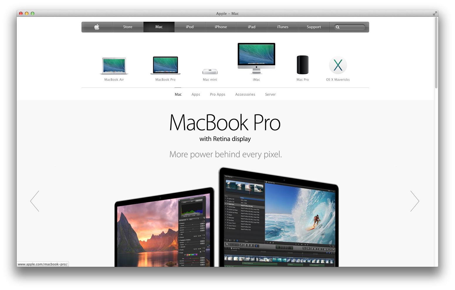
Compare that to the new Apple website, which is just pretty much "Designers Gone Wild," with this ridiculous obsession with supposedly "modern" (read: hard to see and ugly) typefaces, and the overuse of blinding whitespace that takes up way too much space and shifts everything down on the page; making it less efficient with space. Is this a step forward or a step back? Whereas on the 2008 site, I could see everything without having to scroll, more than HALF the page is underneath the "MacBook Pro" headliner.
Combine that with the recent changes to all of the great apps we used to love, which have now been crippled to provide "feature parity" with iOS versions, and it just adds up into a big bag of hurt. I mean, Apple is still a company, but it just feels so... cold now. It's more about profits and money than trying to make great computers that both my grandma AND a teenager AND a movie producer AND a professional web developer AND a 3D modeler AND a physics researcher AND a programmer could use. The ads are no longer even whimsical or imaginative; they're boring and too "emotional," because that's the only thing that sells nowadays after Google started doing it with their Nexus commercials.
Apple just seems so contrived and unoriginal now. With no Steve Jobs to rein in Jony Ive, he's going on a rampage.
So, what is the key takeaway from all of this? HARDWARE DESIGNERS SHOULD NEVER BE ALLOWED TO DO SOFTWARE. Ever. Period. There are a completely different set of rules for software when compared to hardware; and applying the same techniques of "minimalism" (read: making the hardware so cold it doesn't tell you anything about what it's doing, so when something goes wrong, you don't know what the heck is going on) to software will result in disaster. Minimalism in software is a set of code and UI principles that reduces clutter; it has NOTHING to do with whitespace or Helvetica Neue Ultra Light (who the heck approved that?!).
A year or two ago, I would have never said this, but Scott Forstall, we need you back. Badly. Just don't make my calendar leather again.
I miss this Apple. The one that focused on user-friendliness, but also the Apple that cared about professional users. Aqua was by far one of the most innovative user interfaces ever made. Sure, it wasn't as "clean" as some flat UIs are today... but it was so inviting, warm, and friendly, coming from Windows or even Linux (which had a darn good UI for such a new and relatively alien OS). There were so many great features for power users that Apple removed in later iterations. AppleScripting, full Exposé, and 2D Spaces! Not to mention iWork's stunning new inspector-based UI that was incredibly powerful but so easy to use.
I loved Apple's esthetic during the 2007-2008 time period. The great, bold-set Myriad headings, subtle grey gradients, the little glossy accents thrown around here and there in product illustrations, and the black, white, silver theme of the website kind of illustrates this perfectly. Everything is friendly and readable.
Compare that to the new Apple website, which is just pretty much "Designers Gone Wild," with this ridiculous obsession with supposedly "modern" (read: hard to see and ugly) typefaces, and the overuse of blinding whitespace that takes up way too much space and shifts everything down on the page; making it less efficient with space. Is this a step forward or a step back? Whereas on the 2008 site, I could see everything without having to scroll, more than HALF the page is underneath the "MacBook Pro" headliner.
Combine that with the recent changes to all of the great apps we used to love, which have now been crippled to provide "feature parity" with iOS versions, and it just adds up into a big bag of hurt. I mean, Apple is still a company, but it just feels so... cold now. It's more about profits and money than trying to make great computers that both my grandma AND a teenager AND a movie producer AND a professional web developer AND a 3D modeler AND a physics researcher AND a programmer could use. The ads are no longer even whimsical or imaginative; they're boring and too "emotional," because that's the only thing that sells nowadays after Google started doing it with their Nexus commercials.
Apple just seems so contrived and unoriginal now. With no Steve Jobs to rein in Jony Ive, he's going on a rampage.
So, what is the key takeaway from all of this? HARDWARE DESIGNERS SHOULD NEVER BE ALLOWED TO DO SOFTWARE. Ever. Period. There are a completely different set of rules for software when compared to hardware; and applying the same techniques of "minimalism" (read: making the hardware so cold it doesn't tell you anything about what it's doing, so when something goes wrong, you don't know what the heck is going on) to software will result in disaster. Minimalism in software is a set of code and UI principles that reduces clutter; it has NOTHING to do with whitespace or Helvetica Neue Ultra Light (who the heck approved that?!).
A year or two ago, I would have never said this, but Scott Forstall, we need you back. Badly. Just don't make my calendar leather again.
")