Become a MacRumors Supporter for $50/year with no ads, ability to filter front page stories, and private forums.

Coolnat2004

macrumors 6502
Original poster
Jan 12, 2005
479
4
I thought you guys would like to check out my latest project.

www.pending.be

It's a social countdown site. Only one in the world (so far).

Let me know what you think about it! :D
 
Coolnat2004 said:
I thought you guys would like to check out my latest project.

www.pending.be

It's a social countdown site. Only one in the world (so far).

Let me know what you think about it! :D


"Valentines is in 9 days, 3 hours, 36 minutes, and 14 seconds"

Ah, so that'll be why the missus is dropping hints. :(
 
I think it's a great idea for a website.


Just clean out the layout of the main part of the page, and you'll have a potential killer website.


If you're sure it's the only one out there. Get the link out as there as much as possible (stick it in your sig, e-mail it to your friends, etc.).

Oh, and I like the name "pending".
 
EricNau said:
Why are some things larger than others on the home page?
Larger ones are more popular, smaller ones are less popular.

I might change the algorithm for that and only make *really* popular ones slightly larger than the others. The idea was to be sort of like it is at 43things.com.

whocares said:
I think it's a great idea for a website.


Just clean out the layout of the main part of the page, and you'll have a potential killer website.


If you're sure it's the only one out there. Get the link out as there as much as possible (stick it in your sig, e-mail it to your friends, etc.).

Oh, and I like the name "pending".

Do you have any suggestions for the layout? I'm not a very great designer, which is unfortunate since I am in to web development.. :-\

I've started to get the link around myspace.com (myspace.com/pendingdotbe) and it has brought about 10 users so far. I did some major PHP stuff for my brother in relations to myspace marketing, and I used some of it for myself. ;)
 
Rocksaurus said:
It just gets stuck on "detecting timezone" for me. Maybe because I'm using Opera? Dunno what to do.
I've tested it with Opera 8.01 (and now 8.51) and it seems to work fine.

I believe that if you re-visit the site now it should display normally. Cookies are required.

Actually.. I really should code in a cookie-detection system and allow people to browse the site cookieless with static countdowns -- since without a correct timezone the javascript won't work correctly.
 
Coolnat2004 said:
Do you have any suggestions for the layout? I'm not a very great designer, which is unfortunate since I am in to web development.. :-\

It was mainly the different font sizes that was bugging me. Turn it into a bulleted list and sort them by popularity, all in the same sized-font. Also you might consider loosing the bold typeface in the right side bar. I'm no designer either, but there is one rule I can teach you: keep fonts and font sizes to a minimum. ;)

You might want to merge the countdown info block with the countdown block itself.

My subjective 2¢.
 
Coolnat2004 said:
I've tested it with Opera 8.01 (and now 8.51) and it seems to work fine.

I believe that if you re-visit the site now it should display normally. Cookies are required.

Actually.. I really should code in a cookie-detection system and allow people to browse the site cookieless with static countdowns -- since without a correct timezone the javascript won't work correctly.

Okay okay my bad I had cookies set to something like "only from the server" or something and that's actually screwed up more than just your site. Sorry for the false alarm! Site works great, pretty cool site, too.
 
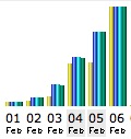
The traffic is increasing exponentially!
 

Attachments

  • screenshot55.jpeg
    screenshot55.jpeg
    10.5 KB · Views: 490
That, plus, I posted a comment on about 200 myspace profiles about it. :p The banner got around 23,000 hits from that, and several hundred click-throughs.
 
Great name, great site, great idea! :) There's a few things to note though:

I'm sure the interface will improve with time as you figure out better ways to display everything. It's looking pretty good now as it is; it can only go up! I don't have any real suggestions for the design (as I'm not a real designer myself).

You'll probably want to be a little "tighter" with the code with all of the hits you're getting (bandwidth does add up!); you're using a little bit of CSS, but it's mainly tables for the layout. I'm pretty sure you could get the interface running with purely CSS, depending on what browsers you're trying to support. Coding is something I can help with (although my current site may not be a demonstration of that, since I'm just using K2 with WordPress).

If I can help at all, it'd be a real pleasure. You've got a great project!
-Chasen
 
rendezvouscp said:
Great name, great site, great idea! :) There's a few things to note though:

I'm sure the interface will improve with time as you figure out better ways to display everything. It's looking pretty good now as it is; it can only go up! I don't have any real suggestions for the design (as I'm not a real designer myself).

You'll probably want to be a little "tighter" with the code with all of the hits you're getting (bandwidth does add up!); you're using a little bit of CSS, but it's mainly tables for the layout. I'm pretty sure you could get the interface running with purely CSS, depending on what browsers you're trying to support. Coding is something I can help with (although my current site may not be a demonstration of that, since I'm just using K2 with WordPress).

If I can help at all, it'd be a real pleasure. You've got a great project!
-Chasen
Thanks for the comments!

I'm aware that it is using tables for the layout, and I tried several times to get a pure CSS layout. The problem was, I could only get the CSS to work correctly in Safari, and it would choke in every other browser I tried -- especially IE 6 for windows. While IE is a horrible browser, it is also the most used (around 50% of the hits in the past 6 days) and thus it needs to look correctly in it.

The problem was with the left column I believe: In some browsers it would show up right where I wanted it (absolute positioning) and some it wouldn't.. And then the column background needed to stretch the entire page height.. that didn't work very well (CSS doesn't do vertical stretching of elements apparently.. unless you set a specific pixel height).

The other problem was the fact that I wanted the right "content" column to be centered (as it is now) within that area, but there was no CSS method of doing so.

I tried to use a stylesheet for most everything I could, though.

But.. most of the actual PHP code is nice and clean thanks to storing all of the functions in a certain folder and creating a file that includes all PHP files in the current folder (and including only that file). It makes it a breeze to make site-wide changes. Although, a few things are still static that I need to fix up--like the header and footer, etc.

Anyway, if anyone wants to demonstrate how I could achieve the same layout using purely CSS, that'd be great! :p
 
I'm going to take a stab at making the layout in just CSS tonight, in about 4 or 5 hours. So maybe by the time you wake up tomorrow (unless you're up past midnight) I'll have a demo (if I can get it to work!).
-Chasen

EDIT: This may take me a while. You can take a look at how I'm doing here (but remember that it's a work in progress, and I'm only testing in Safari as of right now).
-Chasen
 
Ok, it's obviously not perfect. There are some style things that would have to be ironed out, I did very little browser testing, and it's not bullet proof. I also, for convenience, made some changes and ignored some things just for the sake of getting through the general styling (i.e., I totally ignored the forms). However, it's a good demonstration, and I think that most of it can be styled through CSS without tables; but, don't you just love that lighter markup?

I'd really like to be involved in the project if you decide to make the next "version" of the website without tables and rely on CSS.
-Chasen
 
Ouch.

  • The left column isn't a fixed width; It needs to be.
  • The left column doesn't extend to the absolute bottom of the browser.
  • The infobox isn't a fixed width.
  • The links in the infobox have bullets next to the plaintext bullets :X
  • The spacing on the menu items is a bit much
  • The countdown links in the left column are messy: I believe tables are qualified for that job as it is technically tabular data.
  • CSS needs more flexibility :-\

On the brighter side, it does validate as XHTML. :)
 
Coolnat2004 said:

:eek:

Coolnat2004 said:
  • The left column isn't a fixed width; It needs to be.

Fixed (a simple width change).

Coolnat2004 said:
  • The left column doesn't extend to the absolute bottom of the browser.

This was a pretty simple fix: since the sidebar is a fixed width, I just made a background image and threw that onto the page. The image was 133 bytes, which is practically nothing (for perspective, the optimized CSS file is over 13 times that size). Originally, I had it the way you did: the border and background end at the end of the longest content; but, I decided to make it extend the length of the page, regardless of the longest content size. It's easy to make it the way you have it right now, though, in CSS.

In the spirit of making things better, I also allowed the navigation to expand past the height of 16px and I made the whole top blue part clickable, but those "features" are easy to remove too.

Coolnat2004 said:
  • The infobox isn't a fixed width.

Fixed (again, a simple change).

Coolnat2004 said:
  • The links in the infobox have bullets next to the plaintext bullets :X

Fixed (added no styling to the list items for that box).

Coolnat2004 said:
  • The spacing on the menu items is a bit much

I made some size adjustments; it's not exactly like yours, but it's really really close.

Coolnat2004 said:
  • The countdown links in the left column are messy: I believe tables are qualified for that job as it is technically tabular data.

...and I would say that it's a list of dates and events, so perhaps it would be a definition list; but, I do understand the idea that it's a table of dates and events as well. I put the tables back in, so that's "fixed."

Coolnat2004 said:
  • CSS needs more flexibility :-\

If this isn't flexible enough for you... ;)

There are a few things CSS just can't do and wasn't made for, but it's surprisingly strong.

Coolnat2004 said:
On the brighter side, it does validate as XHTML. :)

Yes, it does validate as XHTML (and with a little bit of more work, I could get it validating in XHTML 1.0 Strict and XHTML 1.1).

That demo page is still not perfect, since I haven't bothered fixing all of the sizes for the boxes and text. I'm not going to bother updating it further if you're not really interested in making the switch over to a CSS layout, but if you are, then you know who to get in touch with. ;)
-Chasen
 
Thought i would bring this back up as there are heaps of new features on Pending now. Nathan is happy to accept all comments on how to improve the site :)
 
Um, I agree, Glenn..?

Anyway I just got in RSS feeds along with a new 'details' field and the ability to edit countdowns. I find it sad how long it took me to implement editing.

Haha, I guess I'm just really lazy. :p
 
Register on MacRumors! This sidebar will go away, and you'll see fewer ads.