Good afternoon all.
I’ve been reading lots of posts on here & other forums about how messy the CC & other parts of the menus can look with the new Liquid glass icons/look.
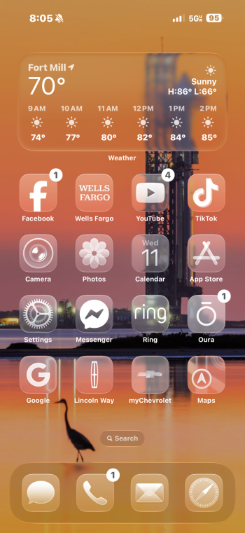
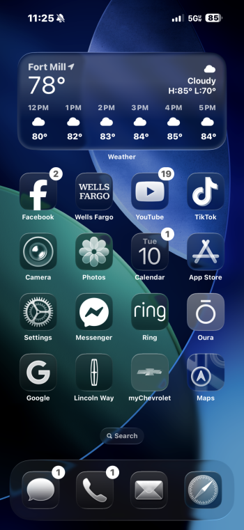
I’ve seen a few videos & pics of the Control Centre in particular & it seems that if you have a set wallpaper of patterns & bright colours etc , the CC with its new transparent liquid glass look , can look a visual mess with just a jumble of icons due to the CC being an overlay of more icons etc underneath.
Now this is going to be tweaked & is only beta 1. Going by previous betas of 18, 17 etc , there’s no way things like this don’t get sorted. Currently I can see how some are having readability issues.
As a temporary workaround & make easier on the eye , is a solid coloured wallpaper more pleasing to the eye when it comes to the new liquid glass icons/CC look ?
If anyone has screenshots of a solid coloured wallpaper (Blue) , I’d be interested in seeing how it looks & your thoughts.
Cheers
J
I’ve been reading lots of posts on here & other forums about how messy the CC & other parts of the menus can look with the new Liquid glass icons/look.
I’ve seen a few videos & pics of the Control Centre in particular & it seems that if you have a set wallpaper of patterns & bright colours etc , the CC with its new transparent liquid glass look , can look a visual mess with just a jumble of icons due to the CC being an overlay of more icons etc underneath.
Now this is going to be tweaked & is only beta 1. Going by previous betas of 18, 17 etc , there’s no way things like this don’t get sorted. Currently I can see how some are having readability issues.
As a temporary workaround & make easier on the eye , is a solid coloured wallpaper more pleasing to the eye when it comes to the new liquid glass icons/CC look ?
If anyone has screenshots of a solid coloured wallpaper (Blue) , I’d be interested in seeing how it looks & your thoughts.
Cheers
J