I'm just wondering if anyone else has noticed this.
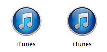
A lot of icons in and throughout Mavericks (including icons in the Finder and icons in System Preferences) are rendering "darker" then normal. You can actually screenshot this and it'll show up. I've attached an example of this from the iTunes icon- 10.9 is on the right, 10.8 is on the left.
Has anyone else noticed this? It is moderately annoying, considering how many icons suddenly look like garbage because they're showing up darker then they should. I'm not sure how hard it could possibly be to render icons properly, but apparently the answer is "very"?
-SC


