Become a MacRumors Supporter for $50/year with no ads, ability to filter front page stories, and private forums.

CD3660

macrumors 603
Original poster
Jun 6, 2007
5,483
2,797
Cheshire, United Kingdom.
IMG_0117.JPG
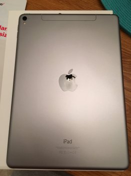
What's with the variety of shades in Space Grey?

The new iPad Pro 9.7" matches the iPhone 6s but is significantly lighter than the 2015 MacBook and the iPad Air 1.

Just curious.
 
Variations in materials I'm sure. I would be more concerned about the variation of color along the same model numbers really. I like how the Space Gray looks on the Pro 9.7", I hope the SE has a similar color. I prefer the iPhone 4 style black and silver over the black and gray look.
 
Space gray shades had always been a hot mess for Apple. It's pretty frustrating how not even the same year's products can't have the same shade.
 
  • Like
Reactions: gewawd
Why do you want to see the front? It's black like all Space Grey units.

Seriously, are you questioning my word on this? I've been a member of these forums for very nearly 9 years!


I wasn't. I am a little now though....

Here is mine for comparison
 

Attachments

  • image.jpeg
    image.jpeg
    965.9 KB · Views: 640
Space gray shades had always been a hot mess for Apple. It's pretty frustrating how not even the same year's products can't have the same shade.

Check out the 5s next to the SE. Also a noticeable difference. I'm willing to bet it has something to do with the anodizing process. The first slate black or whatever they called it was a disaster. They've been subsequently making their products lighter and lighter ever since.
 
Variations in metallurgy, surface area and shape makes it very hard to create a consistent colour. This is what we see always in the photography business when we have to colour match product photography. A PVC bag and a leather bag from the same company will have the same colour name description but just the way light bounces of the different materials and designs makes it impossible for there to be real world consistency in all lighting conditions.
 
The space grey colours got lighter from the 5S to the current 6S. The gold also changed through each generation. At least the most recent versions of iOS devices match. The gold from the 6S matches the iPad Pro 9.7, just as the gold iPhone 6 matched the iPad Air 2 gold. The same thing happens with the space grey eg, iPhone 5S and iPad Air (1). Truely, only the silver and white model stays has stayed the same.
 
  • Like
Reactions: MacFather
Variations in metallurgy, surface area and shape makes it very hard to create a consistent colour. This is what we see always in the photography business when we have to colour match product photography. A PVC bag and a leather bag from the same company will have the same colour name description but just the way light bounces of the different materials and designs makes it impossible for there to be real world consistency in all lighting conditions.

Ummmm,, Slightly different, as Apple deliberately change the colour for each generation - but at least the iPhone and iPad will have matching colours in each generation.
 
Check out the 5s next to the SE. Also a noticeable difference. I'm willing to bet it has something to do with the anodizing process. The first slate black or whatever they called it was a disaster. They've been subsequently making their products lighter and lighter ever since.

Gold, Silver, and Rose Gold do not nearly have as much variation as Space Grey. Maybe it is something with the grey. But if they can get the 5S consistent, why can't they use the same color setting for the 6? Odd.
 
Maybe it's a long slow "tie in" (see what I did there?) with 50 Shades of Gray.

But considering actual outer space is more or less black, all bets are off.
 
Register on MacRumors! This sidebar will go away, and you'll see fewer ads.