Become a MacRumors Supporter for $50/year with no ads, ability to filter front page stories, and private forums.

Aoligei

macrumors 65816
Original poster
Jul 16, 2020
1,483
1,821
I do not have iPad with Apple Silicon, nor I feel I want one. I am testing iPadOS 26 on the 9th iPad, the last iPad with home button.

The experience is bit choppy, as this is the first beta, so understandable. I don’t know if this is bug or not, but it seems that Stage Manager is enabled with this iPad.

1750039531162.png


Overall, iPad 26 is still a dramatic improvement and it is good step towards iPadOS being useful.

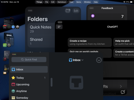
However, out seems that UI elements still need to be arranged, for example:

1750039733927.png


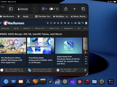
Safari looks very cramped. You have the traffic light icons, side bar icon, forward/backward icons, address bars, share, add page icons all cramped together.

Then you have menu bars that goes on top of two apps, which is kind of confusing.

1750039919228.png


Anyway, this is just my three minutes experiences with iPadOS..

P.S. Preview app on iPad is awesome.
 
Then you have menu bars that goes on top of two apps, which is kind of confusing.
Did you put your windows at the top of the screen? In Apple's presentation, they show the menus above the windows.
iPad.jpg

Edit: In this video, I see that the windows do go from the top to the bottom of the screen. They aren't reserving precious space for the menus. Maybe the design will change by release.

 
Last edited:
I'm also using a 9th-generation iPad, and the menu bar is accessible by swiping down at the top of the screen, no matter where an app is placed on the screen.

Yes. I also figured that out. But the problem with iPadOS is that it is hard to tell which app is active. There is no enough shadow on the active app to distinguish from other app.

Also, if you have app on four coroners, all the app looks very small on 9th gen iPad. It is literally impossible to enter URL on Safari.
 
  • Like
Reactions: Jimmie Geddes
Yes. I also figured that out. But the problem with iPadOS is that it is hard to tell which app is active. There is no enough shadow on the active app to distinguish from other app.

Also, if you have app on four coroners, all the app looks very small on 9th gen iPad. It is literally impossible to enter URL on Safari.

I can't even get to the address bar in Safari most of the time because of how cramped it is. Apple better Liquid Glass it up to show which app is active.
 

Attachments

  • ipad.png
    ipad.png
    1.3 MB · Views: 33
Last edited:
I can't even get to the address bar in Safari most of the time because of how cramped it is. Apple better Liquid Glass it up to show which app is active.

Screenshot 2025-06-18 at 7.55.42 AM.png


This is Safari on Mac. Admit this is o a 15 inch MacBook Pro. All the icons are arranged beautifully and there are enough of spaces between each icons. At least URL bar is not cramped like iPadOS.

But I also tried the 11inch MacBook Air from 2013. Even with 11 inch MacBook Air, apps are still more usable.
 
  • Like
Reactions: Jimmie Geddes
View attachment 2521092

This is Safari on Mac. Admit this is o a 15 inch MacBook Pro. All the icons are arranged beautifully and there are enough of spaces between each icons. At least URL bar is not cramped like iPadOS.

But I also tried the 11inch MacBook Air from 2013. Even with 11 inch MacBook Air, apps are still more usable.
I owned the same 11-inch MacBook Air and never felt uncomfortable with its size. It also allowed users to customize the screen resolution by using third-party applications to see more. If the 9th-generation iPad’s 10.2-inch display feels cramped, I wonder how iPad mini users are experiencing this.

As this is the initial developer beta, there will be technical glitches. Apple pays attention, so it's essential for users to utilize the Feedback app to report any issues/requests.

I'm still kinda shocked that Apple added Stage Manager and resizable app windows to this old entry-level iPad, lol. I can't wait for iPadOS 26 to work the way it's supposed to.
 
Got the 12.9" iPad Pro, its terrible. I dont see the usefulness of windows with a clumsy UI like this.
 
Wow, didn't expect that. Is Safari as cramped as the screenshot I posted above?
Similar, but for multiple windows the UI needs to be space efficient to allow more content to fit. This in turn require precision input devices, which is what the Pencil is but that they refuse to enable for UI interaction!? Or now you can apparently interact with the traffic light buttons but not move, resize or access quick settings etc…wth Apple.

I can have 3 vertical tiny mobile browser windows side by side at least, great.
 
  • Like
Reactions: Jimmie Geddes
Similar, but for multiple windows the UI needs to be space efficient to allow more content to fit. This in turn require precision input devices, which is what the Pencil is but that they refuse to enable for UI interaction!? Or now you can apparently interact with the traffic light buttons but not move, resize or access quick settings etc…wth Apple.

I can have 3 vertical tiny mobile browser windows side by side at least, great.
Thanks. I completely agree with you. I submitted Feedback asking to allow users to use Apple Pencil to move windowed apps and access the new File menu. After all these years you'd think Apple Pencil would be able to perform these basic features.
 
Thanks. I completely agree with you. I submitted Feedback asking to allow users to use Apple Pencil to move windowed apps and access the new File menu. After all these years you'd think Apple Pencil would be able to perform these basic features.

I don't think Apple Pencil is necessary. Keyboard and mouse should be enough.

1750289356741.png


You see, if you manually adjust the Safari window, it defaults to iOS style of Safari. But for some reason, if you use system preset, everything is cramped together.
 
Last edited:
  • Like
Reactions: Jimmie Geddes
I don't think Apple Pencil is necessary. Keyboard and mouse should be enough.

View attachment 2521241

You see, if you manually adjust the Safari window, it defaults to iOS style of Safari. But for some reason, if you use system preset, everything is cramped together.
If you can access the File menu with your finger, it'd make sense to allow the Apple Pencil to do it. I could see if the File menu was only enabled when using a keyboard, as was rumored. Apple Pencil works fine, tapping the "traffic light" to close, minimize, or arrange windows. Control Center and Notification Center should also be able to work just like Spotlight does with Apple Pencil.

A great way to mimic macOS would be similar to the 3-finger gesture to hold and move windows. If I can use a mouse to do it, it'd be nice to use Apple Pencil since it's a precision input device as well. I use Apple Pencil all the time, and I never use a mouse or keyboard. The Apple Pencil limitations of what it can and can't touch should be addressed after all these years. Having to constantly switch from Apple Pencil to finger interrupts workflow and feels like a total disconnect.

I'm sure Apple will fix the UI elements in subsequent betas, because it's a mess. Also, whatever app is active should have some kind of Liquid Glass effect/shadow to indicate the active app easily for users. I know I'm asking for a lot, lol.
 
My Samsung Galaxy Note 11 years ago had a more compact multi-view UI where the pen worked for all input elements, just let the user decide.

 
I’m using this more on a external display using mouse and keyboard, I’m very happy with the changes

However when the iPad is in my hand its clunky, clearly its designed for a precision pointing device.

So I think apple is preparing ipadOS as a replacement for MacOS sometime later
 
Register on MacRumors! This sidebar will go away, and you'll see fewer ads.