Become a MacRumors Supporter for $50/year with no ads, ability to filter front page stories, and private forums.

JackT06

macrumors 6502
Original poster
Jul 24, 2009
293
0
Hello,

You may of seen me posting alot over the weekend about my website.

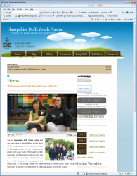
Please can you give me some critque, and i would like you to be as to the point as possible...

The main reason why is on Friday, the HRH (Prince Phillip), will be coming to Hampshire (where i live), and I have to show him this website, and i want it too be as 'good' as possible... :)
 
just quickly glancing through it I noticed that the Documents page did not work or the "Design by" link at the bottom "nodethirtythree" was a 404 page.

Looks good though ... best of luck with your presentation.
 
just quickly glancing through it I noticed that the Documents page did not work or the "Design by" link at the bottom "nodethirtythree" was a 404 page.

Looks good though ... best of luck with your presentation.

Both errors now fixed..

Thanks mate:)
 
It seems to have some issues on my IE (8.0.7600.16385). The menu doesn't seem to center properly vertically and flows off the right of the screen. The link in the "Latest News" section runs out of the box and the two columns in the body have no gutter.

Ah that joy that are browsers.
 

Attachments

  • ws.png
    ws.png
    967.9 KB · Views: 91
Good site, great even.

I like the RSS Feed animation, classy.

On Documents, don't make the links different colors.

I personally don't like weird youtube, twitter, etc. buttons at the bottom, just go with classic with some rounded edges.

This
"This is our Blog, we will try and keep this up-to-date as much as possible for you to read. "
is superfluous, and distracting.

The DofE awards, again, no multi-color.

Just little things, overall it's excellent.
 
It seems to have some issues on my IE (8.0.7600.16385). The menu doesn't seem to center properly vertically and flows off the right of the screen. The link in the "Latest News" section runs out of the box and the two columns in the body have no gutter.

Ah that joy that are browsers.

Yeah, i realized this issue the other day, and rearranged some code and added parts and changed it, and i just couldn't figure this one out:(
 
Good site, great even.

I like the RSS Feed animation, classy.

On Documents, don't make the links different colors.

I personally don't like weird youtube, twitter, etc. buttons at the bottom, just go with classic with some rounded edges.

This
"This is our Blog, we will try and keep this up-to-date as much as possible for you to read. "
is superfluous, and distracting.

The DofE awards, again, no multi-color.

Just little things, overall it's excellent.

Thanks for the feedback!:)

What do you think of the colors for the RSS feed? I'm not sure...?

I shall look at changing the colors:)

I have been looking at changing the logos...

thanks!:) all your feedback has been taken on board.
 
My 2 cents:

Seems redundant to have the name of the site and the logo at the top. Why not just have either or?

Remove the border around the RSS feed icon.

Add some margin to the "click here" buttons in the sidebar. If you created these buttons, I'd de emphasize the "click here" and make the relevant text bigger.

Under "Useful Websites", I'd resize the logos to be similarly sized, since they're all different widths, change the heights to be all the same.
 
Thanks for the feedback!:)

What do you think of the colors for the RSS feed? I'm not sure...?

I shall look at changing the colors:)

I have been looking at changing the logos...

thanks!:) all your feedback has been taken on board.

I like the entire color scheme, (unless otherwise stated), very earthy.
 
Moving Social Media Icons

I've been thinking of moving the social media buttons up to the bottom right hand corner, BUT on the white space.....

or am i better leaving them...?

Opinions...?:)
 
Looks good.

Mail icon (bottom) is not linked.

Page heading might need more description for search engines (instead of "Home")

What did you use for twitter feed?
 
Looks good.

Mail icon (bottom) is not linked.

Page heading might need more description for search engines (instead of "Home")

What did you use for twitter feed?

Thanks:)

I was just testing that logo at the moment:)

For the twitter feed... do you mean the ones on the Blog/DofE News Page?
 
Register on MacRumors! This sidebar will go away, and you'll see fewer ads.