Hi everybody,
I would need help with the text smoothing on my MacBook Pro (2010, i5) standard res.
Description of the problem
I find that all the text displayed on the screen looks bad, incredibly smoothed and bold. It really gives me a headache and makes me dizzy. For comparison, my wife old Windows XP laptop still looks better.
What I did first
System Preferences > Appearance > Turn off text smoothing for font sizes 12 and smaller.
It did not help. System bars, help menus, some parts of webpages were still smoother. The screen looks even worse now, with some fonts smoothed and some others not.
What I did next
I installed TinkerTool.
Font Smoothing > Turn off font smoothing for fonts size 144 and smaller.
Fonts > I changed all the fonts to Arial.
I rebooted several times because apparently you need to in order for the changes to take effect.
The results
Now, my screen is a mix of smoothed text (system bar), not smoothed text (the battery %, the date and time top right corner of system bar), smoothed (spotlight icon, wifi icon, speaker icon, battery icon), smoothed (some internet panes), not smoothed (some other internet panes). In summary, it's even worse than before as there is no consistency on the screen.
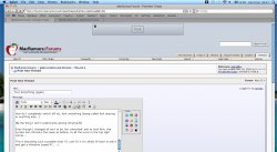
I attached a few screenshot for your comments.
The 1m dollar question
How do I completely switch off ALL font smoothing (being called font aliasing or anything else...)
The thing I don't understand (among others)
Even though I changed all text to be 'not smoothed' and to Arial font, the system bar still looks the same as before, so all the icons in the top right corner...
This is becoming such a problem that if I cant fix it I'm afraid I'll have to sell it and get a Windows based PC...
[EDIT]: For whatever reason, the screenshot looks worse than it actually is. To avoid confusion, my screen resolution is set to the native resolution of the panel.
I would need help with the text smoothing on my MacBook Pro (2010, i5) standard res.
Description of the problem
I find that all the text displayed on the screen looks bad, incredibly smoothed and bold. It really gives me a headache and makes me dizzy. For comparison, my wife old Windows XP laptop still looks better.
What I did first
System Preferences > Appearance > Turn off text smoothing for font sizes 12 and smaller.
It did not help. System bars, help menus, some parts of webpages were still smoother. The screen looks even worse now, with some fonts smoothed and some others not.
What I did next
I installed TinkerTool.
Font Smoothing > Turn off font smoothing for fonts size 144 and smaller.
Fonts > I changed all the fonts to Arial.
I rebooted several times because apparently you need to in order for the changes to take effect.
The results
Now, my screen is a mix of smoothed text (system bar), not smoothed text (the battery %, the date and time top right corner of system bar), smoothed (spotlight icon, wifi icon, speaker icon, battery icon), smoothed (some internet panes), not smoothed (some other internet panes). In summary, it's even worse than before as there is no consistency on the screen.
I attached a few screenshot for your comments.
The 1m dollar question
How do I completely switch off ALL font smoothing (being called font aliasing or anything else...)
The thing I don't understand (among others)
Even though I changed all text to be 'not smoothed' and to Arial font, the system bar still looks the same as before, so all the icons in the top right corner...
This is becoming such a problem that if I cant fix it I'm afraid I'll have to sell it and get a Windows based PC...
[EDIT]: For whatever reason, the screenshot looks worse than it actually is. To avoid confusion, my screen resolution is set to the native resolution of the panel.