Hi,
I'm being fussy here so don't read on of you don't want to.
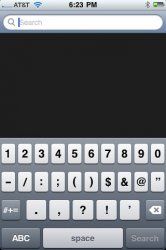
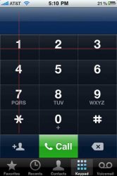
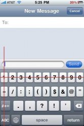
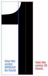
Something seems different with the on-screen keyboard following 3.0, and I was just wondering if anybody else had noticed that the number on the number 1 key is a little more to the left than the other numbers?
Yeah, anyway, that's all!
I'm being fussy here so don't read on of you don't want to.
Something seems different with the on-screen keyboard following 3.0, and I was just wondering if anybody else had noticed that the number on the number 1 key is a little more to the left than the other numbers?
Yeah, anyway, that's all!