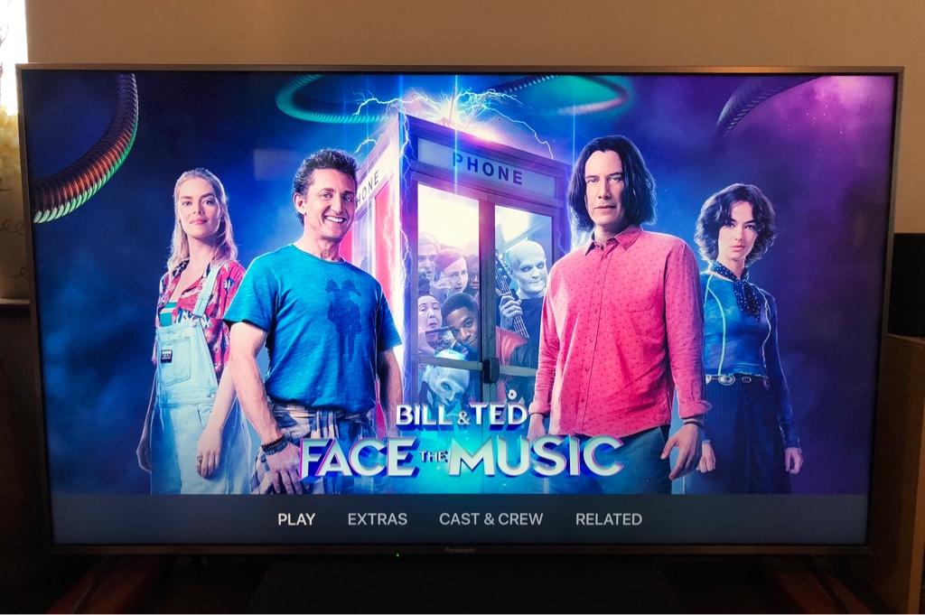
I can't believe they are on the fourth of fifth iteration of tvOS, yet Apple still hasn't addressed the unreadable iTunes Extras menu bar.
Don't know what I'm talking about? Open up a movie with iTunes Extras that you bought via iTunes. On the movie's menu screen (the screen with the "poster image"), use the remote to swipe between menu options in the menu bar at the bottom of the screen (the menu bar that is displayed horizontally at the bottom of the screen, with menu headings such as "Play" "Scenes" "Extras" "Cast & Crew" etc).
As you navigate left to right through the horizontal menu bar can you even tell which menu item is selected? I can't. The text of the selected menu item maybe–*maybe*–brightens by 1% at most. It's almost impossible to tell which menu item is selected, in other words.
How can Apple not have noticed this glaring user interface drawback?
It annoys me every time I navigate the main iTunes Extra menu as I can barely tell what's selected without squinting.


