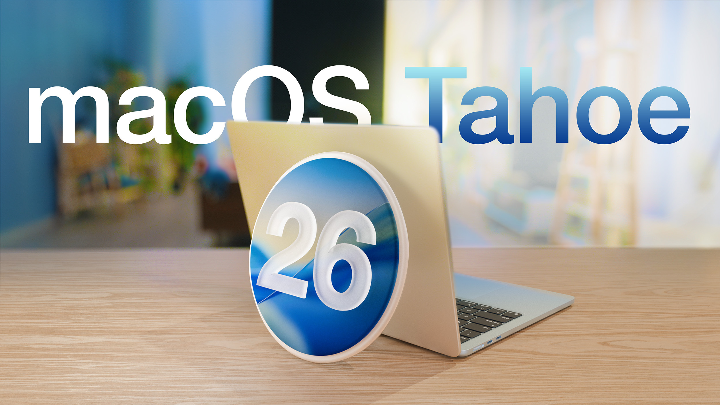
Its safe to move to this from Sequoia?
NO! Don't do it. I tried Tahoe for almost 4 months. All the way to 26.2 and reverted back to Sequoia few weeks back. Took me whole weekend to go back on my M4 MacBook Pro. I have almost 4TB of data on the SSD harddrive so the full new backup and copying back from backup was about 17 hours each time. It was a pain and cost me so much lost time.
Tahoe looks and behaves really bad. I don't understand how someone on this very forum praises the look. Sorry folks if I don't care about looks as much as I care about functionality, speed, precision, stability and focusing on my content. Tahoe's design elements are constantly screaming at you - look at me! It's distracting. Or, you cannot find them when you need them fast because they are "melting" into your content due to Liquid Glass.
And the insanely rounded corners everywhere that cut off valuable space AND content!!! For example I use my desktop to store pictures and video files for my immediate projects for easy drag and drop. The extra rounded corners on the desktop icons now cut off so much content that you can't see what the icons represent. You have to adjust the size of the icons to be much bigger. Therefore, taking up more space, so you can't fit as many as needed on the desktop.
I don't understand whose stoooopid idea this was. It must have been someone working on 30" monitors. But if you use 13" Air or 14" Pro with limited screen real estate, the excessive ROUNDNESS of everything doesn't allow for the same fit/look of your files and content like on Sequoia or prior (my very first Mac had Leopard OS on it) so I know what I'm talking about.
The whole system now looks like lego DUPLO for kindergarteners.
I have iPhone 17 Pro and I have iOS 26 on it. It's fairly fine on the iPhone - but I did have to turn on the Tinted version of Liquid Glass to improve readability. However, Tahoe with its new redesign is not fine. I don't even mind the Liquid Glass effects, as we can make it look more Tinted or frosted now, as I mind the redesign of the OS. The new lines everywhere like on the sidebars in every app, bunch of new uneven lines in and around menus, weird padding around sidebars and control elements/buttons, stupidly positioned buttons and menus, stupidly inconsistent shapes of buttons and padding around them. Content moving through/behind menus and buttons and sidebars. It's all more distracting than ever. The macOS is now distracting and wants to be more important than your content! It's getting in the way of your content! Instead of being in the background working for you invisibly and be there when you need it - it screams LOOK AT ME! And at times it hides so well you can't read/see what the buttons are.
And has anyone mentioned the new dumbass position of the control menu in the Music app on the very bottom? I mean what the... Whose idea??? Who approved it??? Who thought this was an improvement??? It can work on an iPhone because your thumb is on the bottom of the screen. But it is truly one big idiotic decision to do it on a desktop.
NOPE!!! I'm skipping 26 altogether and will stay on Sequoia until 27 comes out, and we will see what they come up with there.
You will NOT be missing out on any security as Sequoia will be supported and getting updates for minimum of next 3 years. I hope that by that time, the new design team who took over, after the "firing" of the old design chief Alan Dye, will come up with much needed improvements.
Lastly, we are only 5 months from the new os 27 being shown and announced at the WWDC. I can easily wait to see what's cooking until then.