Become a MacRumors Supporter for $50/year with no ads, ability to filter front page stories, and private forums.

Tar Sniffer

macrumors 6502
Original poster
Apr 11, 2012
302
50
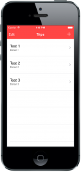
Like a lot of people that dislike iOS 7, I find the stock apps lack structure, style and most importantly, colour. For fun I've been playing around with iOS 7's apps hoping to make them look more lively and incorporating some of the better layouts of iOS 6, while still remaining sympathetic to the new style.

For best results, please save image to Photos. So what do you think? Better? Worse? Too distracting? If you don't like it then please provide constructive feedback.

UPDATE: Version 2 is up. A thank you to Why?????? for the feedback.


Last edited:
Your concepts look far better than current iOS 7, but I think that deglossified and evolutionised classic iOS would look even better.
 
Your concept sucks from my point of view, the original one is way much better!
 
I think that the colours of the navigation bars are way too much "in-your-face" and provide a distraction. That's why the current bars are white or black– so the distractions are minimised.

I think that you should try using less flashy and loud colours. Try using slightly more muted colours, but make sure that they aren't too dull, because you want character in the UI. From experience in developing an app for iOS 7, don't leave the main colours as an afterthought: it takes time to find the right one.
 
Your concepts look far better than current iOS 7, but I think that deglossified and evolutionised classic iOS would look even better.

I agree current iOS7 is very bland and boring, also seem to have more apps quit often on my IP5 then they did with iOS6 even setting up as a new iPhone.
 
I think that the colours of the navigation bars are way too much "in-your-face" and provide a distraction. That's why the current bars are white or black– so the distractions are minimised.

I think that you should try using less flashy and loud colours. Try using slightly more muted colours, but make sure that they aren't too dull, because you want character in the UI. From experience in developing an app for iOS 7, don't leave the main colours as an afterthought: it takes time to find the right one.

Thanks for the constructive feedback. I originally played around with muted colours, but I thought it felt inconsistent with iOS 7's colour palette. In the end I only wanted to gauge peoples opinion on what they thought of the addition of colour, since the apps are often criticised for being too white. I felt people would judge the mockup simply on aesthetics rather than practicality, which was my reason for using the gradients found on the Notes, Phone and Photo Booth icons. Like you said, the colours are quite loud and flashy, which in hindsight was a bad move and could be partly why it's so poorly received.
 
Thanks for the constructive feedback. I originally played around with muted colours, but I thought it felt inconsistent with iOS 7's colour palette. In the end I only wanted to gauge peoples opinion on what they thought of the addition of colour, since the apps are often criticised for being too white. I felt people would judge the mockup simply on aesthetics rather than practicality, which was my reason for using the gradients found on the Notes, Phone and Photo Booth icons. Like you said, the colours are quite loud and flashy, which in hindsight was a bad move and could be partly why it's so poorly received.

So I'd say that you should change the tint colours of the buttons to be the same as the nav bar colours, which makes it consistent. It can add a degree of beauty because of the consistency.

Attached is a screenshot of my app which is a work in progress, but I'm more or less set on the colour. The coloured navigation bar is of a more muted colour, but I still think that it retains the character of the UI. The shade of red looks a lot like what you'd expect in a boiled sweet, which would keep the same character that made the original iMacs famous, where you'd want to "lick" it.

But that's my interpretation. I'd change the tint colour of the buttons to match the navigation bar tint if I were you.
 

Attachments

  • Real Sample.png
    Real Sample.png
    309.8 KB · Views: 123
So I'd say that you should change the tint colours of the buttons to be the same as the nav bar colours, which makes it consistent. It can add a degree of beauty because of the consistency.

Attached is a screenshot of my app which is a work in progress, but I'm more or less set on the colour. The coloured navigation bar is of a more muted colour, but I still think that it retains the character of the UI. The shade of red looks a lot like what you'd expect in a boiled sweet, which would keep the same character that made the original iMacs famous, where you'd want to "lick" it.

But that's my interpretation. I'd change the tint colour of the buttons to match the navigation bar tint if I were you.

Thanks for the feedback and support. I have uploaded a second version using more muted colours and have reworked the Calendar App so it's inconsistent with the changes of iOS 7.1.

I'm not a fan of the colour I chose in Contacts, since it's hard to find a muted green that doesn't look 'heritage'. I like your idea about the original iMacs though. I'll keep refining the mockup based on your advice. Thanks again!

You're welcome! The refined version looks a lot better, but as said, could still use some work.
 
I would say they're better. iOS 7 is horrible so that's still not saying much, though. With yours, I'm really distracted by the color in the nav/status bar. I think Apple trying to make the two bars into one in iOS 6 was a bad move and it's only gotten worse with iOS 7.
 
For more feedback on your contacts app, try and match the colour of the UI buttons to the one of the navigation bar. It looks inconsistent.
 
Register on MacRumors! This sidebar will go away, and you'll see fewer ads.