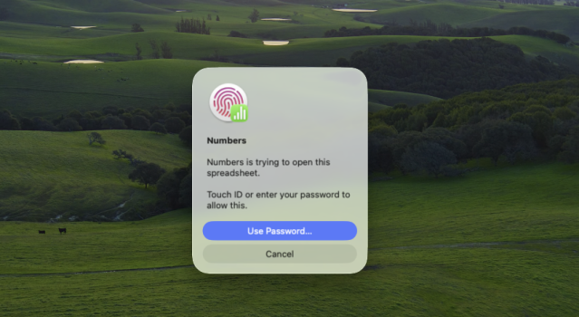
Sadly, this is not a bug, but something Apple actually thought was an improvement. It looks awful. It's shocking that people actually wanted or asked for this. If you're going to have the icon and text left aligned, then clean up the font/text weighting and make the dialog window horizontal/wide.
The more I use it, the more Tahoe feels like a Sequoia beta (it's buggy) with a 3rd party skin applied (which looks bad in Dark Mode) and a few visual changes for the sake of change with the hope that the next beta will correct these odd decisions, but no, this is Tahoe, and this is how it's going to stay (most likey).
If only Apple had the resources to make a beautiful OS that is also functional with a great UX that geared towards desktop computing specifically. Instead, the primary focus is iOS-ifying macOS as iPhone is Apple's main moneymaker, therefore their largest consumer base, so everything will surround catering to this market in hopes of getting iPhone users onto Mac and into more of Apple's services within their ecosystem.