Become a MacRumors Supporter for $50/year with no ads, ability to filter front page stories, and private forums.

Which logo has a better concept in your opinion?

  • Left

    Votes: 0 0.0%
  • Right

    Votes: 0 0.0%

  • Total voters
    0

creator2456

macrumors 68000
Original poster
Jul 10, 2007
1,649
2
Chicago
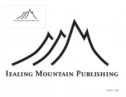
Working on a logo for Healing Mountain Publishing (very small, niche publishing company), and I am having trouble deciding which direction I should take.

These are still in the 'sketch' phase but I have been working on the ideas I am a little clouded to what they actually look like.

Just asking fellow designers' opinions on the concepts more than anything.
 

Attachments

  • Logo1.jpg
    Logo1.jpg
    131.2 KB · Views: 66
  • Logo2.jpg
    Logo2.jpg
    94.1 KB · Views: 62
If I'm completely honest neither really strikes me.
The left one looks more like some logo for a bottled water while the right one reminds me of H&M logo

Also if this is for a client then the best person to be asking is them as they have an idea of what they are after
 
Register on MacRumors! This sidebar will go away, and you'll see fewer ads.