Become a MacRumors Supporter for $50/year with no ads, ability to filter front page stories, and private forums.

jonathanlaniado

macrumors member
Original poster
May 13, 2012
45
2
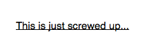
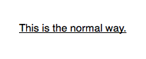
Why is it that in some cases the underline in Pages is way too close to the words, and then in other cases, it is perfectly normal? I attached pictures to show you what I mean.
 

Attachments

  • Screen Shot 2012-09-04 at 9.48.01 PM.png
    Screen Shot 2012-09-04 at 9.48.01 PM.png
    8.9 KB · Views: 1,535
  • Screen Shot 2012-09-04 at 9.48.09 PM.png
    Screen Shot 2012-09-04 at 9.48.09 PM.png
    9.2 KB · Views: 1,865
Last edited:
It seems like underlining behaves differently, depending on whether it's done in a word processing document (what you're calling normal) or a page layout document (what you're calling screwed up). Maybe reporting it on apple.com/feedback/pages.html will bring it to the iWork team's attention and they'll fix it.

I would suggest avoiding underlines altogether unless there is a very specific need. Not because I'm suggesting you avoid the bug/problem, but stylistically, they're quite visually abrupt and we have much more visually pleasing options available to us. If you're making a heading, I would make it larger, and choose a contrasting typeface (font) from the body text. If you're making a subheading, the bold version of your body text font is a sure bet.

For bibliographical information, use italics instead of underlines.

You might really like the results after experimenting with these suggestions, so give them a try! :)
 
I just opened a random document and tried it out, and it looks normal to me, so it has to do with either the font or something else.
 
It seems like underlining behaves differently, depending on whether it's done in a word processing document (what you're calling normal) or a page layout document (what you're calling screwed up). Maybe reporting it on apple.com/feedback/pages.html will bring it to the iWork team's attention and they'll fix it.

I would suggest avoiding underlines altogether unless there is a very specific need. Not because I'm suggesting you avoid the bug/problem, but stylistically, they're quite visually abrupt and we have much more visually pleasing options available to us. If you're making a heading, I would make it larger, and choose a contrasting typeface (font) from the body text. If you're making a subheading, the bold version of your body text font is a sure bet.

For bibliographical information, use italics instead of underlines.

You might really like the results after experimenting with these suggestions, so give them a try! :)

I agree with this statement.

In APA formatting, both underlining and boldface should be avoided. Underlining is only acceptable is calling out a website URL. Italic is acceptable if it is being used for emphasis or introducing a new term, but only for the first instance. Italic can also be used for the title of books and words that could easily be misread.

APA formatting is what approximately 90% of high school and college students are taught and use unless specifically advised by their instructor. In my experience, I have only had one instructor mandate the use of the MLA style, where as all others have been the APA style.

Technical writing is typically an exception to the rules of all writing styles, especially when responding to Request for Proposals (RFPs).
 
It probably has something to do with the fact that you are using software that doesn't exist. :p
 
I did notice, but I was being nice. :p
I'd LOVE for Apple to release a new version of iWork, building on what we love about it and in classic Apple fashion, adding features and touches to it that make complete sense that we never realized we couldn't live without.

Side note regarding MLA style: For names of information sources, underlining is really only something you do when you have to write them out by by hand or for whatever reason you're stuck at a typewriter. Thankfully, italic type is preferred when you're using a computer. I wrote many bibliographies in MLA style for academic papers and never underlined.

Haha I fixed it the title. But I need answers, because I need to actually underline something important in my document and it looks unprofessional like this.

And I think the most annoying part of all this, is the fact that it gets messed up in the same document.
 
What font are you using? I just went through and could not find any way to move the underline. BUT I then went and changed around the fonts and I found about 25% of them have underlining just like the "bad" type.
 
What font are you using? I just went through and could not find any way to move the underline. BUT I then went and changed around the fonts and I found about 25% of them have underlining just like the "bad" type.

Oh wow, now that is a start. However, both of the pictures you see are Helvetica and they are in the same document!!
 
I say just use Word and forget all this nonsense. Yeah I don't know why Pages behaves this way.
 
I say just use Word and forget all this nonsense. Yeah I don't know why Pages behaves this way.
Word is at the heart of some of the worst formatting offenses in typography today. It is all that I can do not to stick needles in my eyes every time I see open single quotes (‘) used in the place of apostrophes (’).
 
Word is at the heart of some of the worst formatting offenses in typography today. It is all that I can do not to stick needles in my eyes every time I see open single quotes (‘) used in the place of apostrophes (’).

This used to be true, and bugged me too. It has long been fixed in the newer version of Word. As for other typographical offenses by Word, they may exist but I haven't come across any in a long time and I use Word (and Excel and PowerPoint) many times a week for complex projects.

----------

APA = American Psychological Association?

Yep.

APA is the American Psychological Association.
http://en.wikipedia.org/wiki/APA_style

MLA is the Modern Language Association of America.
http://en.wikipedia.org/wiki/MLA_Handbook_for_Writers_of_Research_Papers
 
This used to be true, and bugged me too. It has long been fixed in the newer version of Word. As for other typographical offenses by Word, they may exist but I haven't come across any in a long time and I use Word (and Excel and PowerPoint) many times a week for complex projects.


Still, why not use Pages? It's so much better!
 
Register on MacRumors! This sidebar will go away, and you'll see fewer ads.