Become a MacRumors Supporter for $50/year with no ads, ability to filter front page stories, and private forums.

sultanoflondon

macrumors 6502
Original poster
Dec 3, 2013
342
16
Hi all,

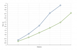
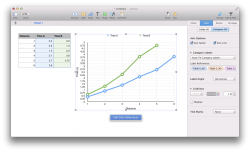
I was wondering whether anyone knew how to get x axis labels for the screenshot of the chart i have attached? I want 1, 2, 3, 4, 5, 6 (Distance) for the x axis wherever the vertical lines are and the little tick marks are? Please help I have a submission tomorrow?


Thanks!
 

Attachments

  • Screen Shot 2014-02-12 at 16.39.38.png
    Screen Shot 2014-02-12 at 16.39.38.png
    53.9 KB · Views: 1,285
Do you have data sets for both the x and y axis, and if so have you selected them both when creating the chart?

For example here's one that I've made, with the two sets of data one for each axis. Where Sample Number would be the equivalent of Distance.
 

Attachments

  • Screen Shot 2014-02-12 at 17.21.39.png
    Screen Shot 2014-02-12 at 17.21.39.png
    240.2 KB · Views: 1,142
Do you have data sets for both the x and y axis, and if so have you selected them both when creating the chart?

For example here's one that I've made, with the two sets of data one for each axis. Where Sample Number would be the equivalent of Distance.


No, I didn't actually. But I have two lines on the graph, the blue and the green.
 
Yeah so for two lines on the graph you have three data sets right, two for time (on the y axis) and one for distance (for the x axis)?
Or do you only have two data sets and it's graphing both on the y axis?

Maybe this is a better example, where I have Position for the x axis and Hough and Laplacian in the y axis to create two lines on the graph. In this case I selected all three columns of data and then chose 2D line graph from the Chart button on the toolbar.

EDIT: I took your screenshot and made a chart (see the second screenshot I uploaded), is this what you want?
I did have to manually select the label references (Axis > Category (X), Label References) to add in the distance labels.
 

Attachments

  • Screen Shot 2014-02-12 at 17.57.41.png
    Screen Shot 2014-02-12 at 17.57.41.png
    319.3 KB · Views: 1,284
  • Screen Shot 2014-02-12 at 18.36.59.png
    Screen Shot 2014-02-12 at 18.36.59.png
    192.4 KB · Views: 1,360
Last edited:
Yeah so for two lines on the graph you have three data sets right, two for time (on the y axis) and one for distance (for the x axis)?
Or do you only have two data sets and it's graphing both on the y axis?

Maybe this is a better example, where I have Position for the x axis and Hough and Laplacian in the y axis to create two lines on the graph. In this case I selected all three columns of data and then chose 2D line graph from the Chart button on the toolbar.

EDIT: I took your screenshot and made a chart (see the second screenshot I uploaded), is this what you want?
I did have to manually select the label references (Axis > Category (X), Label References) to add in the distance labels.


Wow, you are amazing! Thanks for all of your help, that's great! You have really helped me. Thanks again for your support!
 
Register on MacRumors! This sidebar will go away, and you'll see fewer ads.