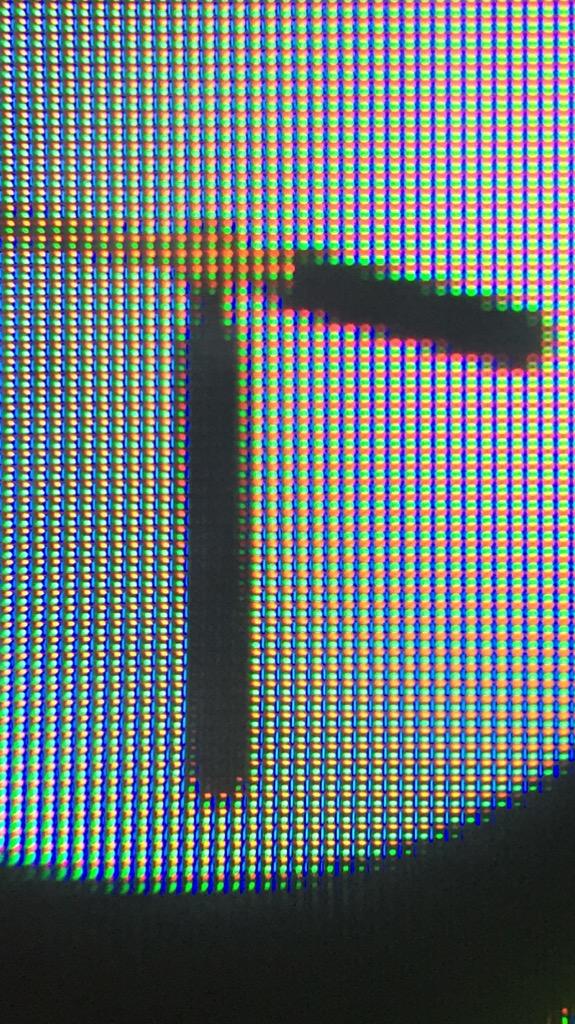
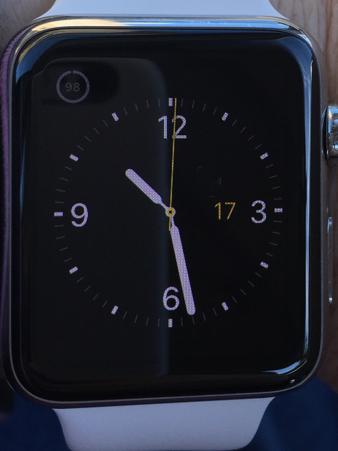
I got a clip-on macro lens for my iPhone and decided to try to take a close up of my Apple Watch Sport display. On close examination it looks similar to the "pentile" display pictures I've seen in other articles describing different subpixel arrangements. Does anyone have any expertise in this area? Also, does anyone have the ability to take a picture of their Steel Apple Watch to see if the pixels look any different? I had thought that the DisplayMate guys had tested a Steel Apple Watch and found that it had "RGB stripe" pixels.

Got a tip for us?
Let us know
Become a MacRumors Supporter for $50/year with no ads, ability to filter front page stories, and private forums.
Watch Display Pixels, pentile?
- Thread starter mrkymarc
- Start date
- Sort by reaction score
You are using an out of date browser. It may not display this or other websites correctly.
You should upgrade or use an alternative browser.
You should upgrade or use an alternative browser.
This is definitely RGB stripe. As you can tell, Red Green & Blue sub pixels are in line (RGB Stripe). You may want to take a closer look at a Pentile display to observe the difference.

Left is RGB Stripe (like on Apple Watch) | Right is Pentile (Like on many Samsung displays)

Left is RGB Stripe (like on Apple Watch) | Right is Pentile (Like on many Samsung displays)
It looks like a slightly unusual RGB arrangement with the red and green horizontal to vertical blue, but each pixel clearly has all three elements.
Don't have the magnification to do a close up, but I did notice this when driving the other day with the sun hitting the display at a certain angle. Thought it was caused by the flexible retina OLED panel under the sapphire glass (AW). Screen looks very colorful even though unlit and black at the time of the photo.

To my eye, in person, the colors looked somewhat like round dots depending on the angle and reminded me of the Apple Stores' window display with all the colorful tubes although I know they were meant to represent that watch app icons.
...Just remembered seeing a photo I took for my AW Car photo thread that had a pattern I could discern in the watch face display. The photo was taken with the watch in the shadows. Here it is. I cropped the photo constraining the original dimensions so not magnified, and taken from maybe a foot or less away with my iPhone 6+, and you can clearly see the pixels. Pretty good camera wouldn't you say!
Last edited:
Don't have the magnification to do a close up, but I did notice this when driving the other day with the sun hitting the display at a certain angle. Thought it was caused by the flexible retina OLED panel under the sapphire glass (AW). Screen looks very colorful even though unlit and black at the time of the photo.
That looks like some polarisation effect or interference pattern, probably caused by laminated layers of the display.
I cropped the photo constraining the original dimensions so not magnified, and taken from maybe a foot or less away with my iPhone 6+, and you can clearly see the pixels. Pretty good camera wouldn't you say!
The checkerboard pattern is Moiré caused by the watch display raster interacting with the camera sensor raster. The actual pixels are somewhat smaller, you can see them under a loupe or by taking a screenshot and zooming in.
It'd be interesting to know what the advantages of this arrangement is.
It appears to be similar to the Z-Type matrix, only without the half-pixel offset between lines. The advantage is a high aperture ratio. I've posted this previously here: #107
Register on MacRumors! This sidebar will go away, and you'll see fewer ads.

