Become a MacRumors Supporter for $50/year with no ads, ability to filter front page stories, and private forums.

JudyK

macrumors newbie
Original poster
Sep 25, 2009
4
0
London
Hi all

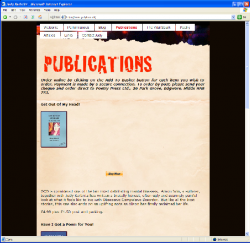
I've made two websites using iWeb and have been delighted with them but a friend who has a PC told me that on the Publications page of
www.judyk.co.uk
and also on The Vital Spark page, the words are jumbled over the pictures and the Buy Me buttons are in the wrong place too.

Do you have any suggestions and please try not to make it too complicated as I'm very much a novice.

Thanks for any help

JudyK
 
(On Windows XP) In Firefox a couple images are out of place on the publications page. In IE6 they look even worse. The top area is OK, but it gradually gets worse as you go down. This is a common problem with iWeb. It uses a lot of absolute positioning and it doesn't take much to throw it off as browsers render things a little differently from other browsers.
 
Thanks for that.

Presumably, if I get it perfect for one browser, it'll look wrong on another.

You talked about absolute positioning, angel, but it does look right on iWeb and on my computer so I'm really stuck what to do about it.
 
With iWeb for it to display good in all browsers make sure you stick to default web fonts like Arial, Verdana, Helvetica etc. Any others will cause problems!
 
Its because PC's dont use the same fonts or the same font smoothing that Mac's do even when you have Hellvetica on a PC it will different than it does on a Mac.

I figured this out after I did an entire site in Helvetica and then realized that it would show up like garbage, that was one of the more painful experiences I had, it took so long to change all the fonts back.
 
Agreed. It's the browser, not the fact that it's a pc. It should look best in Safari 4 and worst in IE8. Tell your friend to get Safari for PC. Google Chrome or Opera :rolleyes:may be able to view it normally.
 
I've changed the page (and font) so there's no spaces indenting the lines to the right of the books. Is it any better?

I can't ask people to look at it in particular browsers as I don't know everyone who reads it.

Again, thank you so much, it's really starting to make sense.
 
I've changed the page (and font) so there's no spaces indenting the lines to the right of the books. Is it any better?

Firefox (WinXP) looks better. IE6 not so much. Here's a screen shot from IE6. The font doesn't look like it does, that was just from scaling it down.
 

Attachments

  • judy-1.png
    judy-1.png
    245.1 KB · Views: 110
Thanks angel, that's really a help.

I've tried putting the words in individual text boxes and fiddled around with the pictures. I don't know if this is any better.
 
Top area looks pretty good now, but the bottom isn't.
 

Attachments

  • Screen shot 2009-09-25 at 6.20.19 PM.png
    Screen shot 2009-09-25 at 6.20.19 PM.png
    202.9 KB · Views: 72
Register on MacRumors! This sidebar will go away, and you'll see fewer ads.