Become a MacRumors Supporter for $50/year with no ads, ability to filter front page stories, and private forums.

superninjagoat

macrumors 6502
Original poster
Apr 23, 2004
325
0
Apex, N.C
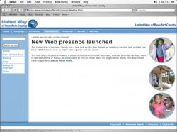
I've been working on a United Way Web site off and on for a while now. I'm relatively happy with the look and feel. There's almost no content yet, as I'm waiting on updates from the org. And some of the pages don't exist. But enough of the template's there to get some idea.

Anyone have any critiques/criticisms as far as the code goes? Any ways to better streamline things? Design ideas? I'm looking for simplicity.

site

css

Be brutal. Be honest. I know I always am. :D

Thanks in advance. s.n.goat
 
Hey,
Overall, I like it. Here's some of my opinions:

- Put the search bar in the main nav bar, to the right of "Get Help"
- Make the subnav text in the darker blue color, not a lighter box
- Make the subnav text a little smaller, or not bold
- Don't align the bottom nav right

good job!
Lee Tom
 
• page title on the right is easily missed

• is it cool with united way's identity rules that you cut off the bottom of thier logo? ... and left it no space? most places are pretty strict with logo useage. if you were trying to match the color of the bar and the logo you are off... just barely. :)

i think it looks nice and clean; i think a united way org. should be very pleased with it. no reason to be all 'fancified'. :D


peace.
 
neut said:
• page title on the right is easily missed

• is it cool with united way's identity rules that you cut off the bottom of thier logo? ... and left it no space? most places are pretty strict with logo useage. if you were trying to match the color of the bar and the logo you are off... just barely. :)

i think it looks nice and clean; i think a united way org. should be very pleased with it. no reason to be all 'fancified'. :D


peace.

good catch on the logo. I'm working that out right now. The logo is supposed to overlap the bottom bar. See this earlier template version for an example. (There will be a little more shadow in this new version.)

I'm using (or at least atempting to use) overlapping background images in css to deliver much of the graphics. I'm trying to find a way to use this trick to to get the logo shadow to work without junking up my code in the process.

As for the small name on the right, that's actually more of a section header. It changes with most pages, and the "movement" I feel forces the mind to register the page. Let me know if you feel differently. (Also, could you -- or someone else -- send me a Safari screenshot with the mouse hovering over one of the top navigation elements. I'd like to see what that looks like as I'm developing this on an IBM. Crappy Dell computer ... always crashing </grump>)
 
LeeTom said:
Hey,
Overall, I like it. Here's some of my opinions:

- Put the search bar in the main nav bar, to the right of "Get Help"
- Make the subnav text in the darker blue color, not a lighter box
- Make the subnav text a little smaller, or not bold
- Don't align the bottom nav right

good job!
Lee Tom

I'm definately going to try the search bar in the top navigation. I like that a lot.

I don't completely follow about the sideNav links. Do you mean have them in the dark blue color, and on rollover have the highlight boxes appear?
 
superninjagoat said:
Also, could you -- or someone else -- send me a Safari screenshot with the mouse hovering over one of the top navigation elements. I'd like to see what that looks like as I'm developing this on an IBM. Crappy Dell computer ... always crashing
 

Attachments

  • uw-screen01.jpg
    uw-screen01.jpg
    81.7 KB · Views: 103
Register on MacRumors! This sidebar will go away, and you'll see fewer ads.