Got a tip for us?
Let us know
Become a MacRumors Supporter for $50/year with no ads, ability to filter front page stories, and private forums.
Website mockup, sans-content - what do you think?
- Thread starter glossywhite
- Start date
- Sort by reaction score
You are using an out of date browser. It may not display this or other websites correctly.
You should upgrade or use an alternative browser.
You should upgrade or use an alternative browser.

Ah, well it's an unfinished concept - I maybe posted it prematurely through enthusiasm ")
Not quite a theme... yet...
Not quite a theme... yet...
You need some lore ipsum and picture place holders to give it some context. Otherwise it just looks like a bad wallpaper.
You need some lore ipsum and picture place holders to give it some context. Otherwise it just looks like a bad wallpaper.
haha! Yes, I do Not much of a mock up. You need to add something as what you intend to use.
For instance, if you plan on having lots of flash or multimedia that design may not work. If its just a blog with links it may be ok. To be honest, it looks nice but its impossible to know if it works with your intended purpose.
For instance, if you plan on having lots of flash or multimedia that design may not work. If its just a blog with links it may be ok. To be honest, it looks nice but its impossible to know if it works with your intended purpose.
The glowing tombstone needs a glowing "RIP" carved on it.
Ifya nowat imeen.
And less empty space
around the tombstone.
around the tombstone.
Ifya nowat imeen.
I cannot stand when people overly use gradients and huge rounded edges.
So my suggestion is to tone down the radius of the rounded edges. Also if your going for a border effect that separates the site and footer (assuming the bottom is a footer) make it more subtle.
Less is more IMO. Its fine to want to clearly define each space but you don't need to over do it so much. For example the white content area and its blue background has so many barriers right now, color contrast, light blue gradient, white stroke, drop shadow and before you even have time to take in the blue background you are hit with another gradient from the footer or edges.
Last edited:
Well, what's the website supposed to be?
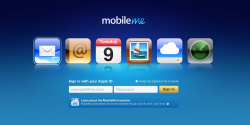
Mobile Me Inspired perhaps??....
Attachments

Register on MacRumors! This sidebar will go away, and you'll see fewer ads.