Got a tip for us?
Let us know
Become a MacRumors Supporter for $50/year with no ads, ability to filter front page stories, and private forums.
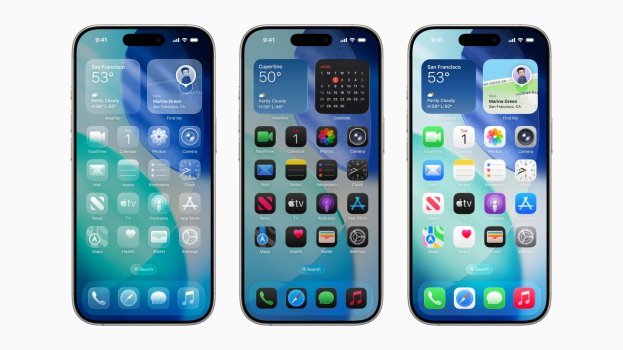
What do you think of the new icons
- Thread starter AndronicusMaximus
- Start date
- Sort by reaction score
You are using an out of date browser. It may not display this or other websites correctly.
You should upgrade or use an alternative browser.
You should upgrade or use an alternative browser.
Would love to see some large versions of them if they're uploaded anywhere?
Grays in light mode look weird. Camera, Calculator, and Settings. Calculator is bad even in dark mode, though. And the clear icons are atrocious for everything. And I am still surprised we are entering year 2 of a dark icon for Notes looking like a black sheet of paper.
Last edited:
They feel very familiar so I don’t mind them.
It’s nice to see the iOS 6 camera app icon again but that’s the one that just doesn’t fit in.
The trash icon on MacOS Tahoe really bothers me though.
It’s nice to see the iOS 6 camera app icon again but that’s the one that just doesn’t fit in.
The trash icon on MacOS Tahoe really bothers me though.
The only one's I'm not keen on at the moment are photos and settings. The colours in the photos app icon would look better if they was slightly darker, same with the grey on settings.
They should have updated them all, as with the camera app icon (beautiful as on iOS 6) instead they are practically almost the same as before with the touch of liquid glass. The Safari icon still remains the ugliest since it was introduced in iOS 7
Register on MacRumors! This sidebar will go away, and you'll see fewer ads.


