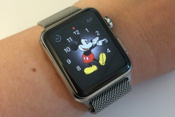
I mean at the end of the day, it's just a square with a couple of buttons on it. Others have tried this exact same thing, pebble was square, Sony smart watch (1 and 2) was square, the original LG watch was square and yet none of them match the same standard of praise that the Apple watch has when it comes to cosmetics.
Just curious why, I know Apple watch is a nice looking watch because I look at it and think that, but I just can't pinpoint what it is about it that's make me think that.
Just curious why, I know Apple watch is a nice looking watch because I look at it and think that, but I just can't pinpoint what it is about it that's make me think that.
Last edited: