Become a MacRumors Supporter for $50/year with no ads, ability to filter front page stories, and private forums.

Mantat

macrumors 6502a
Original poster
Sep 19, 2003
619
0
Montréal (Canada)
I have managed to redesign my Ruby on Rails website by myself (darn CSS!), fixed a few design and usability issues and now I am ready to move to my next iteration. Anyone can suggest me a next area to improve/work on?

One of the thing I was thinking about was to change the font size of plugins name according to their popularity (as a tag cloud) but I fear it would mess up the overall readability/look of the site. What do you think?

Any other ideas are welcome!

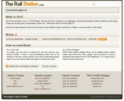
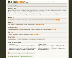
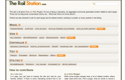
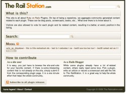
URL: www.therailstation.com

Oh, I know it looks like crap on IE6. And I really dont care.
 
I'd move the search to the top right, move the legend about and contact buttons to the bottom, get rid of the redundant second contact link, change the home button to your logo, and do something with multiple columns so your information is more... usable. Maybe have a highlighted rails plugin at the top. Add some graphics. Make it less boring to look at. Also for your rss, you have alot of links for rss but none of them make an rss button show up in my address bar.
 
Thanks for your comment. I did a quick mockup of what it would like if I followed them (with the exception of the column display which just look silly) and it looks like this.

There is only 1 content section because this is my dev database...

I kept the big search section in the middle of the page only for the home page, but it might go too once I take a deeper look at it.

As for adding more images, I really wish I could. I just dont know what to add!

The "What is this?" section can be remove (X click in the pane) to show the news and most recent/popular entries. Or I will move these into a sidebar since the site is quite thin.

Anymore ideas welcome! Thanks
 

Attachments

  • Picture-14.jpg
    Picture-14.jpg
    109.5 KB · Views: 89
I think your sidebar idea is better. Looking at the snapshot above, two search forms is confusing - you only need one, sitewide, top right. Add an advanced icon to the right of it if you need to create refined searches. You made some good suggestions for your own site, let's see 'em! Keep the images to a minimum - i.e. okay to add user profile photographs and/or user contributed pics (most recent only) for example, but don't dress up the site with graphics for the kind of site you're running. It slows things down and isn't necessary, focus on the content. My .02.

-jim
 
The mockup looks good. I'd lose redundant search in the middle still. I liked your idea of the tag cloud.

Your site is very narrow. I'm viewing it on my kitchen computer, which has a 1024x768 display, and the borders are pretty wide. I think you can convey your information to your visitors in a more effective manner if you widen the field of view. A small side column with your tag cloud and your category links in it would help to navigate your site and bring unity to your pages.

Snippets from blog posts, thumbnails from screencasts, and book cover thumbnails on your pages would help to share your information links more effectively imo.
 
Thanks guys. I am going to remove the middle search box and add the side bar.

I tried to find the 'official' width for website and could find any standard for 1024px screen. What should I use? Most popular seems to be 976px.
 
For a static layout, 970px is about right.

[Idea!] In your case, a liquid layout is something to consider so all content spans the width of the browser window plus certain content re-sizes automatically along with the window.

This implies the following:

_____________________________________________
<----------- 100% width container (wrapper) ------>
----------------------------------------------------
100px | sidebar 350px | dynamic content area | 100px
----------------------------------------------------
______________________________________________


A container (such as a div) wraps the entire page, set for 100% width with padding and margin both set to 0. Inside that is a 100px border strip on the left, then your sidebar with a static width of say 350px, then the content area which fills the rest of the width up until the 100px border strip on the right.

This is of course an informal suggestion, a little more work but very flexible for your users. The widths I used above are examples, you can play with them very easily in both tabular and CSS/DIV layouts. I hope you consider this as looking at your site with the boxes and gradient fills, it won't be hard to implement. But if not, that's cool too! :)

-jim
 
Hi all, I have had some time to execute the proposed changes. I have not put the side bar yet because:

1- I really dont know which color to put the side bar.
2- I havent coded the content to put in it yet.

I think it looks much better right now, thanks for the feedback. Any other suggestions?
 
I'll put in another vote for some sort of preview of each post.

Also some way to visually break apart each post.

On my first viewing I thought the horizontal text for each post looked like it was all one sentence/piece of text. In reality these are multiple links. This is made worse when posts include lower hyphens such as "alter ego - acts_as_solr - acts_as_taggable_on_steroids-" Consider a vertical layout with some previews to let us know what we are clicking on.
 
I'll put in another vote for some sort of preview of each post.

I would love to do it but I dont know how to implement it since there is no way for me to locate the start of the blog post. If someone has an idea, I am all for it!

As for the inline links on the home page, I will try some ideas and then see what you guys think...
 
Did some tweaks to the inline plugin list. It think it is much cleaner now. I also like the contrast of the orange "X more" at the end of each section.

Now I will move to the side bar, I just really dont know which color to use for it! :-S
 
Ok, I played for 2 days with the concept of a side bar and I never managed to make it look good. I did make the content area wider (900px vs 750px).

I moved the content of the sidebar to the footer. What do you think about this iteration? I still have some work to style the lists at the bottom.
 

Attachments

  • Picture 18.png
    Picture 18.png
    138.3 KB · Views: 71
Hi,
My initial thoughts on looking at the page was that it was visually busy.

There are lots of boxes around boxes in boxes. Maybe take the layout from 'How to contribute', using a box just around the header of the section.

I hope you understand what i mean? I think in trying to highlight the important bits with the borders has over complicated it too much.
 
boxes.tiff


this is a picture of the busy bits...

You have a white background for the site, with an outlined box, then a new box for each section, the a background for the text of each link.
 
I see what you mean, but on my screen is doesnt look that busy, but I work at a quite high resolution...

does it look cleaner if I remove the borders of the lower part like this?

EDIT: wrong file attachment!
 

Attachments

  • Picture 17.png
    Picture 17.png
    133.6 KB · Views: 70
ye, it's better to look at. Maybe make the spacing slightly larger between each section to really clear it up?

Id probably remove the border and background on 'What is this?' to make it more like 'how to contribute'.

The content under 'How to contribute' is the easiest piece of text to read on the picture you sent.
 
Ok, I removed the whole title bar "what is this" and kept the text with the pale background. It looks like this:

I am probably going to add a 'hide for ever' link in the bottom right corner of the text box too so it does not waste space for regular users.

Any other usability concerns?
 

Attachments

  • Picture 21.png
    Picture 21.png
    112.3 KB · Views: 57
try to get your RSS feeds to show up in the address bar of the web browser, and then perhaps ditch the subscribe to all plugin releases button... ?

The Add a plugin opens the Submit a Plugin page
 
...could you also perhaps make the list of plugins as a list, each with a description (partial) on one line. That would help get some air into the layout.

At the moment its rather compressed.


MODEL
Thinking Sphinx - a blah blah blah about nothing...
Alter Ego - more of the same less than expected...
More...

Then randomise the content each time the page loads for good luck.
 
Mantat, from the first revision to what you have now, nice subtle but effective changes to the site.

One thing I would consider as the site grows in popularity and you start to analyze statistics on the most popular content, is whether the individual posts are the most popular or if it is the "Popular Plugins/Content" at the bottom.

Basically decide if people are more interested in joining the discussion or they are simply looking for a quick repository of code. If it is that they are coming as a quick reference to a repository it might be worth reversing their order on the page, Popular Plugins/Content coming at the top.

I am not literate in Ruby on Rails, so this might seem like a stupid question, but the topics you have "Model, View, Controller, etc." Are those the only categories that you can think of, that you commonly see, that there is content for? I am wondering if those are going to be limiting not far down the road?

These are bigger questions about the overall direction of the site, rather than nit picky things. Chances are you've thought about them already and are good to go, just thought I'd bring them up in case you were so busy with the coding that they weren't addressed.
 
Thanks again for the comment.

Actually, each of the section on the main page only shows the 10 most popular plugins according to the user votes. If they want to see more, they have to click on the "x more" link. My dilemma right now is what happen when I add a new plugin? It wont be popular enough to be on the front page (hence the new plugin section at the bottom).

I guess I will have to see the behavior of visitors and adapt the site.

As for the categories, These were the great divider but as the site grows, I will probably have to reorganize everything. But at the same time I dont want to become like some other directories who have too many categories that it is impossible to know where something should fit. It is a hard balance to keep.

As for the RSS link in the URL bar, call me stupid but I dont know how to set it up. I will have to check it out!

Thanks everyone for your comments, really appreciated! Also, if you know about any other domains of knowledge that could use this directory engine, please contact me we can work something out!
 
You might also want to get rid of the white space on the left and right margin. I know that this is a common thing, I do it myself, however just now I noticed that most pro sites do not do this.

Basically that empty space is wasted screen real estate which a user has no influence over, that is in contrast to the overall browser window which can be resized as required.

Its a small thing but for coders with many windows open, control over screen real estate makes life easier.
 
As for the RSS link in the URL bar, call me stupid but I dont know how to set it up. I will have to check it out!

take a look at the source for MR, I think there is an example in the first page or so of source, in the header somewhere.
 
You might also want to get rid of the white space on the left and right margin. I know that this is a common thing, I do it myself, however just now I noticed that most pro sites do not do this.

Basically that empty space is wasted screen real estate which a user has no influence over, that is in contrast to the overall browser window which can be resized as required.

Its a small thing but for coders with many windows open, control over screen real estate makes life easier.

Do you mean changing the background color to match the border color (see below)? Or not to center the content area?

As for the RSS link, I made the change (not sent to production yet, testing something before). Thanks for the tip!

I am really happy with the comments I got here, great feedback and I really see an evolution in the overall look of the site!
 

Attachments

  • Picture 22.png
    Picture 22.png
    156.5 KB · Views: 99
Register on MacRumors! This sidebar will go away, and you'll see fewer ads.