Become a MacRumors Supporter for $50/year with no ads, ability to filter front page stories, and private forums.

Fallforward

macrumors member
Original poster
Aug 29, 2023
75
58
I voted NO on the Liquid Glass poll. It's annoying. However, a few easy tweaks like Reduced Transparency and it's not even noticeable. Yet the MacRumors Tahoe forum is chock-a-block with angry vitriol about Tahoe from "why should I have to tweak it" to "fire Tim" and literally "Apple is doomed."

Tahoe tells me that Apple is doing business as it always has. Wolf1701 posted a YouTube regarding the history of MacOs. If that video is correct, Tahoe seems average in terms of issues. For me, Mac is the best product on the market and the Tahoe issues are trivial.

As for the record of Saint Jobs, Tahoe is doing better than many of his endeavors....

First tenure from founding to 1985:
  • Apple III. Bad design. QA failure with overheating and chips coming loose.
  • Lisa flop. Limited software. Significant reliability issues.
  • Macintosh 128K botched 1984 launch. Limited RAM. Few applications.
Second tenure from 1997 to 2011:
  • Power Mac G4 Cube failure.
  • iPod Hi‑Fi flop.
  • MobileMe botched launch. Outages. Sync errors. Billing errors.
  • iTunes Ping. Low engagement. Infested with spam.
  • iPhone 4 antennagate.
  • Final Cut Pro X botched rewrite. Dropped critical features. No back compatibility for previous projects.
  • Xserve slooow-flop.
 
  • Like
Reactions: baconcat_8964
The liquid glass effect is not the only issue. Reducing transparency won't fix every other UI element that still will look like a blank slate, with broken spacing, enormous corner radius that requires 10 different workaround (and even if Apple implemented some API to fix the scroll bars for example, they forgot to use it if 75% of their own apps), less screen usable area because of the corner radius, the lack of consistency between the built-in apps, and every thing else.

Is it usable? Yes. Is it a joy to use it? Not really. We are here for the joy, not for the mostly bearable. If people at Apple can't even align text inside buttons properly, they clearly have an issue.

I've had enough of seeing a bug every 10 second. Even the cursor gets stuck to the wrong icon so often. That's like the basic of a UI, how could they break it without noticing, only they know.
 
Fallforward –

I also wouldn't claim Apple has never made mistakes (as Steve Jobs didn't). And it sounds like you're not necessarily even denying that Liquid Glass is in some ways a mistake.

While I agree that macOS is still the best operating system around, I have felt pangs of concern about Tahoe which, for me, have been the first of their kind in the history of the Mac. The concern is perhaps compounded by Apple's confidence around the introduction of the paradigm; they explicitly said something like "major interface updates only come along once every ten years," implying that they see these changes as foundational to the next decade. A decade-long mistake sounds like an outlier to your category of examples.

Reduced Transparency does remove much of the smeary glass effect, but has some pretty annoying side-effects of its own. Control Center becomes an overlarge block, QuickTime Player's title bars – which overlap the content – become opaque, icons and widgets still have the unappealing specular lighting and reflective effects, and nothing is remedied about the overlarge circularized controls in most windows.

The "tinted" option from 26.1 is a hint that people are listening. The seemingly unexpected departure of Alan Dye, and the rumoured affection for Steve Lemay, are temptingly hopeful trickles of news. But the judgment calls should wait at least until WWDC this June, when we see what the leaders have actually decided to do after this heck of a year.
 
You make some great points about Apple’s track record, there’s no reason for anyone to believe that Apple was perfect under Jobs.

Perhaps what makes Apple different under Cook is the choice standards being upheld.

To understand this is to remind ourselves that Jobs and Cook are two completely different individuals. Jobs spent much of his time with the Industrial Design team because he had strong design sensibilities, but his downfall may have been that he focused too much on quality design over user interest (Cover Flow, Ping, skeuomorphism that sometimes went too far).

TC is the opposite, an individual with strong corporate and operational abilities but who lacks the design sensibilities required to drive excellence in user experiences.

This is why Liquid Glass fails for me: it is Apple trying to tick generic business boxes - let's be creative, different, bold - to be exceptional in a concept that is simply not suited and unproven for the medium it was designed for.

We often make a joke that SJ would never have done something, but in this case I’m confident that he would have asked the same question that many of us have done, which is “Why?”.

And no one has been able to answer this question. And, to add further insult, to challenge it is to be greeted with “It’s different / cool / that’s your opinion” at al.

Liquid Glass isn’t solely defined by transparency, it’s the use of a new ‘material’ and the ways that they and the controls are layered. It's the whole product.

The arguments from those who dislike Liquid Glass lean more into how busy the elements are, though the transparency concerns are still valid, I believe.

What’s concerning to me is that, for a company that has always been very focused on user experience, the UI is focused on aesthetic rather than functionality - which is counter to Seqouia, a UI that may not have been (subjectively) pretty but was true to less being more; hence why elements such as sidebars are literally a separate block connected to a window, rather than a panel needlessly placed on top of a window.

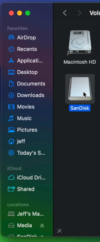
Case in point is Finder. Why should this left side bar be placed on top of a window when one has no means or reason to hide it?

Screenshot 2026-01-18 at 17.56.52.png


They're adding more visual complexity compared to the previous UI for absolutely no reason. That isn't an opinion. And if users with visual impairments turn on a range of options, it's likely experience will just look awful.

This makes absolutely no sense and is just one of example of Apple not thinking this design language through properly as a computing platform; but rather are more concerned about producing videos with back-slapping nonsense about what geniuses they are for reproducing the optical characteristics of glass in software. Bravo.


What nonsense.
 

Attachments

  • USB-Volume-macOS-Sequoia-USB-Install-Disk.jpg copy.png
    USB-Volume-macOS-Sequoia-USB-Install-Disk.jpg copy.png
    613.3 KB · Views: 7
Reduced Transparency does remove much of the smeary glass effect, but has some pretty annoying side-effects of its own. Control Center becomes an overlarge block, QuickTime Player's title bars – which overlap the content – become opaque, icons and widgets still have the unappealing specular lighting and reflective effects, and nothing is remedied about the overlarge circularized controls in most windows.
Liquid Glass is the opposite of my preference. Before iPhones offered pure black wallpaper I took a snapshot against a blanket to make one.

I'm not seeing any of those issues with Control Center (both on laptop and monitor screens) or QuickTime. When not traveling, I have a monitor plus a dozen widgets on the laptop screen and no issues.

Perhaps my dark mode with black wallpaper and lock screen are factors? Control Center is a pure black background with zero translucence, mostly white circle icons with blue symbols. Controls with sliders, like display and sound, are pure white on black. It's clean and simple. (You can also turn off show background on the menu bar.)

If they provide the option to get rid of it, adjusting the few easy settings is trivial. I have always had to set up, maintain and tune the screen widgets, a ton of dock changes, the menu bar, the control center, wallpaper, lock screen, always on dark mode, family sharing, various iCloud settings, time machine, battery, privacy & security, and many more that don't immediatly come to mind, before getting into the safari settings like DDG, etc.

Edit: Just noticed i can expand your screen shot. Mine is just pure white on back, not at all like your image.
 
Last edited:
  • Like
Reactions: Starfia
Hey, Fallfoward –

Thanks for the detail.

We seem pretty kindred in this way. I also always use dark mode, and also always use a solid black wallpaper on iPhone and iPad. (I don't always use a solid black backgroud on Mac, but it's always a dark background.) And of course, I also sift through and tune every setting I can find.

I'm not sure what you mean by "screen shot" – I haven't attached any images before this reply.

But I'll attach a couple here: illustrations of the side-effects of Reduced Transparency from Tahoe 26.2 on my M1 Mac mini:

CC.png


You can see that Control Center is rendered with a ton of excess vertical space. Interestingly, this comes and goes – which, if anything, only seems to confirm it's a surviving bug, and it's one you encounter because you turn Reduced Transparency on.

QT.png


And here's a clip of Yoshi's Story in QuickTime Player. You should be able to read the score at the upper-left, but you can't because the title bar never fades.
 
The liquid glass effect is not the only issue. Reducing transparency won't fix every other UI element that still will look like a blank slate, with broken spacing, enormous corner radius that requires 10 different workaround (and even if Apple implemented some API to fix the scroll bars for example, they forgot to use it if 75% of their own apps), less screen usable area because of the corner radius, the lack of consistency between the built-in apps, and every thing else.

Is it usable? Yes. Is it a joy to use it? Not really. We are here for the joy, not for the mostly bearable. If people at Apple can't even align text inside buttons properly, they clearly have an issue.

I've had enough of seeing a bug every 10 second. Even the cursor gets stuck to the wrong icon so often. That's like the basic of a UI, how could they break it without noticing, only they know.
💯💯💯💯💯💯💯💯💯💯💯
 
Register on MacRumors! This sidebar will go away, and you'll see fewer ads.