Got a tip for us?
Let us know
Become a MacRumors Supporter for $50/year with no ads, ability to filter front page stories, and private forums.
General Which of these will be the iOS 7 iBooks icon?
- Thread starter iRobby
- Start date
- Sort by reaction score
You are using an out of date browser. It may not display this or other websites correctly.
You should upgrade or use an alternative browser.
You should upgrade or use an alternative browser.
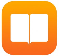

I think it will be the first one but with a white circle around just like the iTunes and App store iOS 7 icons do. At least I hope it does, for consistency sake. Because all three store icons on Mavericks are also circular so I think that design cue will carry over to the iOS 7 icon.
And a bit unrelated, but iBooks really needs to become built in next year in iOS 8.
And a bit unrelated, but iBooks really needs to become built in next year in iOS 8.
And a bit unrelated, but iBooks really needs to become built in next year in iOS 8.
God, no, 50+ Mb I could use for music. They should really really built in Find My iPhone, though. I can't believe people won't download that one!
God, no, 50+ Mb I could use for music. They should really really built in Find My iPhone, though. I can't believe people won't download that one!
A 16GB iPhone and you're complaining about 50 MB?

If you were to set aside 3GB for iOS 7, and all you would have left is 13GB, iBooks would only take roughly .004% of your storage...
Don't forget that 16 GB in advertise speak is less in actual technical speak (and reality) right from the get go.A 16GB iPhone and you're complaining about 50 MB?
If you were to set aside 3GB for iOS 7, and all you would have left is 13GB, iBooks would only take roughly .004% of your storage...
Don't forget that 16 GB in advertise speak is less in actual technical speak (and reality) right from the get go.
Right, I understand that. But does it really make a difference if your measuring 50MB vs ~12-13GB?
God, no, 50+ Mb I could use for music. They should really really built in Find My iPhone, though. I can't believe people won't download that one!
You don't need to download find my iphone. Just turn it on in iCloud. Technically it's already built into the phone.
The nomenclature for the "advertise speak" is accurate. The OS 'technical speak' is invalid.Don't forget that 16 GB in advertise speak is less in actual technical speak (and reality) right from the get go.
Blame Apple. They advertise using correct standard nomenclature. Then somewhere in their software, they turn around and use G-(Giga-), standard universal metric prefix for 1000^3, to represent 1024^3.
Everyone does it, it's not something that Apple is responsible for.The nomenclature for the "advertise speak" is accurate. The OS 'technical speak' is invalid.
Blame Apple. They advertise using correct standard nomenclature. Then somewhere in their software, they turn around and use G-(Giga-), standard universal metric prefix for 1000^3, to represent 1024^3.
Irrelevant what everyone else does. They make the choice, they are responsible for their actions.Everyone does it, it's not something that Apple is responsible for.
It would be silly for them to do it differently from the rest of the industry as it would only cause confusion among customers and can likely end up hurting Apple rather than helping them in anyway. The whole industry needs to change, but that's not likely to happen, at least not anytime soon.Irrelevant what everyone else does. They make the choice, they are responsible for their actions.
I think it will be the first one but with a white circle around just like the iTunes and App store iOS 7 icons do. At least I hope it does, for consistency sake. Because all three store icons on Mavericks are also circular so I think that design cue will carry over to the iOS 7 icon.
And a bit unrelated, but iBooks really needs to become built in next year in iOS 8.
I believe #1 - also think it looks good and is very 'clean'. The gradient is more subtle than Apple generally uses in iOS7. I'd prefer even subtler gradient
I don't think a circle one, since iBooks is not only a store, it's an app for reading content you could have synced elsewhere.
I don't think a circle one, since iBooks is not only a store, it's an app for reading content you could have synced elsewhere.
I really hope there is a circle. Why else did they make the icon in Mavericks circular? It just makes sense to keep things completely consistent across both OSes.
I really hope there is a circle. Why else did they make the icon in Mavericks circular? It just makes sense to keep things completely consistent across both OSes.
They haven't so far, so why start now?
Too simple. You're looking at it knowing it's iBooks, so it makes sense. Imagine not knowing what you're looking at all, then it wouldn't be obvious that it's about books.They all look good. I do like the simple one thoug, the one with just 2 white blocks
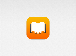
I'm going with the third icon, looks nice.
Too simple. You're looking at it knowing it's iBooks, so it makes sense. Imagine not knowing what you're looking at all, then it wouldn't be obvious that it's about books.
I'm going with the third icon, looks nice.
The app icons are all labeled. Someone new to iOS sees the simple iBooks icon, sees beneath it 'iBooks', and from then on knows that that icon is iBooks. The simpler the icon/colour scheme of an icon, and the fact that each one has a unique colour, the easier it is to spot it amongst all the icons. I've noticed this since using iOS7. I used to have trouble locating icons, but now they jump out at me. I don't even have to search. My peripheral vision catches sight of the icon's colour, and I've found it in an instant.
They all look good. I do like the simple one thoug, the one with just 2 white blocks
It doesn't even look like a book.
The 3rd one is the obvious choice.
Register on MacRumors! This sidebar will go away, and you'll see fewer ads.