Become a MacRumors Supporter for $50/year with no ads, ability to filter front page stories, and private forums.

Which watch face will you mainly use on your Apple Watch?

  • Chronograph

    Votes: 13 13.1%
  • Colour

    Votes: 3 3.0%
  • Modular

    Votes: 15 15.2%
  • Utility

    Votes: 10 10.1%
  • Mickey Mouse

    Votes: 26 26.3%
  • Simple

    Votes: 12 12.1%
  • Motion

    Votes: 6 6.1%
  • Astronomy

    Votes: 6 6.1%
  • Solar

    Votes: 8 8.1%

  • Total voters
    99

cambookpro

macrumors 604
Original poster
Feb 3, 2010
7,237
3,398
United Kingdom
To pass the time until April 24, I was just wondering which watch faces people planned to use (we've had a poll about almost every other conceivable thing! :p )?

I know a great feature of the watch is the ability to swap the look on a whim, but I just wanted to get a feeling of which faces will be most popular.

Hopefully we'll be allowed third party faces one day, but I know that could throw up a lot of copyright issues if suddenly there were thousands of Rolex faces available.

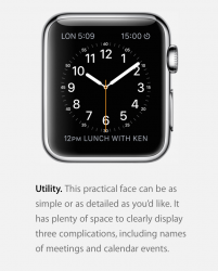
Personally, if I get the watch, I'll be mainly using the Chronograph face, as I love a more classic look an analogue face brings. I'll probably add activity, stopwatch and weather as complications - the last one I'm especially looking forward to, as it's obviously not something a so-called 'dumbwatch' can do.
 
I'd probably switch between modular and simple. Modular seems the most immediately useful, while simple just looks so clean.
 
I wouldn't mind a "random" option, where I can choose if it changes hourly/daily/weekly ;)
 
I hope we'll see more themed watch faces just like Mickey Mouse. I would love to see some comic book themed watch faces.
 
I think I'll start off with utility but try out modular if I find that I want more complications on the face. I like that utility still has the analog face design but also has enough space for complications.
 
I would use motion. As soon as I saw the jellyfish I knew I would. Other than that I would use solar.
 
I honestly don't know. It's a weird feeling for me. I almost always know what I want right away. But with this watch face I guess its just something I personally will need to try in person to decide.
 
I actually wrote a blog post today on this topic:
The Color face is simple and fun. I plan, at some point, to get a green fluoroelastomer Sport Band because green is my favorite color and it looks like a good, bold shade. Unlike the shades of green that Fitbit uses for their Flex bands. So the color face gives me versatility, and I love how it looks in green in the promotional images.

The Modular face is probably the most useful one for me. It gives a lot of options for customization and complications, has a great layout, and I much prefer a digital watch to a traditional analog-style face.

Utility strikes me as being a classy, analog-style alternative to the Modular face. It only has three spots for complications, but I much prefer the layout and the way they are presented. Even though I prefer digital, this is definitely a classy face that would look great for more formal settings.

The Motion watch face is the one that I find most visually appealing. The idea of having a moving animal (no interest in the flower option) every time I look at the face just adds that “Wow!” factor to the face. I like it, and I hope Apple expands on that in future builds of the Watch’s OS.

Lastly, there’s the one that I think is coolest. The Astronomy face is interactive, fun, and really appeals to the sci-fi loving kid in me. I would love to zoom out and see the positions of all the planets in our solar system on my watch. It just … it’s cool, okay? Geez. Let me have this.
Basically: I have no idea which watch face I'm going to end up using. I plan to try out these five in particular and see which ones I enjoy most. It may just come down to the one that provides me the most and best arrangement of complications.

The Astronomy and Motion faces are the coolest, in my opinion. It's just a matter of whether I want cool or functional.
 
I'm in love with the utility. Able to add or take away from it. Not as busy as Chronograph, but still is functional and fashionable. Especially with the added complications.


But I might play with the astronomy one just for fun! I think they changed the look of the globe. It might be just me, but I think I recall it being less realistic looking when that face was first revealed.
 

Attachments

  • Screen Shot 2015-03-17 at 11.01.27 PM.png
    Screen Shot 2015-03-17 at 11.01.27 PM.png
    199.4 KB · Views: 145
The modular seems to be more practical for a smart watch. gives you time, weather, and you can also have it give you next appointments which for people on the go is a good thing.
 
I really like the look of the Motion and the Astronomy, i also hop that more :apple: Watch faces are added over time or even the option to buy new ones. I'm really liking the whole customisable options from what I've seen there will be lots of them (over 2 million i think Tim Cook said).
 
Aren't Simple and Utility the same thing just with different amount of info chosen. I can't find it on the Apple website, but I remember seeing a gif of starting from the Simple face and adding things till eventually it's the Utility face.
 
This was my favorite since I saw it. I'm not sure which one it is. It has the look of Color, but I think it's Utility with some changes. I haven't seen anything like it on the site. the stick marks are much smaller, and it uses sticks instead of numbers. I think faces are more customizable than we think.
Screen%20Shot%202015-03-18%20at%202.12.19%20PM_zpsbm8jzkf7.png


I also really like Chronograph.
Screen%20Shot%202015-03-18%20at%202.12.29%20PM_zpsyglencw5.png
 
This was my favorite since I saw it. I'm not sure which one it is. It has the look of Color, but I think it's Utility with some changes. I haven't seen anything like it on the site. the stick marks are much smaller, and it uses sticks instead of numbers. I think faces are more customizable than we think.
Image

I also really like Chronograph.
Image

Second that. I'll probably go with this one:

Screen%20Shot%202015-03-18%20at%202.12.19%20PM_zpsbm8jzkf7.png
 
Register on MacRumors! This sidebar will go away, and you'll see fewer ads.