Got a tip for us?
Let us know
Become a MacRumors Supporter for $50/year with no ads, ability to filter front page stories, and private forums.
Why are there 120 “dots” on Infograph watchface??
- Thread starter jon08
- Start date
- Sort by reaction score
You are using an out of date browser. It may not display this or other websites correctly.
You should upgrade or use an alternative browser.
You should upgrade or use an alternative browser.

Some watches have even more tick marks, but they empathize the second to make the time easier to read (like Apple probably should have).


Last edited:
What would be the point of that? Literally of no use to anyone...
Been that way for normal watches. Why do they have them?
Just wait a few years, you young fellows won’t even be able to see those marks, lol.
Which Daytona reference is this?
Some watches have even more tick marks, but they empathize the second to make the time easier to read (like Apple probably should have).
View attachment 809802View attachment 809807
I don’t like it and don’t know why they did it. Its almost impossible to accurately read the minute hand at a quick glance unless its at or close to the 5 minute marks. I would have preferred second marks or even more marks with the second marks emphasized. That’s why I also have a second infograph with digital time in the top center complication spot for when i quickly need accurate time.
I don’t like it and don’t know why they did it. Its almost impossible to accurately read the minute hand at a quick glance unless its at or close to the 5 minute marks. I would have preferred second marks or even more marks with the second marks emphasized. That’s why I also have a second infograph with digital time in the top center complication spot for when i quickly need accurate time.
That "digital time thingy" is why people are unable to read the time accurately. My watches is 2 Minutes fast so I always have some buffer time.
That "digital time thingy" is why people are unable to read the time accurately. My watches is 2 Minutes fast so I always have some buffer time.
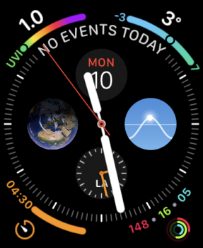
I read an interesting post a while ago about Apple's design of the analog infograph watch face. I personally find the time difficult to read at a glance, and I thought it was because I was out of practice even though I used to wear traditional watches years ago.
However, Apple hasn't done the best job designing this analog face. The author compared how difficult it is to tell the time at a glance on the infograph face:
with how much easier it is to tell the time at a glance on well designed analog faces:
- The hour markers for 12 (and often 3/6/9) are more prominent.
- The hour indices are much larger than the minute markings.
- The hour hands nearly touch the hour indices.
https://marco.org/2018/10/09/infograph-legibility
Last edited:
That "digital time thingy" is why people are unable to read the time accurately. My watches is 2 Minutes fast so I always have some buffer time.
Except my previous watch was an analog watch, and I have been reading analog clocks daily since I was a kid. It's not the issue. The issue is that the infograph is difficult to read accurately at a glance. I can easily read the approximate time but getting it within the minute from just a quick glance is not easy.
If anything I find it easier to read within the minute on watches with only 5 minute marks and no second marks than the infograph.
I read an interesting post a while ago about Apple's design of the analog infograph watch face. I personally find the time difficult to read at a glance, and I thought it was because I was out of practice even though I used to wear traditional watches years ago.
However, Apple hasn't done the best job designing this analog face. The author compared how difficult it is to tell the time at a glance on the infograph face:
View attachment 810074
with how much easier it is to tell the time at a glance on well designed analog faces:
View attachment 810075
- The hour markers for 12 (and often 3/6/9) are more prominent.
- The hour indices are much larger than the minute markings.
The author suggests Apple needs to open the Apple Watch up to allow for third party faces. I think this could lead to more confusion and issues than it's worth, and I would rather see Apple make better analog faces. The full article has more examples and is worth a read for anyone interested in the topic:
- The hour hands nearly touch the hour indices.
https://marco.org/2018/10/09/infograph-legibility
I get the indices thing but if it is to be a fair comparison on how easy it is to quickly read the time then at least 3 of the sub dials need to be turned off on the Apple Watch as the other watches don't have them.
I read an interesting post a while ago about Apple's design of the analog infograph watch face. I personally find the time difficult to read at a glance, and I thought it was because I was out of practice even though I used to wear traditional watches years ago.
However, Apple hasn't done the best job designing this analog face. The author compared how difficult it is to tell the time at a glance on the infograph face:
View attachment 810074
with how much easier it is to tell the time at a glance on well designed analog faces:
View attachment 810075
- The hour markers for 12 (and often 3/6/9) are more prominent.
- The hour indices are much larger than the minute markings.
The author suggests Apple needs to open the Apple Watch up to allow for third party faces. I think this could lead to more confusion and issues than it's worth, and I would rather see Apple make better analog faces. The full article has more examples and is worth a read for anyone interested in the topic:
- The hour hands nearly touch the hour indices.
https://marco.org/2018/10/09/infograph-legibility
I use that face with the black background and it is much easier to read the time that way. The white is more confusing IMHO.
In the article he shows Infograph with minimal complications, and I don't think it's as easy as it could be to read at a glance:I get the indices thing but if it is to be a fair comparison on how easy it is to quickly read the time then at least 3 of the sub dials need to be turned off on the Apple Watch as the other watches don't have them.
Apple could make it so much easier to read at a glance with a simple update to the second markers, just make them stand out a little more like in this quick mock-up ...

Adam.
Adam.
Apple could make it so much easier to read at a glance with a simple update to the second markers, just make them stand out a little more like in this quick mock-up ...
Adam.
Also, I think what trips me up is the distance between the hour indices and the hour hand. I didn't really think about it until I read his blog and saw the photo examples.
I'm not bashing Apple at all, and I'm a huge fan of the watch. This is actually one of the few issues I can think of that affects me.
I agree, the hour hand could be a bit longer, personally I think it would be better 3 quarters the size of the minute hand.Also, I think what trips me up is the distance between the hour indices and the hour hand. I didn't really think about it until I read his blog and saw the photo examples.
I'm not bashing Apple at all, and I'm a huge fan of the watch. This is actually one of the few issues I can think of that affects me.
Adam.
Register on MacRumors! This sidebar will go away, and you'll see fewer ads.