Become a MacRumors Supporter for $50/year with no ads, ability to filter front page stories, and private forums.

CrysisDeu

macrumors 65816
Original poster
Sep 16, 2018
1,034
1,520
Before Ventura, the preview app had a loupe/magnifying glass at the bottom right of the icon. After the icon update, it was an empty ink bottle. Now iOS26 has the same empty ink bottle for the preview app, which feels so weird? Why would I need an empty ink bottle for viewing a PDF?

Am I missing something? Or did a designer in Apple thought the old icon was an ink bottle and designed the new icon wrongly?
Unknown-3.jpg
Unknown-4.jpg
Unknown-5.jpg
 
that is intended to be a linen tester and not an ink glas - but you probably know that 🤓 otherwise it - IMHO -does seem to be one of the less liquid-glassy icons, doesn't it?
 
  • Like
Reactions: FreakinEurekan
Yeah and with this new blue-on-blue design, the Preview icon looks like one big blue blob with a black spot of unclear purpose.
 
that is intended to be a linen tester and not an ink glas - but you probably know that 🤓 otherwise it - IMHO -does seem to be one of the less liquid-glassy icons, doesn't it?
The more common terminology in English is a loupe - but yes, agreed. Frankly the new loupe design makes a lot more sense than the old one... photographic loupes do tend to have glass sides, not opaque, so that light can get in.

Who ever said skeuomorphism is dead? 😉 this, Mail, Books, Contacts, and many other icons show visual representations of items that are not AT ALL used in those pursuits any more, other than by people who specifically eschew modern methods.
 
Last edited:
It's not an ink bottle. But I wonder how many people see it that way. You'd certainly not be alone. Personally I find a magnifying glass more intuitive even if it's not what you'd use IRL.
 
It's not an ink bottle. But I wonder how many people see it that way. You'd certainly not be alone. Personally I find a magnifying glass more intuitive even if it's not what you'd use IRL.
I guess if would help if the loupe was actually facing the pdf in the icon
 
  • Like
Reactions: MakaniKai
It's not an ink bottle. But I wonder how many people see it that way. You'd certainly not be alone. Personally I find a magnifying glass more intuitive even if it's not what you'd use IRL.
I've wondered why it looked like a weird see-through and oddly-proportioned megaphone, but never wondered enough to actually look it up :)
 
  • Like
Reactions: MakaniKai
Take a look at this scerenshot from Mac OS X 10.0.

Seems we have come full circle!
 
Take a look at this scerenshot from Mac OS X 10.0.

Seems we have come full circle!

“Those who cannot remember the past are condemned to repeat it”
 
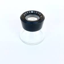
Oh, you kids! ;) It's an Agfa Loupe. Something once owned by every professional and serious amateur photographer! I've still got one somewhere.

View attachment 2519699
I've got about a dozen of them (various manufacturers) laying around my office. I actually do still use it once in a while to try to figure out if a brochure (or whatever) that a client gives me was offset printed or digital, among other things.
 
  • Like
Reactions: jetsam
Oh the irony that the original icon actually showed the effects of how glass can refract light and the new icon lacks any of the Liquid Glass design elements. Hope they reverse this one before final release.
 
Register on MacRumors! This sidebar will go away, and you'll see fewer ads.