Got a tip for us?
Let us know
Become a MacRumors Supporter for $50/year with no ads, ability to filter front page stories, and private forums.
Youtube ios7 update
- Thread starter ajiuo
- Start date
- Sort by reaction score
You are using an out of date browser. It may not display this or other websites correctly.
You should upgrade or use an alternative browser.
You should upgrade or use an alternative browser.


Me likes it!
But I prefer how Apple makes the top bar (carrier, battery, etc.) is the same color as the app navigation bar.
Apps cannot release updates using the new iOS 7 API's until iOS 7 is officially released.
I'm betting most apps will take advantage of this once they can.
Apps cannot release updates using the new iOS 7 API's until iOS 7 is officially released.
I'm betting most apps will take advantage of this once they can.
Makes sense.
Still, good to know developers are starting to update their apps. From what I've seen in some design sites (Dribble, deviantArt), many designers are liking the "flat" concept of iOS7.
Now I'm just missing Whatsapp, Things and Twitter to change their apps. They look ugly alongside all the Apple icons, which I've actually come to like a lot.
Its not totally updated.. I think they are just laying the groundwork..
The keyboard and status bar obviously can not be updated yet.
This isnt stopping google from updating the non standard elements and icon though
Also has a cool new feature with shrinking video window while browsing
The keyboard and status bar obviously can not be updated yet.
This isnt stopping google from updating the non standard elements and icon though
Also has a cool new feature with shrinking video window while browsing
Icon rubbish.
Google has done this "3D ing" of all their app icons. I hate it. I remove any app from my home screen that does this. Hopefully the flattening of the iOS will change things. I have heard developers think it makes their app stand out but this has the opposite effect for me.
Google has done this "3D ing" of all their app icons. I hate it. I remove any app from my home screen that does this. Hopefully the flattening of the iOS will change things. I have heard developers think it makes their app stand out but this has the opposite effect for me.
All the apps can change the icon, but I think they want to wait until iOS 7 is released so the icon change reflects the app change.
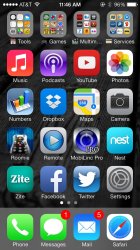
Looks like yoitube has made the first step towards ios7
New icon and new white ui.
The Red shadow under the icon is kind of ugly.. But a good start
Angry Tube is still much better.
You missed the most important part of the update. You can now watch a video while searching for another!
You missed the most important part of the update. You can now watch a video while searching for another!
I posted that in my last comment
")
----------
Angry tube looks a lot nicer.. Backgrounding, add blocking, and video downloading as well.. Plus it has a flat icon
I posted that in my last comment
----------
Angry tube looks a lot nicer.. Backgrounding, add blocking, and video downloading as well.. Plus it has a flat icon
Oh fine!
Still no background audio :'(
This makes me sad, I miss it so much.
I'm loving what Google is doing to their apps. To be honest, I even love their UI for the Google+ app!
EDIT:
That was the best feature of the native YouTube app!
EDIT:
Still no background audio :'(
That was the best feature of the native YouTube app!
Google is going in a very good direction with their UI. Much better than what we saw back in 2010 and even 2011.
Google has no clue how to make good apps, if you go to the video history the app kind of hangs and if you scroll down the app hangs
Also I have no problem with Google's "3D" icons...but they look weird in iOS 7 compared to iOS 6
Register on MacRumors! This sidebar will go away, and you'll see fewer ads.