Installed it on my iPhone 4 this morning, and am very disappointed with how it looks, dreadful actually! I have always looked forward to each major iOS update, but not this one! Ugly as sin!! I just hope Jonny Ive never gets his hands on Mac OS X!!! flat is fugly!
Become a MacRumors Supporter for $50/year with no ads, ability to filter front page stories, and private forums.
Apple Releases iOS 7 Beta 1, Xcode 5 Preview to Developers
- Thread starter MacRumors
- Start date
- Sort by reaction score
You are using an out of date browser. It may not display this or other websites correctly.
You should upgrade or use an alternative browser.
You should upgrade or use an alternative browser.
Everything seems to be working nicely so far. It was a little slow, so I ended up resetting everything and it's a lot smoother now.
Question- What do you guys see when you try to change the wallpaper? When I go to choose wallpaper, it says I don't have any photos (didn't take any pics yet). I wonder if the stock wallpapers deleted when I performed the reset.
I had no wallpapers on my original install. Reset it and they came back!?
If you choose update instead of restore, you don't need to be registered.
Really? Awesome.
Installed it on my iPhone 4 this morning, and am very disappointed with how it looks, dreadful actually! I have always looked forward to each major iOS update, but not this one! Ugly as sin!! I just hope Jonny Ive never gets his hands on Mac OS X!!! flat is fugly!
I think it looks worse on the 4 because it's missing a few of the gee whiz effects. Like animated wallpapers, the tilt effect on the icons, lacking the blurred layer effect.
I love the new functionality tho. Especially the block list
Installed it on my iPhone 4 this morning, and am very disappointed with how it looks, dreadful actually! I have always looked forward to each major iOS update, but not this one! Ugly as sin!! I just hope Jonny Ive never gets his hands on Mac OS X!!! flat is fugly!
How is the performance for you ?
iOS 7 was designed to attract female clients. Nothing else. Everything about iOS 7 says I am feminine.
1. The bright color scheme, full spectrum of colors and soft pascal look instead of the darker, solid tone of the previous theme.
2. The sexy look of the new theme and women love sexy look.
3. The thinness of the number 7 (women want to be thin)
4. The constant beautiful women expression throughout the presentation.
It makes logical sense. Go after the women.
They know apple fans will not switch. And they know that they have a pretty good portion of the men that will stay with iPhone based on the satisfaction surveys. And most men want big fatty phones, and another segment of geeky men want the ability to tweak and have widgets and customization.
So, no reason to continue to create a phone to impress those men when they're not going to switch.
But if you create a UI that is feminine to attract females from the competition, and those women are married, their men will not have no choice but to buy an iPhone because of the family pack deals. And we all know when decisions have to be made between the husband and wife, the wife always comes out the winner.
Apple wins in the end! Interesting!
please stop.
How is the performance for you ?
Right after install it was super laggy on my 4. It's sped up considerably but the keyboard still lags more then I like. Scrolling can be choppy as well. I roam at work a lot. It seems to stick to either roaming or sprint better then before. It would keep switching back and forth more with ios6
I'm curious to know if the 4S has any difficulty in running all the new stuff. I'd like to keep my 4S a little longer, but this update could well drive me to upgrade, assuming the software is laggy on the 4S.
I put it on my 4S this morning. So far, this is the best my 4S has worked since I got it. There is a little lag at times, but I'm chalking that up to beta and not hardware limitations.
Question for iOS developers
If you are in the iOS Developer program only, are you able to download the Mac OS X 10.9 DP as well as the iOS 7 DP or only the iOS Developer Preview?
I am thinking of reactivating my paid developer account (I let it expire because I wasn't doing much development recently) and want to be able to download personal projects to my iPhone as well as play around with Mavericks now if possible.
Yes, my phone is always hot plus the battery drain is crazy.
Bang on.
How do you use search on safari? When I hit the space bar between words in the url bar it forcefully adds .com and sometimes I am able to google search. Its quite annoying.
Does anybody experience that the device is extremely hot all the time after the update? Seems if something is processing all the time. I have installed it first time as an update with my old apps, and thought it was it, so I installed as a fresh copy and still.. the device is hot as hell..
Performance in the simulator on my rMBP is pretty poor. Lots of laggy animations. How is it on the device?
Bang on.
How do you use search on safari? When I hit the space bar between words in the url bar it forcefully adds .com and sometimes I am able to google search. Its quite annoying.
Installed it on my iPhone 4 this morning, and am very disappointed with how it looks, dreadful actually! I have always looked forward to each major iOS update, but not this one! Ugly as sin!! I just hope Jonny Ive never gets his hands on Mac OS X!!! flat is fugly!
iPhone 4 can't handle the real iOS 7 so it gets a watered-down version that lacks all the features that make the upgrade special. I recommend getting a better phone.
Whoa hang on. I have voice memos of my kids on that. How do I recover them!?
Why would they remove the voice memos app but not the compass app?
Apart from that, love iOS 7! Can't stand all the moaning on here - looks like a lot of people complaining before they remember this is beta 1, day 1
I just got to check it out and I love it. The look is just gorgeous. People are fixated on the icons, but there's a ton of attention to detail in the animations and how it all works that you can't get from screenshots. And this is just the first beta.
For the most part, people are going to love it.
For the most part, people are going to love it.
Thanks so much!! So that would allow us to each download the beta not simply to test apps we develop?
You would be able to download the betas.
MUCH better! The phone icon should show a phone, but other than that, it's a big improvement.I've update a few more of the iOS icons. What do you think...
I, too, am very disappointed in the look of iOS7. It reminds me of Windows Vista, for crying out loud. And even MS is getting away from those colors and semi-transparent windows. Ugh. Both my iPhones (4 and 4S) are still on jail-broke 5.1. I didn't see any reason to update to 6 and I'm not seeing any reason to go to 7 either. Even less, actually with that horrid color scheme.
Actually it's: 1428: ATT and TMobile, 1429: Sprint and Verizon.
Right. That's what I said.
GSM = ATT & T-Mobile
CDMA = Sprint & Verizon
MUCH better! The phone icon should show a phone, but other than that, it's a big improvement.
Don't you consider the iPhone to be phone? The reason I changed it is because nobody has those old fashioned 80's phones anymore. The first time a kid sees a phone symbol like that they must wonder what the hell it is. Also the phone symbol on iOS isn't just for making an audio call as the icon implies.
My designs are only a very quick attempt. I'm sure I could come up with something better if I spent some time on it, which is why it's so worrying that Apple's icons are so bad. If I specifically set out to create the most ugly icon I could, I doubt it would look as terrible as the one Apple are using for Game Center.
If they eased off on the day-glow gradients on iTunes, App Store, Mail, Music, Weather and Videos... and totally redesigned Game Center, Safari, Notes, Reminders, Photos, Camera and Settings... It would look a lot better.
New signal strength icon (circles) is a bad and amateur design choice (just like the most of the UI). The way it looks now it looks a lot like a password field with hidden text. And to get the idea about signal strength you need to count circles while previously you just looked at the last bar and immediately get it based on its size.
New icons are cheap, amateur and there's no any reason and any sense to make them flat, especially when you add new 3D effects such as moving wallpapers and Safari 'stacks'.
New quick settings aka 'control center' panel is a total mess. If it's done it should be done way better.
App switch panel is a step back now you see only 3 icons at a time instead of 4, and app previews are only distracting. It's way easier and faster to navigate by icons.
Removing buttons and visual highlights and replacing them with plain text is a one more step back and a nod (why??) to Android and Windows design. You need to spend time trying to find a button and guess if it's a button at all.
^That's why Siri panel now shows "Tap to edit" under your question, since there's no any other visual clue that it's tappable. When you have to explain something (what was clear in iOS 6) to the user it's a very bad UI design.
Share panel is a mix of colored and outline icons. Again you need to make an effort to differentiate between outline icons, they're harder to read than before.
The whole UI doesn't feel consistent, you always need to guess something or spend some time in an app to just understand the interface layout. Getting tired and bored very quick.
iOS lost its unique, rich style. Definitely a huge step back.
I agree with a lot of your points. Similar to with what The Verge said: http://www.theverge.com/apple/2013/6/10/4416726/the-design-of-ios-7-simply-confusing
Personally, I find the UI "too flat" in a lot of areas, especially the buttons. The lack of depth makes it harder to distinguish certain aspects of the UI and I'm still stumbling with it a bit since yesterday afternoon. I think a good example is comparing the new Mail app to the iOS Gmail app. I used to think the Gmail app was too flat but it pales in comparison to the stock apps (Messages, Photos, Calender etc...).


Perhaps, I'll get used to it. The muscle memory hasn't developed for the icons and such. I do hope however, that Apple continues to add visual tweaks and consistency throughout ios 7. Even for a Beta 1, it seems a bit unpolished for Apple.
As for the icons, I'm not impressed by them but at the same time I don't hate them. I have been using winterboard themes since ios 3.x so the change isn't to drastic compared to some of the themes I've used. I like what downpour did with his/her mockup. This is what I expected when Apple said "flat". It's not as vibrant I supposed, but apple's icons just remind me of a blend of MIUI rom for Android and the Nokia N9.
BTW, I like the control center. The layout isn't perfect but close to what I had on my jailbroken phone with intelliscreenX and NC settings. But I guess that's just personal preference.
Notification center looks nicer but no major functional changes. Actionable notifications are past due.
App switching is a downgrade in functionality (4 to 3 icons) but looks nice visually. There have been card switchers in the jailbreak scene for a long time now and I never preferred them over simple list or icon switchers which are more efficient.
Overall, I'm left with the feeling that many of the changes are to combat critics that have dubbed iOS outdated and boring rather then innovation. Perhaps too much focus on UI changes, bright colors and flattening everything out. Beta 1, maybe they will prove me wrong.
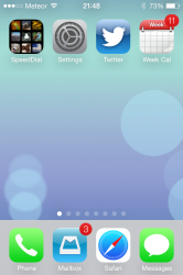
is the dock shading supposed to be translucent? on my iPhone 4 its just grey/silver, no matter what wallpaper I use
Should be. More like a blurred/ground glass appearance.
Should be. More like a blurred/ground glass appearance.
just found this in another thread
- All these are addressed in the release notes of the beta for iphone 4. So I believe/hope they will get fixed
Springboard
Notes:
‣ Active touches are no longer canceled when the user takes a screenshot.
‣ Dynamic wallpaper is not available on iPhone 4.
UIKit
Notes:
‣ Blurred layers are not available on iPhone 4.
‣ Parallax is not available on iPhone 4.
‣ Letterpress text is not available on iPhone 4.
Weather
Notes: Weather conditions are not animated on iPhone 4.
LOL, tell me how it goes for you im thinking of trying it on my iPhone 4, performance wise and all that
Its stable enough to use daily. Seems a bit slow tho at times. keyboard lags sometimes more then i would like. GPS being broke is the big downside for now.
Thank you!
Thank you Andrew!

Thank you Andrew!
I had the same problem. I fixed it by selecting General->Reset->Erase All Content and Settings and then restoring from a backup.
Note: Make sure you have a backup first
----------
btw, I wasn't too impressed with 7 to begin with, but after a day of using it I am starting to fall in love.
Just fix those stupid icons for Settings and Safari and I'll be a happy man.
And for the love of all that's good tell me that you aren't going to use the same stupid method of selecting a new tab on the iPad version. i.e. please stick with the current tab setup rather than a solution that requires multiple presses and screen changes to select a different tab.
Have you tried GPS on your iPhone 4? Would be a bummer if it's not working. My dev phone is an iPhone 4, but I can't loose GPS on it, because our app heavily relies on it.
Well Im basing that on the release notes saying this:
In this seed, GPS-based location is nonfunctional on iPhone 4. This includes AGPS call flows used for 911 emergency services location requests. Wi-Fi and cellular-based location remain functional."
That said. It pulls me right up on a map. Havent tested it in a car or out and about tho.
Register on MacRumors! This sidebar will go away, and you'll see fewer ads.