Got a tip for us?
Let us know
Become a MacRumors Supporter for $50/year with no ads, ability to filter front page stories, and private forums.
Apple Releases OS X Yosemite Developer Preview 6
- Thread starter MacRumors
- Start date
- Sort by reaction score
You are using an out of date browser. It may not display this or other websites correctly.
You should upgrade or use an alternative browser.
You should upgrade or use an alternative browser.
Lucky. My search terms aren't yielding results as lucky as yours did.
Are you a registered devolper? if you are its on the forums.
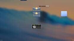
it really should have an option to disable the dashboard
I didn't know anyone even developed new widgets for dashboard. I think it could still serve a great purpose if people actually brought out updated widgets,
A more intuitive stock widget,
Updated eBay widget
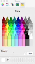
Check out the hideous color picker!
View attachment 486134
I just Laughed Out Loud at that comment. That was great.
it really should have an option to disable the dashboard
They do
Shame, I preferred the transparent layer so you could use the widgets like the calculator on documents I had open....
Oh that new battery icon makes me happy. I was PISSED when I saw Apple made it green while charging, like in iOS. I've already had my hissy fits against Dropbox and other apps that tried to put color icons in the menu bar. (Yes, I know Dropbox is better now.) It was quite an "Et tu, Apple?" moment for me.
And I'm going to assume the only thing Dark Mode does is make the dock and menu white on black. AKA no windows and stuff now white on black. Does anyone know if that's going to change? I really liked the idea of darker window elements. :c
Added:
And I'm going to assume the only thing Dark Mode does is make the dock and menu white on black. AKA no windows and stuff now white on black. Does anyone know if that's going to change? I really liked the idea of darker window elements. :c
Added:
When are they going to get rid of that? I'm tired of praying that my Mac hater friends never find out that OS X has crayons in it.Check out the hideous color picker!
View attachment 486134
it really should have an option to disable the dashboard
You can, go to System Settings -> Mission Control and select Dashboard Off.
it really should have an option to disable the dashboard
There is I think. Dashboard used to be great - it could still be - but Apple are turning it into something with no use at all.
Is "flatter" considered to be "more modern," or is "more modern" flatter?
Inquiring minds demand to know.
If Jony Ive had his way there would be no user elements at all because to have something on the screen is ugly to people like him.
Some things are getting lighter, thinner, smaller and this is terrible for people with any eyesight issues. Apple is going to get a lot of complaints. Look at the forward and back "buttons" on iOS 7 and 10.10 Safari.. thin as a human hair and a lower contrast. Terrible.
If you increase the size of the system-wide font it destroys all rendering of a web page - things overlap! Gee thanks, I can see better now. In other words, we are stuck with type sizes that are smaller than the rest of the publishing industry uses because it "looks better." "But I can't see it!?" Who cares, it's prettier this way.
Last edited:
It was removed... I downloaded it before they removed it.
Any idea why it was removed?
And I'm going to assume the only thing Dark Mode does is make the dock and menu white on black. AKA no windows and stuff now white on black. Does anyone know if that's going to change? I really liked the idea of darker window elements. :c
Correct. Now instead of dark mode its a checkbox that just says: Use dark menu bar and dock
You can, go to System Settings -> Mission Control and select Dashboard Off.
Oh!! I've never seen it, sorry
Oh that new battery icon makes me happy. I was PISSED when I saw Apple made it green while charging, like in iOS. I've already had my hissy fits against Dropbox and other apps that tried to put color icons in the menu bar. (Yes, I know Dropbox is better now.) It was quite an "Et tu, Apple?" moment for me.
And I'm going to assume the only thing Dark Mode does is make the dock and menu white on black. AKA no windows and stuff now white on black. Does anyone know if that's going to change? I really liked the idea of darker window elements. :c
Added:
When are they going to get rid of that? I'm tired of praying that my Mac hater friends never find out that OS X has crayons in it.
I know what you mean. One of the reasons I dislike using Parallels Desktop since it chucks that red pause icon onto the menu bar.
Don't worry, parallels will have a $49.99 patch to support Yosemite
Parallels 9 did not work for me with DP5 as well
File Choose Dialog
In Beta 5 and earlier, if you opened a choose or upload dialogue box (like in Safari) and you dragged a file over from an open Finder window it would MOVE the file to the folder that was currently showing. They have fixed this (as it was in previous versions of OS X) so that it correctly just opens the folder where the file resides so you can easily choose the file for uploading or selecting.
Clear as mud?
The animations are running A LOT smoother on my 15" Retina.
I can confirm this. Resize performance has improved tremendously (e.g. Safari can now resize The Verge and Facebook without any perceivable lag on my side) — same for scrolling. App Store, which has always been a showcase for the resize lag, still lags but its MUCH better now. Mission Control is much much faster than on Mavericks or DP5 — although there is still a small initial delay (and I really mean SMALL) when many windows are open, its a very noticeable improvement. And overall, the UI just feels more responsive. Spotlight launches pretty much instantly (used to have a short lag). I have no idea what they did (probably optimised the hell out of drivers+windows server and enabled really aggressive content caching), but it works.
Also, they have fixed a very nasty Safari bug (lack of autofocus in the new tab)
Very impressed by this update, a must have for rMBP owners. This should hopefully put the end to the 'hardware it too slow for the retina' nonsense (I have the HD4000).
Register on MacRumors! This sidebar will go away, and you'll see fewer ads.


