Yosemite-style third party app: first sighting on Mavericks. Alarmingly fugly.
W . T . F ..
I shan't name the app, but I just launched a beta of something from a third party developer. First impression: ****ing hideous. Like something ported from … I don't know what, but it bore only partial resemblance to one of the Yosemite experiments.
Sheep-like behaviour of developers, I suppose I shouldn't diss that side of things, plus inferior human interface guidelines from Apple that try but fail to hide the lack of explanation of inconsistencies within OS X 10.10, offensive glaringly bright, I mean REALLY bright overall interface, reduced usability … and so on. I literally yelped when I saw it, a high-pitched "No!". Readers, go ahead and laugh – if you find it funny that
shockingly ugly apps – apps that can not be consistent with either Mavericks or Yosemite – are in the pipeline from third party developers …
… so soon after Apple's dismal work. A few weeks ago I wondered whether
cack-handed lobotomy had been too caustic a description, especially considering the pre-release/beta status of the software. Since launching, for the first time, a third party fruit of Apple's new guidelines, I have to say, no regrets. Yosemite is unforgiving and now it seems that the unforgiving side of it is rubbing off on things that might be used beyond Yosemite.
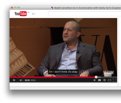
I'm about to sign off, but first I've gotta share something.
Sir Jonathan Ive, if ever you read this: I tried, really hard, repeatedly, to discourage the disappointed customers in this forum from targeting any individual within Apple with complaints about the development of Yosemite. After seeing the ****ing state of what I just saw, I'm inching towards a suspicion that you were the mystery person – the STARK RAVING BONKERS PERSON ON THE DESIGN TEAM – who I uncharacteristically screamed about in my feedback months ago. Nice ****ing work, mate. A really, really nice ****ing precedent you set there. If what I just saw is the shape of things to come, it can only accelerate the abandonment of Apple by people who truly appreciated what was done in the company's past. Pfft.