Yes. The rounded corners look cheap, tacky, ugly and out of place. Mac isn’t an iPhone, why copy iPhone corners everywhere? (And I’d much prefer the iPhone to have square corners as well).UI now looks clunky and ugly - silly rounded corners make no sense in most apps - think weedy lines splattered everywhere - buttons vanishing - UI text unreadable - inconsistency - are these the features ?
Got a tip for us?
Let us know
Become a MacRumors Supporter for $50/year with no ads, ability to filter front page stories, and private forums.
10+ macOS Tahoe Features You Might Have Missed
- Thread starter MacRumors
- Start date
- Sort by reaction score
You are using an out of date browser. It may not display this or other websites correctly.
You should upgrade or use an alternative browser.
You should upgrade or use an alternative browser.

Here is one; but these forums have a search feature you can use.A link would be helpful here.
Last edited:
Thanks much for making the effort to share the screens. I was curious what the dimmed app buttons in the 2 original MR screens i “replied” to would look like with Reduce Transparency activated.Preview toolbar looks like this with Reduce Transparency ON:
View attachment 2563567
.... though, interestingly Preview's Settings has an option to set the background colour for the window, which affects the toolbar. I rather think that the buttons look quite nice with a stronger background, regardless of whether Transparency is reduced or not:
View attachment 2563568
... though I'm not wild about the sidebar shape.
I'd love to have that option for Finder windows, and other apps generally. Some colours work quite well:
View attachment 2563571
Same, I don’t see the need for toolbars to have those shapes. I was curious (and couldn’t remember) so I looked back at previous versions. They were removed in Big Sur, but previously looked like this is Catalina. Much more compact.I just don't understand what we are gaining with everything being trapped in a capsule shape.
Feels much more visually "busy" to me.
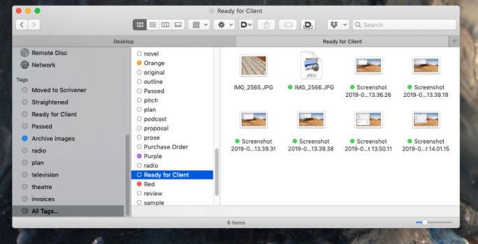
Sequoia Finder below
View attachment 2563574
As far as I can tell, the capsules are just so Apple can show off the glass effect. They don’t really serve a purpose at all.
I know this won’t happen, because this is Apple, but it would be nice if they offered themes, including the new glass style, but also the previous “compact” style.
Attachments
Last edited:
Fugly OS. Hard pass. About to throw my new iPhone across the room in frustration with the laggy, low contrast, unnecessary ornaments and effects that clutter the screen and take up far too much real estate. Not gonna do that to my daily driver, no way.
The dumbest thing ive read on this forum in 2025.
Bet youre still using that iphone 17.
To be fair, toolbars once looked like this (in Mac OS X 10.4 Tiger, 20 years ago)Same, I don’t see the need for toolbars to have those shapes. I was curious (and couldn’t remember) so I looked back at previous versions. They were removed in Big Sur, but previously looked like this is Catalina. Much more compact.
As far as I can tell, the capsules are just so Apple can show off the glass effect. They don’t really serve a purpose at all.
I know this won’t happen, because this is Apple, but it would be nice if they offered themes, including the new glass style, but also the previous “compact” style.

after initially (in the earlier Mac OS X releases) looking more like this

The Tiger look interestingly bears some resemblance to Liquid Glass IMHO.
Image sources: Mac OS X 10.4 Tiger - Ars Technica
Last edited:
Somehow Apple managed to create an interface that's too minimalist and too busy at the same time.I just don't understand what we are gaining with everything being trapped in a capsule shape.
Feels much more visually "busy" to me.
Sequoia Finder below
View attachment 2563574
Do they not define the clickable area for the button? My main problem with it is the lack of colour and contrast, rather than the shape.As far as I can tell, the capsules are just so Apple can show off the glass effect. They don’t really serve a purpose at all.
Was that a beta for Tiger? I don’t think I’ve seen that before. I have an old iBook with Tiger, but it looks like this:To be fair, toolbars once looked like this (in Mac OS X 10.4 Tiger, 20 years ago)
after initially (in the earlier Mac OS X releases) looking more like this
The Tiger look interestingly bears some resemblance to Liquid Glass IMHO.
Image sources: Mac OS X 10.4 Tiger - Ars Technica
Edit: Ah, sorry, I just realized that’s the mail app. Also, I miss the OS have some of this character.
To be fair, toolbars once looked like this (in Mac OS X 10.4 Tiger, 20 years ago)
after initially (in the earlier Mac OS X releases) looking more like this
The Tiger look interestingly bears some resemblance to Liquid Glass IMHO.
Image sources: Mac OS X 10.4 Tiger - Ars Technica
Somehow, for some reason, I totally prefer BOTH of these to what I'm seeing from Tahoe examples.
Maybe the "encapsulation" itself isn't the issue so much as the execution of it?
I think a lot of it has to do with contrast, and the lack thereof.Somehow, for some reason, I totally prefer BOTH of these to what I'm seeing from Tahoe examples.
Maybe the "encapsulation" itself isn't the issue so much as the execution of it?
Post #42 above is a good example.
I think a lot of it has to do with contrast, and the lack thereof.
Post #42 above is a good example.
Absolutely!
That, and honestly, the interface was just better looking and more "fun" with some actual personality?
At least to me?
They've strip mined the whole thing further and further down to just "blobs of shape" everywhere and now are trying to re-inject some life by making it all "semi transparent" (to bring in color) ... which sucks, because that concept is bad for comprehension and legibility of what things actually are.
And Steve would have pulled him by his ears for such a lousy job!Tim Cook has been directly overseeing Apple’s design of Tahoe https://www.theverge.com/news/701705/apple-tim-cook-design-team-report
To be fair, toolbars once looked like this (in Mac OS X 10.4 Tiger, 20 years ago)
I miss this - back when design, form and function mattered to apple
I miss this - back when design, form and function mattered to apple
And I just don't understand why we can't have something that looks more like this still.
It's got plenty of "liquid glassy" stuff going on to my eyes.
Maybe it's a also because the toolbar icons were more colorful (which is not very hard) and less abstract.Somehow, for some reason, I totally prefer BOTH of these to what I'm seeing from Tahoe examples.
Maybe the "encapsulation" itself isn't the issue so much as the execution of it?
Many nice new features, but the windowing design is rather ugly with its redundant layers and bulky buttons. It makes no sense to have left menus like in Finder and bottom menus like in Music be a distinct rounded-rec atop the window in the same colour as the window. What some refer to as the capsule design. It doesn't feel very Apple. And Safari looked cleaner before.
Design wise this is much more elegant.


Design wise this is much more elegant.
Last edited:
It’s 2012 amateur Android skins all over again.Somehow Apple managed to create an interface that's too minimalist and too busy at the same time.
My main problem *is* the shape. It looks ugly, amateurish and cheap. It very strongly reminds me of homemade Android skins people would share on XDA-developers back in the early-mid 2010s. The lack of skill and taste, offset by enthusiasm.Do they not define the clickable area for the button? My main problem with it is the lack of colour and contrast, rather than the shape.
Except what is OK for a teenage “developer” is inexcusable when coming out of one of the biggest tech companies in the world.
Last edited:
That's Preview not Finder, but I made a similar comment. Sequoia features a more logical and more attractive window chrome design. Just because Apple wanted icons and the Lock Screen clock to be "glass" didn't mean they had to mess up the macOS window chrome. If ya'll recall back a few years ago they tried to make window chrome overly transparent and backed off when many complained. Apple needs a design guy. Someone with impeccable taste and clout within the company. Like Jony Ive but for software. They need someone in there to cut through the bs. Someone who can take one look and go "yuck". Someone who ugly software design upsets. Find someone!I just don't understand what we are gaining with everything being trapped in a capsule shape.
Feels much more visually "busy" to me.
Sequoia Finder below
View attachment 2563574
Last edited:
Apple needs a design guy. Someone with impeccable taste and clout within the company. Like Jony Ive but for software. They need someone in there to cut through the bs. Someone who can take one look and go "yuck". Someone who ugly software design upsets. Find someone!
This! All of this!
Design is SO important that it actually necessitates someone who is empowered to stand up and push back on Tim, and any other internal political winds, and drive the direction in an opinionated and coherent way.
Hearing that "Tim was personally getting involved" is like the literal opposite of what's needed here.
Tim is a world class OPs guy ... a savant when focusing on the financial side.
He knows not a damned thing about great UI/UX design and I wish he had the self awareness to stay out of it.
Well said.Design is SO important that it actually necessitates someone who is empowered to stand up and push back on Tim, and any other internal political winds, and drive the direction in an opinionated and coherent way.
Register on MacRumors! This sidebar will go away, and you'll see fewer ads.