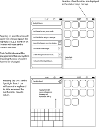
I've just spent the last hour in my graphics lesson drawing this up. It's what I think would be a cool implementation for a notification system in iOS. What do you guys think?
EDIT: I realise now that I forgot to put the dock on the homescreen, and so for clarification: The screen on the right of the diagram is your standard homescreen that you see when you unlock your phone. Swiping right from there will take you to the Spotlight Search screen (which is seen on the left-hand side of the diagram). As you can see, I am proposing that the notifications pane be displayed underneath the Spotlight bar to minimise the wastage of space. Tapping on the Spotlight bar will cause the notifications pane to fade away and for the keyboard to slide up from the bottom, allowing you to perform a standard Spotlight search. The number displayed in the status bar (where the time and battery are located) is just a count of how many unread notifications you currently have waiting (so that you know to visit the notifications pane). Notifications will not be marked as read unless you either tap on them (to open the corresponding app) or swipe over them to mark them as read.
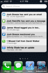
EDIT EDIT: I have attached a mock-up of what the UI would look like on the phone. It borrows heavily from the spotlight search UI, keeping things consistent in the window. The main text of the notification is displayed in bold, and the subtext tells you a bit more about the notification. The icon tells you which app the notification pertains to. What do you think to it now guys?
EDIT: I realise now that I forgot to put the dock on the homescreen, and so for clarification: The screen on the right of the diagram is your standard homescreen that you see when you unlock your phone. Swiping right from there will take you to the Spotlight Search screen (which is seen on the left-hand side of the diagram). As you can see, I am proposing that the notifications pane be displayed underneath the Spotlight bar to minimise the wastage of space. Tapping on the Spotlight bar will cause the notifications pane to fade away and for the keyboard to slide up from the bottom, allowing you to perform a standard Spotlight search. The number displayed in the status bar (where the time and battery are located) is just a count of how many unread notifications you currently have waiting (so that you know to visit the notifications pane). Notifications will not be marked as read unless you either tap on them (to open the corresponding app) or swipe over them to mark them as read.
EDIT EDIT: I have attached a mock-up of what the UI would look like on the phone. It borrows heavily from the spotlight search UI, keeping things consistent in the window. The main text of the notification is displayed in bold, and the subtext tells you a bit more about the notification. The icon tells you which app the notification pertains to. What do you think to it now guys?
Attachments
Last edited:
")