Become a MacRumors Supporter for $50/year with no ads, ability to filter front page stories, and private forums.

Designer Dale

macrumors 68040
Original poster
Mar 25, 2009
3,950
101
Folding space
The purpose of the Challenge is to provide a venue where photographers of all skill levels can work to improve their craft by shooting along a common topic for two weeks - one fortnight. Helpful comments and critiques are key to reaching the intended goal - better photography.

About Your Photos

Shoot for the topics listed on the schedule. You may shoot for upcoming topics, but post photos only to their matching Challenges. Try to avoid using photos from your archives just for participations sake. If you really want input on an older image that fits the Challenge topic, please let us see it.

You may post as many photos as you wish for any one Challenge.

About Your Comments

Comments are critical to the success of the Challenge. If you post a photo, add a comment to another one. If you are only viewing, please add your comments, too.

Comments should be meaningful, something that the photographer can use to improve his/her work. Explain why you like or dislike a photo. Spend a moment looking at a photo before commenting on it. Try to answer the question "I like this photo because…" It really helps the photographer.

The Topic Schedule

Long Exposures (May 12 - 25) Break out your tripods and stop those lenses down! Have Fun
Landmarks (May 26 - June 8)
Age (June 9 - 22)

Dale
 
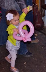
A rose can say "I love you",
orchids can enthrall,
but a weed bouquet in a chubby fist,
yes, that says it all.


I think the photo is well-composed and captures her exploration and curiosity but it is a bit soft and partly overexposed. I would love to hear how I may avoid these issues with my Canon PS I5 (non-DSLR).
(settings: 1/500 secs, f/4.0, Exp bias = 0, ISO 80). Any help is greatly appreciated!
 
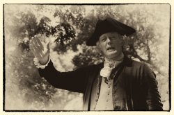
Thomas Jefferson giving a speech. Well....some guy playing Jefferson in Colonial Williamsburg and me playing with Nik plugins.
 

Attachments

  • _DSC1977.jpg
    _DSC1977.jpg
    881.9 KB · Views: 109
Last edited:
Contrast. A bit indirect to the topic, but the contrast between the classic clock and the fairly recent MBP unibody fits into the "Age" concept, IMO.

[url=http://farm4.static.flickr.com/3231/5763260014_890da187e1_b.jpg]Image[/url]
As Time Goes by by Hisdem, on Flickr

Initially I read "age" as old but I think it's really wide open. Age could be anything along a time line. I like what you are going for here. The clock is in focus perfectly and nicely sharp. Great control of focus. You may have intended it to be this warm but it's a little warm for me. It dulls the whole image a bit. I kinda feel the face of the clock should be whiter.
 
Initially I read "age" as old but I think it's really wide open. Age could be anything along a time line. I like what you are going for here. The clock is in focus perfectly and nicely sharp. Great control of focus. You may have intended it to be this warm but it's a little warm for me. It dulls the whole image a bit. I kinda feel the face of the clock should be whiter.

Thanks for your input! I really appreciate it!

As you say, it was a slight mistake, the lighting made it look warm, but I didn't bother to edit the white balance as it affected the rest of the scene, even if just a bit. I will try and adjust it to be just a little cooler though. Again, thank you! :)
 
Contrast. A bit indirect to the topic, but the contrast between the classic clock and the fairly recent MBP unibody fits into the "Age" concept, IMO.


As Time Goes by by Hisdem, on Flickr
I like the colors and composition in this one. I think that's an example of what's called a limited pallet of color. It might do a bit better with a little more fill light to bring out some of the details in the shadows. Makes me want to go out and find a pocket watch, though. I really don't like relying on the cell phone that I don't always have...

Dale
 
Thank you very much for your input, Dale. As always, I've learned something from your post :D

And I do love the idea of having a pocket watch, though it would look a bit awkward I guess, considering you don't see many 16 year olds walking around with one, but I like them :p That one is actually a table clock. It used to have a mount (pen holder), but I lost it:(

Image
ISO 1000, 65mm, -1.33 ev, f/10, 1/60

Are there other settings that might have made this better?

The portrait is quite interesting, I like the look in his face. Totally natural and it's like he didn't even know you were there. However, I think you could have used a larger aperture (smaller f number), as a bit of background blur would make it *that* much better, IMO. Plus it would let much more light in and you wouldn't need to use ISO 1000, maybe ISO 400 would have been enough. ;)

Cheers
 
Kinda surprised no one has posted something like this yet. This is what came to my mind first for this challenge.


Forgotten But Not Gone by Gerg1967, on Flickr

Darn, you beat me to the punch. I had the same thought this morning but was late for work (often a common problem) and said to myself, "Self, post this tonight when you get home!" BTW, love the coloring and rusty feel of your foto.

oldtrucks25020110505121.jpg
 
Here is one of the old barns at the park near my house. It was used by the patients a Western State Hospital when the institution was self-supporting and had a working farm as therapy.

It's a technical exercise working with manual exposure and my old hand-held light meter. I was trying to get the sky right while keeping the detail in the shadows.


EXIF Summary:1/500s f/8.0 ISO100 Tamron 28-75f/2.8@28mm manual exposure

Continuing the Rust truck theme...


Dale
 
Last edited:
Kinda surprised no one has posted something like this yet. This is what came to my mind first for this challenge.


Forgotten But Not Gone by Gerg1967, on Flickr

A brilliant application of punchy processing. Love it. I also really like how you got us in close so we can enjoy the textures and forms, though the crop along the bottom pinches the composition a bit; it would be nice to see the bottom curves of the bumper fins.
 
Darn, you beat me to the punch. I had the same thought this morning but was late for work (often a common problem) and said to myself, "Self, post this tonight when you get home!" BTW, love the coloring and rusty feel of your foto.

oldtrucks25020110505121.jpg

I love the colors in this shot. I like that we can see red, green, blue and yellow in the various items in the shot.

A brilliant application of punchy processing. Love it. I also really like how you got us in close so we can enjoy the textures and forms, though the crop along the bottom pinches the composition a bit; it would be nice to see the bottom curves of the bumper fins.

I had another shot with the bumper fins fully in the frame. I didn't keep it for some reason. It may not have been fully in focus, since I was doing this handheld. I forgot to turn on IS on the lens, and I didn't have my tripod with me because I wasn't expecting to find these cars. It was right next door to a photo equipment store.

Here's an closeup of part of an engine from the same spot.


Rusted Engine by Gerg1967, on Flickr
 
A brilliant application of punchy processing. Love it. I also really like how you got us in close so we can enjoy the textures and forms, though the crop along the bottom pinches the composition a bit; it would be nice to see the bottom curves of the bumper fins.

OK, I will expose my naivete with photography, pray tell what is "punchy processing?'' I tried googling it and ran into a dead end.:confused:

EDIT/ADD ON: Welcome back. I was knee deep in work when you began posting again and by the time I could get to DP in a free moment enough people had expressed happiness in your return that I felt I was a little too late.
 
Last edited:
Punchy processing to me means exaggerating the details and contrast and such. It works well for rusty old items like the cars to really pull out the rust textures. Basically it gives the photo an extra "punch" feel to it.
 
EDIT/ADD ON: Welcome back. I was knee deep in work when you began posting again and by the time I could get to DP in a free moment enough people had expressed happiness in your return that I felt I was a little too late.

Aww, that's sweet, thank you! It's never too late to say something nice! :)

Punchy processing to me means exaggerating the details and contrast and such. It works well for rusty old items like the cars to really pull out the rust textures. Basically it gives the photo an extra "punch" feel to it.

^^^What he said. Punchy processing is processing that is, well...punchy! Taken too far, emphatic effects can make a photo look overcooked, but you know you've hit the sweet spot when the contents of the photo really pop, without the processing itself demanding too much attention.

Here's an closeup of part of an engine from the same spot.

[url=http://farm4.static.flickr.com/3587/5837564521_641a0945f3_b.jpg]Image[/url]
Rusted Engine by Gerg1967, on Flickr

I love the light, color and textures of the foreground. It has a real 'presence.' I feel as though I could reach out and touch those bits along the bottom edge of the frame (again, I feel as though they're a bit too close to the edge, but I'm picky about such things).
 

Educ8r: An interesting subject, but something seems "not quite right." Maybe someone else can help, but I think it's not quite in focus. Or the aperture number is too low? (Or maybe it's just a difficult subject to shoot well? Or, it could even be your hosting company: I'm not familiar with skitch.com) I'm sorry to be negative, and wish I could tell you how to improve.

Since both of us have similar issues with a number of our shots, maybe someone with more knowledge than I can help educate both of us as to how we can improve?

Also: Perhaps this is an ideal subject to give a try at HDR to bring out the details?
 
Register on MacRumors! This sidebar will go away, and you'll see fewer ads.