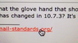
I just noticed that the glove hand that shows when you roll over a link (there's different variations depending on what you roll over) has changed in 10.7.3? It's a little more crooked than before. I like it.
Got a tip for us?
Let us know
Become a MacRumors Supporter for $50/year with no ads, ability to filter front page stories, and private forums.
Anyone else notice the change of the "glove hand" in 10.7.3?
- Thread starter applefan289
- Start date
- Sort by reaction score
You are using an out of date browser. It may not display this or other websites correctly.
You should upgrade or use an alternative browser.
You should upgrade or use an alternative browser.
Ha. That would have been gnawing at me for weeks if you hadn't said something; I never would've been able to put my finger on what was different about my screen.
It is very cartoonish now, though.
It is very cartoonish now, though.
Here's the one in 10.7.2 for comparison
Same glove. They've just tilted the pointer finger to kind of match the angle of the standard cursor. Nice to see that fastidious attention to detail hasn't left Apple with Steve's departing.
It can't be Mickey Mouse because it has 5 fingers.
Now I notice that it appears more like a Disney glove, such as Mickey would wear.
It can't be Mickey Mouse because it has 5 fingers.
Attachments
Well, now that I see the old one, I guess it isn't any more cartoonish that it already was before... but something about the angle makes it feel more whimsical IMHO.
It'd be funny if some programmer pulled a Homer Simpson and leaned against his keyboard, rotating the graphics inadvertently.
It'd be funny if some programmer pulled a Homer Simpson and leaned against his keyboard, rotating the graphics inadvertently.
Upgrade. It's an upgrade; definitely a move in the artistic direction of the Mac's dogcow roots.this is an update?
The mouse pointer has also been updated. First off, it's now a vector instead of a scalar one, meaning that if you scale it in Accessibility preferences, it won't get pixelated. The posterior end is also no longer rounded.
definitely a move in the artistic direction of the Mac's dogcow roots.

Ooh… Clarus the Dogcow. Never knew it was called that! That'd be a nostalgic avatar if I didn't like my IK+ icon so much.
Image
Ooh Clarus the Dogcow. Never knew it was called that! That'd be a nostalgic avatar if I didn't like my IK+ icon so much.
moof moof
The good old days of Macintoshes. That brings back memories
This is why I keep coming back to macRumors. Because some of us notice and appreciate the little things like this. The gloved hand appears to have some depth to it. I can almost see the curve in the hand likes it's reaching into the screen to get at a link.
Kinda sad that Apple only lists the arcane technical updates to explain what's new in 10.7.3 instead of also listing things like icon changes too.
Kinda sad that Apple only lists the arcane technical updates to explain what's new in 10.7.3 instead of also listing things like icon changes too.
Yeah, I noticed that other change when I rolled over a window in Mail.
Register on MacRumors! This sidebar will go away, and you'll see fewer ads.


