Alright, the contest is now officially over. I'm also officially hungry now.
")
Thanks to everyone who submitted an entry. Without further ado, here is my feedback for each submission:
WRP: Beautiful photo. Very good framing, lighting, depth of field, texture and variety of color. The photo is crisp and draws me in. Was this shot handheld or did you use some kind of object to stabilize the camera on?
Ravaroo: A good shot of what I'm sure is a tasty dish. The only thing I would change is the use of off-camera lighting (I'm assuming on-camera flash was used) to illuminate the dish from somewhere other than the camera. I would also reframe the dish a little to the right, but that's just the pickiness in me.
cabernar: Oooooh, one of my favorite dishes! Also a very nice photo. I like the perspective you chose to use with this - up close and personal. I also like the variety of color shown here. The photo makes me want to reach out and grab a piece.
I think I would have exposed for just a little longer to brighten the pizza a little more, and experimented with a smaller aperture to increase the depth of field somewhat.
Keleko: Excellent use of depth of field here. Very good focal plane on the right hand - everything there is sharp, detailed and in focus. Nice, bright and colorful
oranges, as they should be!
AlexH: Very nice collection of fruit. I like the side lighting and the water droplets. Lots of texture and variety of color here. I'm guessing the photo was taken at a slanted angle because the lemon looks like it's resting on the apple and lime. My first thought was "why isn't the lemon falling?".
Sideonecincy: Ah, a meal fit for a... prisoner? I wasn't quite sure what this was when I first saw it, until I looked up the date and realized its historical significance of being the last day Alcatraz was open as a prison. Interestingly,
this photo on Flickr shows a slight variation, saying "Steamed whole wheat". I wonder if they have multiple menus posted or if someone just messed with it? As for your photo, there is a good balance of light and dark, the text is quite sharp and the tight framing must have been difficult!
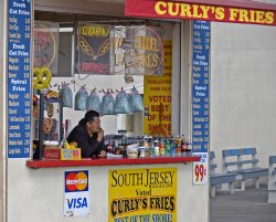
deep diver: Interestingly enough, what draws my attention in this photo isn't the booth, but the pensive vendor. What is he looking at? Just what is he thinking? We may never know.
It's also kind of funny that "Curly's Fries" offers spiral fries instead of their namesake curly fries. Certainly a colorful and sharp photo.
pakyooh: Very nice photo. Great use of lighting to create texture and bring out many light and dark regions, although there appears to be a slight overexposure of the front pepper's cheese (this could just be a difference in gamma between our displays). Nicely controlled depth of field draws focus on the first pepper. I think I would have rotated the framing by one degree clockwise to make the edges of each pepper more vertical.
cambookpro: Another one of my favorite foods. These look quite tasty. There is a bit of purple hue to the white surroundings, which could be attributable to the lighting or the tint applied by the camera. Or maybe it really was purple and my eyes are just deceiving me.
I think more variety of color in the scene would help this one... perhaps having them on a plate with other food would make the composition really stand out more.
Here are the winners of this week's contest:
3rd:
cabernar
2nd:
pakyooh
1st:
WRP
Congrats to the winners and thanks again for everyone who participated. Now to
WRP for next week's contest!