Lots of good ones in this bunch. Couldn't really go in much detail because I have a few things to work on but I tried to comment on all the submissions. Hope I don't get blasted for the critiques.
milbournosphere: the sign is a bit of a distraction. the image became a picture about the sign.
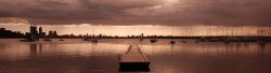
AlexH: the colors, composition, leading lines taking my eyes directly to the horizon/sunset... sold!
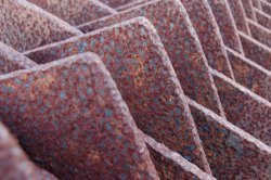
deep diver: the image is lacking something. might need a bit more punch, sharpness. something to enhance the rust details on the metal.
AMariaJ: you can take the image in two different directions. either brighten it up a bit so you can see the details more (golden hour look) or darken the shadows for a defined silhouette.
Comeagain: good job on this one. leading lines are also on point.
Razeus: I'm partial to b&w, i like this one. there's movement but i composition could use some adjustment. maybe straighten out the wall on the left side.
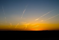
VITM: really diggin' the contrast in this image. im a bit torn with the placement of the horizon though. I myself am not sure if I want more of the sky or the railroad but I think either one would work.
MasterDragon: I like this image a lot but I think it could use more punch. The image is too soft, colors are a bit muted.
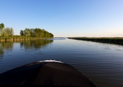
Nathanbl: Monday night? what time was this? would love to get more light like this at the end of the day so I'm not always rushing when shooting. The front of the boat is a bit distracting. I think if you place the horizon a bit lower, it would a bit more pleasing.
Alonzo84: dude, you're brave. Seems like the water was getting really close to your camera. Composition could use a bit more tweaking.
joshuaginter: lol ditto about AlexH and his work. but your work, nice colors and composition works really well.
28Fiend: light is amazing! sharpness works really well, very detailed.
snyder7: nice job with this one. a bit on the soft side though.
cupcakes2000: I'm allover this one. this is what I was hoping to see when I thought of the theme for this week. although I'm partial to B&W, I would love to see a color version of this. I can imagine the texture of the trunks standing out from all the greens.
BarryJ: I can see this one working better if you try b&w. my eyes are drawn directly to the reds, which doesn't really say much as a subject. b&w would eliminate the distractions and help to see the image as whole.
oblomow: the angle of the shot isn't really working for me. i think you would have had a stronger image if you were in the middle and theres more symmetry.
Eolian: first thing I thought was NatGeo, then i realized what it was. cool point of view.
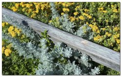
Bartlindon: great detail. this is convincing me to get a macro lens even more.
acearchie: not gonna hate, I'm on instagram too! i think it would work better if you and the subjects were in the middle of the hallway.
JDDavis: I like the POV but lacks subject i think.
iTiki: not really sure about the subject. doesn't draw any attention to anything. maybe a different angle and depth.
3rd: VI
2nd: ALexH
1st: Cupcakes2000