Got a tip for us?
Let us know
Become a MacRumors Supporter for $50/year with no ads, ability to filter front page stories, and private forums.
MSN Messenger 5
- Thread starter CodenameWinger
- Start date
- Sort by reaction score
You are using an out of date browser. It may not display this or other websites correctly.
You should upgrade or use an alternative browser.
You should upgrade or use an alternative browser.
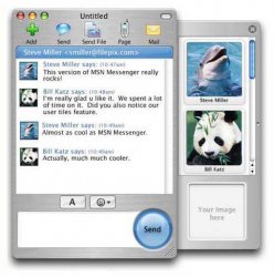
only Ms would waste a huge chuck of screen space with a "Send" button like that... if its even real. Just get adium.
Can you shed some light on an expected time of release? Or is it so far off that Adium will have webcam capabilities when this product hits mainstream? ")
Ok here's my rant. (Codenamewinger, if you are a dev of this, please don't take it personally).
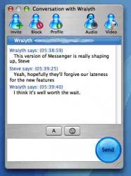
MS is almost universally idiotic about using screen real estate. (MS Office for Mac being the notable exception.) Windows is the worse about it, but these MSN screens reveal the same poor design.
Here's an example... In a normal, default windows setup browsing the internet, you have space being stolen by the Start Menu and status bar at the bottom. Then at the top, you have a huge blue bar at the top of the program window, followed by the file, edit menus...., then those freaking huge buttons that look like they go to a children's playset, then under that a links bar and if you're unlucky also a yahoo or google bar (or both) undernearth that. After all is said and done, you can only look at a web page with about 65-70% of the vertical screen space on an average monitor. (varies depending on screen resolution, admitted). With OS X you start at about 80% and only increase depending on how you have your dock configured. (I've gotten the ruler out and tried it before.)
Now just take a look at the MSN window above. The icons at the top are huge, way bigger than they need to be. The grey bar separating the two text areas takes up way too much space to be used for only two buttons. And, like I said earlier, that huge send button just screams "I'm a waste of screen space!!!"
Ok, I think I'm done. End Rant...
If the one at the top is the new MSN, then where are the display pics?!?!?! Oh and I think the send button looks rather cool!
Oh and I think the send button looks rather cool! CodenameWinger said:I'm sure you're missing the point that it has Webcam and Audio
If this is true, then I'd be delighted. It's been one of my biggest bug bears with MSNM on OS X, and if we have something approaching feature parity, then it would be an excellent step forward.
When the new msn comes out i will be giving it a try as im looking forward to video capabilities.
I would prefer for iChat to be msn capable, but Apple seems not to realise that beyond USA people don't use much of AOL instant messaging. PS i know you can us jabber in iChat.
This is assuming that it is Apples fault, unless its msn fault by banning chat clients other than theirs. Which does not explain how Adium works.
All I'm bothered about in the new MSN is Display Pictures. I loved them when using a PC (its really interesting what you can tell from a picture people display!).
Yes I am easy to please
Yes I am easy to please
Heb1228 said:Now just take a look at the MSN window above. The icons at the top are huge, way bigger than they need to be. The grey bar separating the two text areas takes up way too much space to be used for only two buttons. And, like I said earlier, that huge send button just screams "I'm a waste of screen space!!!"
Ok, I think I'm done. End Rant...
Press the white button and the toolbar icons are reduced to smaller icons, or even just words. Learn how to use OS X before ranting. The middle bar is necessary and will probably have more functionality, and the send button wastes only the far right side of the textbox.
This is a great development as far as I'm concerned.
Well all I have to say is how much longer do we have to wait to actually get some added functionality? It isn't asking much to add support for features third party apps have had to years and indeed the PC equivalent has had since time began. Why they can't just port the PC version is beyond me, we get the best version of Office a good Winblows emulator but a piece of IM software that is on a par with version 1 of the PC equivalent
Great to see some more on MSN 5, I'll be downloading it for sure once it is (eventually) released.
Yeah, I can't believe how difficult it seems to be to use video chat on a Mac, or video conferencing. It's ridiculous. Its like Macs live in 1999 in the IM'ing world. The only thing us non-AOL users have for video IM is Mercury, and possibly something else, but I don't know of it. I guess it's better than nothing, but another option would still be nice.
So is the video IM nice? Is it choppy....ie: 5 frames per second? Is it nice and smooth, or smooth enough not to look completely cut up and incoherent?
So is the video IM nice? Is it choppy....ie: 5 frames per second? Is it nice and smooth, or smooth enough not to look completely cut up and incoherent?
dermeister said:Press the white button and the toolbar icons are reduced to smaller icons, or even just words. Learn how to use OS X before ranting. The middle bar is necessary and will probably have more functionality, and the send button wastes only the far right side of the textbox.
This is a great development as far as I'm concerned.
First, there is no white button in the first pic. Thanks for the recommendation on learning how to use OS X, I'll give it a try. The middle bar could be 1/4 the size it is if the two buttons were moved to a better place. The send button looks like it makes it impossible to make the text entry box as small as 1 or two lines of text, like I like my chat windows to be, so that the chat window only takes up a small part of my screen.
It takes them forever to get this out and... this is what's new? Brushed metal and gigantic icons? Too little too late: too late as in everyone with any control over their computer has long ago switched to a competing program (My Adium setup, all customized up, makes that thing look like what is is, a butchered Windows XP app.)
Specifically for this picture it seems to be the little things that are such big problems. Like Microsofts use of blue, and yet insistence that their blue not match any part of the GUI of OS X and look like it was ripped from windows. OS X has switched from the transparent plastic look that they seem to use: they could have chosen to go with either the matte gradient apparent in the toolbar or with the jeweled look of the core audio/video or quicktime icons. I think it could also look much better if it borrowed more from the unified "plastic" look of the system preferences or mail, but, what the hey.
No tabbed conversation windows (at least not in this pic). Developers, explain why? This is the best feature of Adium in my opinion: the ability to converse with many people at the same time and yet have very few windows open. Similarly, you can choose to have multiple conversation windows but have all of your friends in one window, all your family in another, etc.
Support for widgets. This could be very cool and if Microsoft did it than they could lay claim to being the first, plus it could be taken very far. Instead of wasting space in the program to show user-profiles, just use a profile widget. It could be fairly small and show the user profile of whoever you are selecting on the contact list, and clicking it could take you to their MSN webpage.
All I can say is that I still hope it is a nice update, because I will always need MSN as a backup app to Adium, one that gets opened once a month for whatever reason. But I will definitely not be switching back to MSN with this kind of "progress" as was my original intention.
any idea when will it be released?
is it the Beta version? anywhere available for download to test it?
is it the Beta version? anywhere available for download to test it?
DarkNetworks said:any idea when will it be released?
is it the Beta version? anywhere available for download to test it?
Heh heh - that same question was asked back in April/May, adn the answer back then was "soon". I think you'll just have to be patient like the rest of us and when it's released, it's released... Or in the meantime switch to Adium.
Am I the only one who's thinking... BS, PS, and that the OP doesn't know anything about MSN development?
So since I guess I am, why does everyone think this is legitimate? Is there a link to a more detailed analysis of a build or beta version from which this screenshot was taken?
So since I guess I am, why does everyone think this is legitimate? Is there a link to a more detailed analysis of a build or beta version from which this screenshot was taken?
mkrishnan said:Am I the only one who's thinking... BS, PS, and that the OP doesn't know anything about MSN development?
So since I guess I am, why does everyone think this is legitimate? Is there a link to a more detailed analysis of a build or beta version from which this screenshot was taken?
I've been thinking that too actually, just been to lazy to post it.
Especially as I thought MS said no video support.
Register on MacRumors! This sidebar will go away, and you'll see fewer ads.