Become a MacRumors Supporter for $50/year with no ads, ability to filter front page stories, and private forums.

elhungarian

macrumors 6502
Original poster
Aug 13, 2009
302
50
hello all,

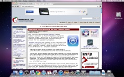
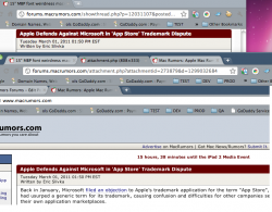
Just noticed that the font for story headings for example on MR looks bad. I compared the font to same browsers on my mac mini at work also on a 1440x900 display and they look fine there. Any suggestions? The font smoothing setting under appearance didn't seem to change anything.

Screenshot: (note white text on red, in headers)
 

Attachments

  • Screen shot 2011-03-01 at 6.21.29 PM.png
    Screen shot 2011-03-01 at 6.21.29 PM.png
    1,011.8 KB · Views: 107
I do, I think. It's kinda blown up and fuzzy looking, most likely from the titles being a bold white, and the screen. Try changing the font size up and see if it sticks.

EDIT: Actually, it really doesn't look that different in comparison to the text below it. It all kind of looks the same...
 
ok now im going crazy in the head.. Maybe its time to stop staring at an LCD for today..

old at top,
new at bottom.. wonder if my appearance font smoothing just took effect. 30 min later? dont think i launched new chrome window...
 

Attachments

  • Screen shot 2011-03-01 at 7.27.05 PM.png
    Screen shot 2011-03-01 at 7.27.05 PM.png
    141.1 KB · Views: 59
Register on MacRumors! This sidebar will go away, and you'll see fewer ads.