Got a tip for us?
Let us know
Become a MacRumors Supporter for $50/year with no ads, ability to filter front page stories, and private forums.
Do you want a unified OS X look?
- Thread starter Benjamindaines
- Start date
- Sort by reaction score
You are using an out of date browser. It may not display this or other websites correctly.
You should upgrade or use an alternative browser.
You should upgrade or use an alternative browser.
mcmillan said:What about "I want everything like iTunes 5/6"?
That's nice, too. If not that, then the iChat preferences look. Really, anything but having all of the various 5 or 6 looks that are available going at the same time.
Oh, and let us changed the colour of the interface to something other than blue or graphite.
That's pretty close to the mail look, just a little darker.mcmillan said:What about "I want everything like iTunes 5/6"?
Well, now the .Mac main page looks different. I sorta like that. It does seem to be getting painfully inconsistant.
br
br
Honestly, I don't really even notice the differences in the GUI any more. However, I do like the iTunes 6 look the best.
I ran UNO for a while to get the completely unified look and it was nice but difficult to see which window was selected. I imagine if Apple changed it from a system level then this wouldn't be a problem though. I just want homogenous design details though. ")
"I want everything like iTunes 5/6"?
isn't that essentialy the brushed steel look?
iWho? said:isn't that essentialy the brushed steel look?
iTunes 5 and 6 are what's loosely called the Unified look whereas previous versions of iTunes are Brushed Metal.
iWho? said:isn't that essentialy the brushed steel look?
Which Brushed Metal look? There are a few of those.
Went with "No, I like it how it is", but it could (should?) just as well be "couldn't care less"... I don't really give d*mn about a "unified look". So different apps look different, so what...?
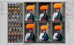
Just seeing Apple use the Black/Gray/Silver Theme through Motion (maybe all of FCP), Apperture and I think now parts of the new iPhoto (that may have just been Appertures' editing functions). Could this be what Apples next theme for Mac OS X?
Personally I like it but it seems to be only in use through the Pro apps.
Personally I like it but it seems to be only in use through the Pro apps.
Attachments
I HATE how the Pro apps look. They're great apps and I use them a lot but I hate how they look.howesey said:I wouldn't be surprized if 10.5 had a black look, like Apples pro apps.
So easy on the eyes though.benjamindaines said:I HATE how the Pro apps look. They're great apps and I use them a lot but I hate how they look.
The important thing about the OS isn't the exact material look, it's the practicality. I think Safari provides a good example of where the new look could become a boon to practicality.
By emulating iTunes 5-6, Safari could gain a sidebar. Rather than having bookmarks and tabs at the top, you could keep them in the sidebar (as preview icons with the webpage) and sort through them like playlists. An intuitive and even spacesaving way to do it.
I'm assuming subsequent app revisions will bring changes like this. The really big change though would be to adopt a unified finder: less confusing and varied and more practical. I really hope that this is planned for the next major OS revision: all the windows switchtards are going to need a really nice simple finder to avoid confusion.
Me too. UNO Gloss is great. I have a feeling 10.5 will be unified, which is cool with me too.radiantm3 said:I already have the UI looking the way I want with UNO (http://gui.interacto.net/index.php)
If they do go to a unified look, I think the iTunes 5-6 look would be the best. I really love the way it looks.
I'm fine with the way it looks now, though.
I'm fine with the way it looks now, though.
Lacero said:I want Cheetah retro pinstripes.Here's to the Crazy Ones
The pinstripes are awesome!
Register on MacRumors! This sidebar will go away, and you'll see fewer ads.