Become a MacRumors Supporter for $50/year with no ads, ability to filter front page stories, and private forums.

kikyuu

macrumors newbie
Original poster
Nov 21, 2016
16
11
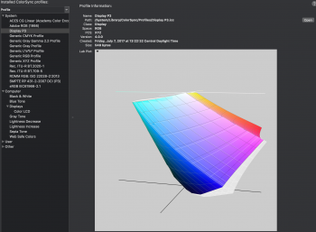
Solid color showing Display P3, compared with the Color LCD profile, which is stretched quite a bit on the blue end. Does this mean the new display has a wider color gamut than P3? Or it is just a bug (running Mojave B4)...
 

Attachments

  • Screen Shot 2018-07-16 at 23.09.02.png
    Screen Shot 2018-07-16 at 23.09.02.png
    866.3 KB · Views: 2,613
Last edited:
Solid color showing Display P3, compared with the Color LCD profile, which is stretched quite a bit one the blue end. Does this mean the new display has a wider color gamut than P3? Or is just a bug (running Mojave B4)...
I noticed the same thing today while using displaycal to calibrate my 2018 13.
 
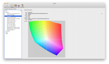
For comparison, my 2016 13"
 

Attachments

  • Screenshot 2018-07-17 at 1.13.06 PM.png
    Screenshot 2018-07-17 at 1.13.06 PM.png
    1.2 MB · Views: 1,098
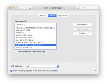
Can anyone please try this highlighted color profile and tell me if this is more natural-looking?

@BigMcGuire @maflynn @Painter2002
I just tried comparing the profile you have selected (SMPTE RP 431-2-2007 DCI (P3)) to the default profile on my 2017 MBP, and while I do see a difference, it is subtle.

I used a two different photos and the reds and contrast are probably slightly more natural looking on the profile you have selected, but personally I like stronger contrast of the default "Color LCD" profile better.
 
Solid color showing Display P3, compared with the Color LCD profile, which is stretched quite a bit on the blue end. Does this mean the new display has a wider color gamut than P3? Or it is just a bug (running Mojave B4)...

Maybe a bug.

The MBP 2016-2018 default profile 'Color LCD' is the same as the profile 'Display P3'.
 
Maybe a bug.

The MBP 2016-2018 default profile 'Color LCD' is the same as the profile 'Display P3'.
I'm thinking it should look the same because the OS has color management. So unless the image is P3 it should look the same and even then if it's on the default Color LCD profile it will still display a P3 image as well.

Just an educated guess though.
 
I'm thinking it should look the same because the OS has color management. So unless the image is P3 it should look the same and even then if it's on the default Color LCD profile it will still display a P3 image as well.

Just an educated guess though.

P3 is good for now but I feel it will be replaced quickly. It’s not a print, web or HDR standard.
 
P3 is good for now but I feel it will be replaced quickly. It’s not a print, web or HDR standard.
My understanding is that while HDR is within a Rec.2020 container, the standard is to have it fit within P3 -- but I don't work in that field.
 
I just tried comparing the profile you have selected (SMPTE RP 431-2-2007 DCI (P3)) to the default profile on my 2017 MBP, and while I do see a difference, it is subtle.

I used a two different photos and the reds and contrast are probably slightly more natural looking on the profile you have selected, but personally I like stronger contrast of the default "Color LCD" profile better.

Same boat, while the overall colours look more natural on the selected profile, the default profile makes things pop.. :p
 
  • Like
Reactions: Painter2002
Can anyone please try this highlighted color profile and tell me if this is more natural-looking?

@BigMcGuire @maflynn @Painter2002

Sorry for late reply. Been one of those days where I had no free time at work, lol. You now its bad when you can't do much MR at work. <cough>

Switching between the default and the SMPTE - everything is brighter, chalkier. But mostly, things aren't as dark and the colors stand out a bit more.

I'll be honest with you, I am terrible at these color profile things and gauging natural / correct color, so I've stayed far from it all. :)

So I took out my phone and ... hopefully this helps?

https://photos.app.goo.gl/9XPrLBL4higeHCkB8

It takes the dark in the window colors and really brightens them up, makes them feel chalky. lol. But I could definitely get used to it. Definitely makes the pictures lighter.
I just tried comparing the profile you have selected (SMPTE RP 431-2-2007 DCI (P3)) to the default profile on my 2017 MBP, and while I do see a difference, it is subtle.

I used a two different photos and the reds and contrast are probably slightly more natural looking on the profile you have selected, but personally I like stronger contrast of the default "Color LCD" profile better.
I also use the Color LCD profile since it’s “calibrated” for the device. Also, though some apps are color managed, some system level features seem not, like wallpapers.
Just want to point out that DCI P3 is not exactly display P3. Display P3 is kind of defined by apple. It pretty much covers the same area on the chromaticity diagram as DCI P3 but has different white point and gamma to make display P3 “backward compatible” with sRGB.
 
  • Like
Reactions: macintoshmac
I also use the Color LCD profile since it’s “calibrated” for the device. Also, though some apps are color managed, some system level features seem not, like wallpapers.
Just want to point out that DCI P3 is not exactly display P3. Display P3 is kind of defined by apple. It pretty much covers the same area on the chromaticity diagram as DCI P3 but has different white point and gamma to make display P3 “backward compatible” with sRGB.

So, using DCI P3 has certain disadvantages?
 
Some colors may look slightly different but I think it all comes to which one you prefer (as long as you don’t need to work on something that requires very accurate color representation)

ok... Let me enlighten you.. each color profile has a specific reason of existence and it is not just a mood board and what colors you prefer to see like a filter on Instagram. For example if you are color grading a photo for digital printing then you should use adobe RGB CMYK. I f you are color graiding for TV then you should use a color profile of Rec 709. if you are color grading for HDR platform use Rec 2020 And if you are color grading a film for the cinema screens that is going to be a DCP (digital cinema package) then you MUST use DCI - P3. The color profiles varies between those categories because there is a difference in technology and algorithms. TV screens use a diferent algorithm than DCI projectors on cinemas. For example on printing industry the colors you see depend on the light that exists on the room so you have to "convert" what you see on the comuter screen to the paper. On the other hand on TV screen you see the source of the light and that is why you cant have pure blacks (even in blacks there is a bit of light). on The projectors the picture is reflected from the wall to your eyes. So as as YOU NEED to work on something that requires very accurate color representation use the coresponding color profile. for Cinema screens is DCI P3 and nothing else.
Last but not least there are monitors that are dedicated for professional color profiles like DCI and usually these monitors are very expensive.
 
  • Like
Reactions: StralyanPithecus
ok... Let me enlighten you.. each color profile has a specific reason of existence and it is not just a mood board and what colors you prefer to see like a filter on Instagram. For example if you are color grading a photo for digital printing then you should use adobe RGB CMYK. I f you are color graiding for TV then you should use a color profile of Rec 709. if you are color grading for HDR platform use Rec 2020 And if you are color grading a film for the cinema screens that is going to be a DCP (digital cinema package) then you MUST use DCI - P3. The color profiles varies between those categories because there is a difference in technology and algorithms. TV screens use a diferent algorithm than DCI projectors on cinemas. For example on printing industry the colors you see depend on the light that exists on the room so you have to "convert" what you see on the comuter screen to the paper. On the other hand on TV screen you see the source of the light and that is why you cant have pure blacks (even in blacks there is a bit of light). on The projectors the picture is reflected from the wall to your eyes. So as as YOU NEED to work on something that requires very accurate color representation use the coresponding color profile. for Cinema screens is DCI P3 and nothing else.
Last but not least there are monitors that are dedicated for professional color profiles like DCI and usually these monitors are very expensive.
Isn't that why I said "as long as you don’t need to work on something that requires very accurate color representation"?
 
Register on MacRumors! This sidebar will go away, and you'll see fewer ads.