Here's a list of the things that have been completely annoying me about Spotlight in Leopard. For me, Spotlight has been severely downgraded in Leopard.
1. No more Spotlight Window (big clean window with search results organized with RSS-like interface)
2. Spotlight Searches open in very small Finder windows (need to resize and stretch column headers to get the results to display with any type of readability)
3. Icon view in Spotlight searches are almost completely useless cause you can hardly read the names under the icons unless you make the icons huge.
4. Any manual view settings you apply to a search window will not stick for next time you search. Icons go back to small in icon view and lists do not retain the same column header sizes.
5. When you use the search field in a Finder window, it always automatically searches your entire system even though 99% of the time, I'm just trying to search within that folder. (I use the Spotlight menu to search my drive)
6. There is no more date column in Spotlight's Finder window. Instead, there's a "Last Opened" column which really isn't what I'd be mostly concerned about. I don't need to know when I last OPENED a file... I wanna know when I last saved a file... and of course, there are no view options for Spotligh search windows. However, I know I can add a search criteria to my Spotlight search to sort it by date or whatnot but, that's one extra step that I didn't used to have to take. It was nice just being able to glance over at the modified date of a file.
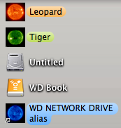
7. Visual annoyances: Can't seem to get rid of the horizontal scroll bar when viewing Spotlight Searches in the Finder.... Spotlight always opens in a tiny window with a horizontal scroll bar and half the names are cut off by the small list headers columns.
8. What happened to the very simple category separations? I used to love that all of my Fonts were grouped, all of my PDFs were grouped, all of my Images were grouped and that sort of thing. That was VERY nice because you could visually and quickly find what you are looking for. If it was a PDF I was looking for, I could just quickly glance to the PDF section and completely skip over the image and text documents sections because those weren't needed. It was just another way to refine the search better.
Overall, I think Spotlight got a lot worse in Leopard... it feels very unfinished and poorly thought out. They changed what was once good into something that is just so ugly that it's not even funny. I almost hate searching in Leopard now... it just isn't the same and not for the better.
ONE plug about Spotlight in Leopard: Yes, it's faster but, I'd rather have slower but, more organized results.
Any thoughts?
List your thoughts on the new Spotlight. If you think it's better, explain your reasons, if you think it's worse, explain your reasons as well.
1. No more Spotlight Window (big clean window with search results organized with RSS-like interface)
2. Spotlight Searches open in very small Finder windows (need to resize and stretch column headers to get the results to display with any type of readability)
3. Icon view in Spotlight searches are almost completely useless cause you can hardly read the names under the icons unless you make the icons huge.
4. Any manual view settings you apply to a search window will not stick for next time you search. Icons go back to small in icon view and lists do not retain the same column header sizes.
5. When you use the search field in a Finder window, it always automatically searches your entire system even though 99% of the time, I'm just trying to search within that folder. (I use the Spotlight menu to search my drive)
6. There is no more date column in Spotlight's Finder window. Instead, there's a "Last Opened" column which really isn't what I'd be mostly concerned about. I don't need to know when I last OPENED a file... I wanna know when I last saved a file... and of course, there are no view options for Spotligh search windows. However, I know I can add a search criteria to my Spotlight search to sort it by date or whatnot but, that's one extra step that I didn't used to have to take. It was nice just being able to glance over at the modified date of a file.
7. Visual annoyances: Can't seem to get rid of the horizontal scroll bar when viewing Spotlight Searches in the Finder.... Spotlight always opens in a tiny window with a horizontal scroll bar and half the names are cut off by the small list headers columns.
8. What happened to the very simple category separations? I used to love that all of my Fonts were grouped, all of my PDFs were grouped, all of my Images were grouped and that sort of thing. That was VERY nice because you could visually and quickly find what you are looking for. If it was a PDF I was looking for, I could just quickly glance to the PDF section and completely skip over the image and text documents sections because those weren't needed. It was just another way to refine the search better.
Overall, I think Spotlight got a lot worse in Leopard... it feels very unfinished and poorly thought out. They changed what was once good into something that is just so ugly that it's not even funny. I almost hate searching in Leopard now... it just isn't the same and not for the better.
ONE plug about Spotlight in Leopard: Yes, it's faster but, I'd rather have slower but, more organized results.
Any thoughts?
List your thoughts on the new Spotlight. If you think it's better, explain your reasons, if you think it's worse, explain your reasons as well.