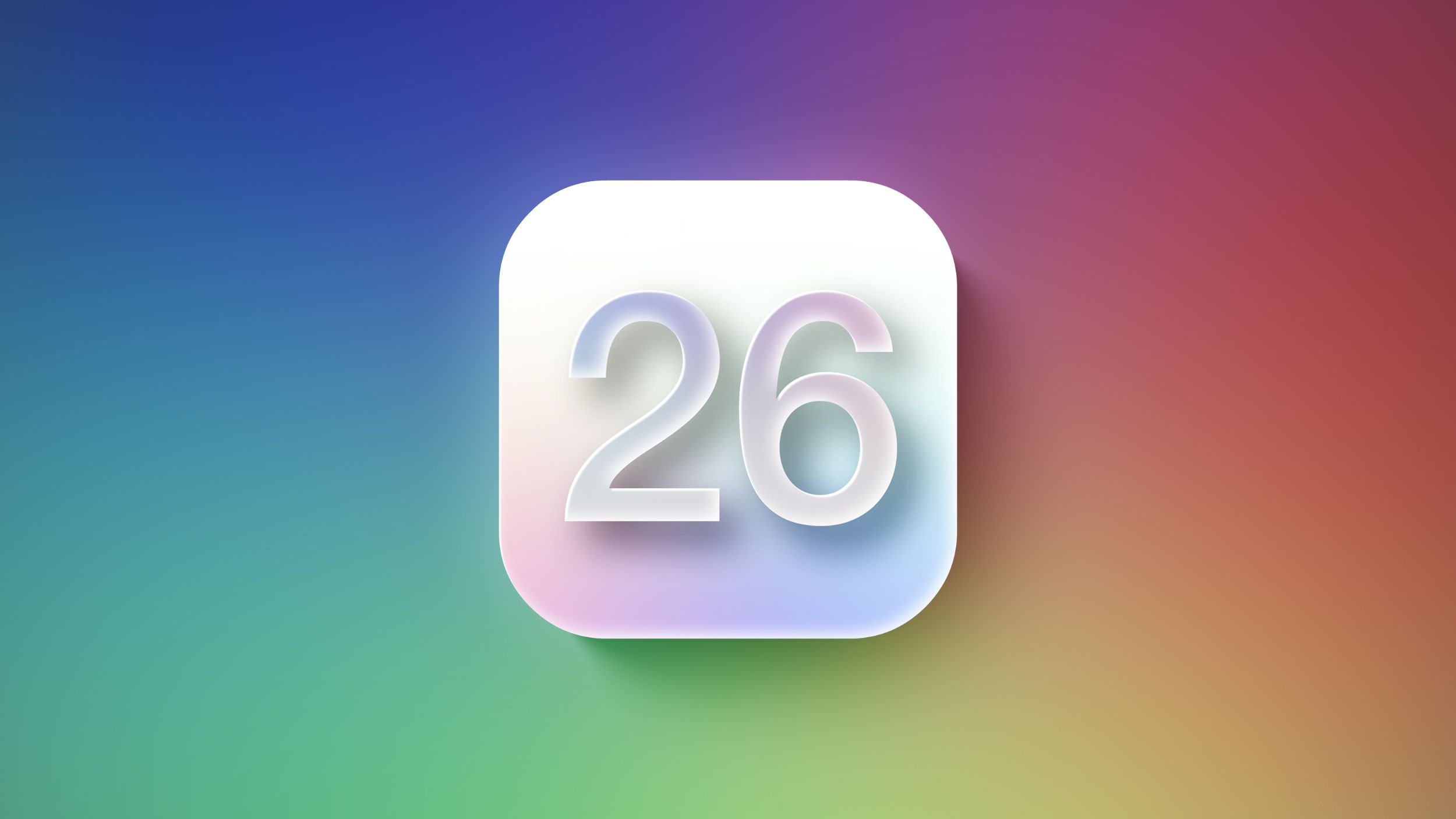
Become a MacRumors Supporter for $50/year with no ads, ability to filter front page stories, and private forums.
I just hope it's better than what it is. Looking at the visionOS UI there are cases that I like, others that bored, others that lack contrast.

We are very focused on visionOS UI but maybe these changes are something new.

iOS 7 UI -> visionOS UI -> New UI
 
On Apple Vision and even Apple TV the translucent feature would be dope….but on a iPhone that seems messy when your screen is very limited and are trying to limit background distractions.

Also the round app icons. Seems meh. Always liked the more crisp lines that Apple layouts gave.
 
I'm not talking about breaking paradigms. Just because you've done something a certain way for 20 years doesn't mean it's the BEST way. And I'm not in any way suggesting change for the sake of change, either. For instance the paradigms you're probably thinking of as just but one example is the Safari toolbar fiasco of a couple versions back. I'm not looking for that & hopefully Apple's not going to make THOSE types of mistakes in completely overhauling the U.I. of all of its OSes.
Yet you advocate doing away with the traffic light styled window control buttons because they tire you. Quite frankly that most definitely sounds like change for the sake of change. To this very day I think the concept is brilliant and works really well. I still have to meet the person that didn’t immediately (or close to immediately) understand what the colors translate to.
 
Last edited:
Just keep the translucently and glass effects to a subtle minimum.

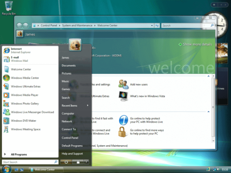
Don't pour them on wholesale because you decided that's your new look, i.e. Windows Aero.
 
  • Like
Reactions: MacMediaNet
I don't mind a new lick of paint. I am just a bit worried that my choice for a black walpaper and grayscale icons will make all apps look dull with glassmorphism. For VisionOS it makes a lot of sense as the backdrop is very dynamic, this is not the case on iOS (I guess the wallpaper will play a more central role).

I hope they combine the notification centre and control panel, or at least find a more convenient way for getting them up (I am not expecting the bottom swipe coming back), instead of having to spread my chopsticks to the far edge of the screen.
 
Last edited:
  • Like
Reactions: gusmula and jwdsail
I'm still not clear on what value translucency adds to a device like the phone. What's it going to bring in behind a currently running app? My wallpaper? Data from my camera? It might make sense in a camera app, but most apps are not camera apps. This also sounds like it could be a bit of a nightmare for contrast and general legibility.
 
Changing how a user interface looks is fine, and I know Apple likes to change and improve the way computers work (the mouse, the removal of the floppy disk, and the iPod, which puts music in your pocket), but I wish they would focus a lot more on their customers and the ideas we share in Applezines, forums, and even their own Support Community forum.

But can they please fix the bugs and design flaws in the current crop of default app's. For example, macOS Music, Calendar, Mail and TV apps all need a total overhaul and redesign. Of these four apps alone, there are many third party apps out there that are way better. Apple can certainly afford to purchase a lot of the intellectual property of these superior third party apps, and they do, but I just wish they would take cues from the ideas their consumer base provides.

I will give Apple credit; they have steadfastly adhered to the KISS principle, in contrast to Microsoft software's maze-like features.
 
Last edited:
Are translucency and glassy-ness not the same thing?
Glassiness usually implies stuff like reflections or highlights to make it look like glass, or in case of visionOS blurred translucency with minor 3D effects or texture to make it look like frosted glass.
 
I'm still not clear on what value translucency adds to a device like the phone. What's it going to bring in behind a currently running app? My wallpaper? Data from my camera? It might make sense in a camera app, but most apps are not camera apps. This also sounds like it could be a bit of a nightmare for contrast and general legibility.
It looks like it’ll be similar to how the Control Center background already behaves, but more pronounced and extended to all kinds of UI controls.
 
I’m ready for a system wide redesign, but I swear to god I will choke on my brown sugar shaken espresso if they announce round icons. Is that really the best they can do in 2025? Android has been doing that for years, and they don’t look good. Just give the OS a fresh coat of paint and leave the shape of the icons alone!
 
I know these are just mock-up concepts, but I hope the final product at WWDC looks better than what I'm seeing here. I guess it will incorporate some kind of ray tracing lighting effects perhaps if the processor allows it?
 
It looks like it’ll be similar to how the Control Center background already behaves, but more pronounced and extended to all kinds of UI controls.
But for what purpose? The Control Center background is like that to signal that it's just an overlay over the homescreen or whatever app you're in. If the whole UI is like that then its meaningless.

It's like how when people who don't know how to write well just bold and capitalise and underline and put exclamation points on everything, but then when they want something to stand out they have nowhere left to go because they've already used up all their tools for emphasis.

I'm not saying Apple can't solve this problem, I just wonder what the purpose of this is other than "it looks pretty".
 
let’s call it “noOS” and just make it run darwin, only boots a terminal, which is still an os, but the gui is completely clear this way. Let’s cut to the chase… i have good ideas…
 
  • Haha
Reactions: iLLUMI
Fingers crossed!
 

Attachments

  • IMG_0434.png
    IMG_0434.png
    91.5 KB · Views: 54
Register on MacRumors! This sidebar will go away, and you'll see fewer ads.