Become a MacRumors Supporter for $50/year with no ads, ability to filter front page stories, and private forums.

Sounds Good

macrumors 68000
Original poster
Jul 8, 2007
1,692
57
If I look at a web page on a PC, the text looks nice and crisp to me. If I look at the same web page on a Mac, the text seems a bit blurry, or slightly fuzzy.

I Googled ‘mac blurry fonts’ and found that it's apparently due to Apple's font smoothing or rendering (or something like that).

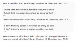
Since this fuzziness really bothers me, I'm wondering if there's a fix for it. Maybe a way to turn off the font rendering, or just tweak it a bit (similar to ClearType in Windows?).

The funny thing is that text on my iPhone looks great -- nice and crisp. So I'm really hoping that text on a MBP can be tweaked to look just as crisp as it does on an iPhone.

Any thoughts? Suggestions?

Thanks...
 
I noticed it too when I bought my first Mac. I started a thread on Notebookreview here.

These images show it well: (OS X on top, Windows Cleartype beneath):
font-rendering-safari3-closeup.png

font-rendering-ie7-closeup.png

http://www.codinghorror.com/blog/archives/000884.html

(Windows Cleartype on top, OS X beneath)
firefox-vs-safari.jpg


I don't know anyway to disable it. Too bad because it stops me from buying Mac again. Windows just looks sharper. I'll be very interested if this can be changed.
 
These images show it well: (OS X on top, Windows Cleartype beneath):

I don't know anyway to disable it. Too bad because it stops me from buying Mac again. Windows just looks sharper. I'll be very interested if this can be changed.
Bingo, that's it! :)

Anyone know of a way to tweak this?
 
If I look at a web page on a PC, the text looks nice and crisp to me. If I look at the same web page on a Mac, the text seems a bit blurry, or slightly fuzzy.

That's an issue with the way macs do their font smoothing (anti-aliasing), and is very subjective. I happen to prefer the mac look to the windows look. But there are some ways to tweak it.

If you go to your System Preferences, and then to Appearances, there should be a Font Smoothing Style pulldown (at least in OS 10.5.X). Based on the way you describe it, it seems like you should try the Light option, but you may as well try all of them to see which suits you best. If none of them are satisfactory, you may just try turning off the smoothing altogether for smaller fonts by setting the minimum text smoothing size at 10 or 12 points.

Edit: Make sure to restart the application after making changes in the System Prefs. The fonts do not update automatically.
 
That's an issue with the way macs do their font smoothing (anti-aliasing), and is very subjective. I happen to prefer the mac look to the windows look.

I'm with you there. Looking at text in Windows always looks too jagged and old school to me. But I'm a lifer, so there's no helping me. I noticed that IE8 does significant font smoothing though, much more Mac-like.
 
So there's no workaround for this?

I'm with you there. Looking at text in Windows always looks too jagged and old school to me.

Really, you think the (Safari) half of the picture I posted looks better than the (Firefox) top half?
 
Is OS X Zoomed in at all?

Hold Control, and scroll the mouse back or forward to see. If it doesn't zoom check mouse preferences, it may be set to another button.


I just remember having my screen blurry, not just for web pages -- everything. I found out I was zoomed in very slightly, and doing so made a noticeable difference in text sharpness.


I've never known my mac to show anything blurry over windows (except for when I had the above problem).
 
I noticed it too when I bought my first Mac. I started a thread on Notebookreview here.

These images show it well: (OS X on top, Windows Cleartype beneath):
http://www.codinghorror.com/blog/images/font-rendering-safari3-closeup.png
http://www.codinghorror.com/blog/images/font-rendering-ie7-closeup.png
http://www.codinghorror.com/blog/archives/000884.html

(Windows Cleartype on top, OS X beneath)
http://i609.photobucket.com/albums/tt179/Vantage72/firefox-vs-safari.jpg

I don't know anyway to disable it. Too bad because it stops me from buying Mac again. Windows just looks sharper. I'll be very interested if this can be changed.

Whoa, that mac screenshot looks blurry! I don't think my screen is nowhere as blurry as that!
 
There is definitely something weird with that Safari shot. If my Macs looked that bad I'd go blind squinting at them all the time.

The other day I installed a new monitor on my Mac and it looked brilliant. I installed some system updates, restarted and it looked fuzzy (the letter "t" in lowercase was particularly noticeable for having fuzzy smoothing) and didn't seem too responsive to changes I made in the smoothing or font settings; quite like that screenshot. I am quite picky about screens so was quite upset. Fortunately another unrelated problem manifested and I ended up restarting again and zapping the PRAM. When it came up again, my crystal clear fonts were back. I can't promise that will fix it for anyone else as I was running updates that day and it could have been anything but definitely try all of the usual troubleshooting steps if you think something looks that off.

I appreciate the smoothing exists but that example picture just looks so gutwrenchingly bad that it is definitely not normal. Windows (on which I am typing this) looks ok to me when it's configured right, but so does OSX.
 
There is definitely something weird with that Safari shot. If my Macs looked that bad I'd go blind squinting at them all the time.

I thought it was quite accurate. It only becomes apparent when connecting a Windows laptop and Apple laptop to the same screen, and then switching.

Edit: Seeing the other screenshot, maybe it got exaggerated. Still a little bit blurry compared to my Windows fonts though.


Thanks. That's a good screenshot, except that it is quite enlarged, which makes the fonts better. I'll make it smaller.
 
Excellent. That is EXACTLY the difference I see when I look at a Mac screen vs. PC.

I sincerely can't imagine how anyone would prefer the Mac text over the ClearType text... nor can I fathom someone not seeing that the Mac text is blurry/fuzzy compared to the PC text.


The important question is, can a Mac's text be tweaked to look more like a PC's text?
 
I acknowledge that it's less sharp, but not that the extreme blurriness reported in the first half of the thread is normal.

For reference (bad picture, not taken on my home machine but a borrowed one) I've attached my view at work, with the examples retaining their order true to the text. It's blurrier but not to the extent of the first comparison, surely? I couldn't even read the username in that picture without straining and I've been using Macs all my life. I will look at home later on my real machines.

http://www.joelonsoftware.com/items/2007/06/12.html has a nice comparison pic too.

Anyway, we've established the OP doesn't like it. Obvious one maybe but have you tried just tinkering with your font smoothing in System Preferences/Appearance?
 

Attachments

  • compare.png
    compare.png
    68.1 KB · Views: 188
I acknowledge that it's less sharp, but not that the extreme blurriness reported in the first half of the thread is normal.
I agree the Safari screenshot makes it looks worse.

I do not think that is a very good picture. It looks very different to what I'm witnessing here.

This is more like it: http://www.codinghorror.com/blog/archives/000884.html
 
...have you tried just tinkering with your font smoothing in System Preferences/Appearance?
I don't own a Mac (yet). To be honest, this fuzzy font thing is holding me back from buying, so I'm hoping for a workaround. I'm on my laptop staring at the screen all day every day, and I'm a stickler about crisp text. The crisper the better! ;)

I agree the Safari screenshot makes it looks worse.
Me too -- but I guess that doesn't really matter as long as we've established that the PC rendering does appear sharper to some people's eyes. Now we just need to see if there's a fix for it, and at least two of us in this thread will be happy campers! :)
 
I don't own a Mac (yet). To be honest, this fuzzy font thing is holding me back from buying, so I'm hoping for a workaround. I'm on my laptop staring at the screen all day every day, and I'm a stickler about crisp text. The crisper the better! ;)

Ok, I just experimented on the mini here and with Tinkertool (a free little app which is worth having regardless) you can disable it for fonts under 144pt, which should be sufficient for most humans ;)

Sample from Safari attached, taken just now on the same machine I took the last Mac sample from.

Unfortunately it now makes this Windows machine with Cleartype look fuzzy to me :p argh.
 

Attachments

  • Picture 1.png
    Picture 1.png
    13.3 KB · Views: 171
Really, you think the (Safari) half of the picture I posted looks better than the (Firefox) top half?

Well, none of my Macs look as blurry as your screen shot there. We still don't know which Mac you're viewing it on, nor if you're using a 3rd party LCD display. I've had problems with some displays making Mac OS X look exceedingly terrible (Dell UlstraSharp, ugh), particularly when not run in the native max resolution of the screen.

Some of my examples, one of these is from Firefox on the Mac, looks smooth to my eyes. The other is the same version of Firefox from WinXP, it looks ugly and poorly rendered to me.

Look at the "A", the first letter of the blurb below the picture. On the Mac side, it's smooth. On the Windows side, it's jagged. To me, jagged != modern.

20090611-cumnifnfe77afi68k771b7gc49.jpg
20090611-8m3dmmphi66xht1nuhn9y1xejy.jpg
 
Ok, I just experimented on the mini here and with Tinkertool (a free little app which is worth having regardless) you can disable it for fonts under 144pt, which should be sufficient for most humans ;)
I'll look into this Tinkerbell ;) thing. Thanks!

On the Windows side, it's jagged.
Are you using ClearType on the Windows side? It makes a big difference -- thin jagged text becomes crisp, sharp and properly weighted. And you can further tweak it to make the text look best to your eyes.

Actually, I was really hoping that the Mac had a form of ClearType.
 
Are you using ClearType on the Windows side?

Nope, why would I? Shouldn't it be on by default? I suspect most generic Windows user (of which I am one) wouldn't know about ClearType.

Ewww, I turned font smoothing (on the Mac) off for size 12 and under. Ugh! I think years of using Mac OS X has allowed Apple to zombie wire my brain about what "looks good".
 
Nope, why would I? Shouldn't it be on by default? I suspect most generic Windows user (of which I am one) wouldn't know about ClearType.
Nah, it's not on by default. I don't know why.

Why is there no Backspace key on a MBP? I don't know why. ;)

Anyway, I figured it was not on, since it looked the way it looked -- I just wanted to double-check. And no, I would not expect anyone to know about ClearType by default. Silly of Microsoft to not make better mention of it since it really DOES make a difference.
 
RE: Tweaking font smoothing...

RE:
"Anyone know of a way to tweak this?"

Download "TinkerTool".
It's free.

- John
 
Well, none of my Macs look as blurry as your screen shot there. We still don't know which Mac you're viewing it on, nor if you're using a 3rd party LCD display. I've had problems with some displays making Mac OS X look exceedingly terrible (Dell UlstraSharp, ugh), particularly when not run in the native max resolution of the screen.

I'm using screenshots, not photographs of the display. What kind of display I use is irrelevant I believe. And yes to make Windows fonts look good Cleartype has to be turned on.

I first noticed this blurring effect when I bought my first Mac: MBA first gen. I noticed it on the MBA display itself. I thought I got a wrong display. I started this thread on Notebookreview:
http://forum.notebookreview.com/showthread.php?t=245012

RE:
"Anyone know of a way to tweak this?"

Download "TinkerTool".
It's free.

Hurray. Can anyone make a screenshot to confirm that this makes the letters crisper?
 
Register on MacRumors! This sidebar will go away, and you'll see fewer ads.