Become a MacRumors Supporter for $50/year with no ads, ability to filter front page stories, and private forums.
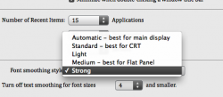
I'm surprised no ones brought this up....you can find this under System Prefs --> Appearance. You need to quit and reopen whatever program to see the difference.

There isn't much difference between 'Standard' and 'Strong'. It's far more subtle than I thought. I've had mine on Strong since I remember out of preference. Left is the lowest smoothing, right is strong (highest). I'll combine the two pics in a sec.

PS: hope the choice of article doesn't offend anyone :) Just chose the first headline I saw.
 

Attachments

  • Picture 2.png
    Picture 2.png
    38.2 KB · Views: 80
  • Untitled.png
    Untitled.png
    262.9 KB · Views: 133
I suppose this issue is largely relegated to one's computing experience? As a longtime Windows user, once becomes accustomed to how fonts should look from a Windows perspective. The same is true of the Mac perspective, the camp which I am from (clearly).
 
Think about it. WHY would high end pc gamers get $500 video cards to enable multiple pass ANTI-ALIAS at high resolution?

Non anti-alias font is a relic of low quality computing.

Anti-alias is the way to go.
 
I don't really have a "fix", though I do know what you are talking about, and I can make some recommendations.

First of all, fonts in OSX do tend to be a bit blurry. IMO they look better on a high DPI display since the smaller, tightly packed pixels tend to hide the excessive smoothing. I don't know what kind of Mac you are using, but say a 22" LCD running at 1680x1050 tends to look a little bleh.

The two recommendations I can make are:

1.) Make sure your macs gamma is set to 2.2. This is the windows default. OSX is default to 1.8. A higher gamma makes the blacks blacker and makes the screen look less "washed out". This helps a bit with font viewing. You can make this change under the display settings, clicking calibrate, and changing the gamma to 2.2 (don't need to change anything else).

2.) Set the font smoothing under "appearance" settings to "standard - best for CRT". This might seem backwards considering almost everyone uses an LCD these days, but the standard font smoothing turns off sub-pixel rendering. This gets rid of what some users describe as "colored noise" around text, since text is only rendered in shades of grey instead of RGB. Make sure you restart Safari and/or your Mac for the changes to take effect.
 
A screenshot of my Mac running Safari and this thread (nested screenshots, yay! :) ):

fonts.png


Not blurry, looks better than Windows to me. Font smoothing set to standard.

--Eric
 
I attached one in my previous post :(
Thanks, I missed that. That's interesting. Now it looks like without AA or Cleartype.

Not blurry, looks better than Windows to me. Font smoothing set to standard.
When you increase the size of the letters it makes it look better.

And we're now taking screenshots of screenshots, with increases and decreases of size and jpg compressionrates, it is not accurate anymore.

Here's one captured in the same frame, same size, no jpg compression:
 

Attachments

  • Fonts.bmp
    182.6 KB · Views: 126
Register on MacRumors! This sidebar will go away, and you'll see fewer ads.