markgpearse
macrumors 6502
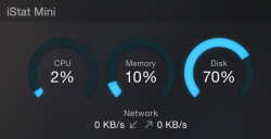
Deleted Monity wich keeps crashing while over VPN
Funny that MacRumors would push an app like Monity that doesn't even work!
Deleted Monity wich keeps crashing while over VPN
Taking the functionality of Dashboard and cramming everything into a thin vertical strip of screen ranks up there as one of the worse UX ideas Apple has come up with in the past few years. It's a good thing Dashboard still exists in Yosemite. One key-press gives me tons of relevant information at a glance. Notification Center is a square peg shoved into a round hole.
Yeah I noticed after I downloaded it today, it has been removed from the front page of the App Store so it may have been pulled for some reason.
Taking the functionality of Dashboard and cramming everything into a thin vertical strip of screen ranks up there as one of the worse UX ideas Apple has come up with in the past few years. It's a good thing Dashboard still exists in Yosemite. One key-press gives me tons of relevant information at a glance. Notification Center is a square peg shoved into a round hole.
Disagree. Found myself never using Dashboard but I'm rather enjoying Notification Center. Primarily because it doesn't move me out of whatever app Im using.
I would love to see a Google Play Music widget.
Disagree. Found myself never using Dashboard but I'm rather enjoying Notification Center. Primarily because it doesn't move me out of whatever app Im using.
Taking the functionality of Dashboard and cramming everything into a thin vertical strip of screen ranks up there as one of the worse UX ideas Apple has come up with in the past few years. It's a good thing Dashboard still exists in Yosemite. One key-press gives me tons of relevant information at a glance. Notification Center is a square peg shoved into a round hole.
Not sure if I'm allowed to advertise here, but Lyrical is also a Notification Center widget that lets you control iTunes, and shows you song information/lyrics. I just uploaded v1.0.1 with some UI fixes and v1.1 will have Last.fm support, and a much better icon. The current one is a bit ugly I know, I sort of rushed it when Apple announced I can submit my app. 🙂
Check out the Link to it in my sig.
Oh and also, it's pretty helpful to set a keyboard shortcut for the Notification Center, (I like Option + Space, similar to Command+Space for Spotlight) if you don't want to move your hands away from the keyboard. It's quicker than moving your hand to perform the gesture, imo.
Taking the functionality of Dashboard and cramming everything into a thin vertical strip of screen ranks up there as one of the worse UX ideas Apple has come up with in the past few years. It's a good thing Dashboard still exists in Yosemite. One key-press gives me tons of relevant information at a glance. Notification Center is a square peg shoved into a round hole.
Disagree. Found myself never using Dashboard but I'm rather enjoying Notification Center. Primarily because it doesn't move me out of whatever app Im using.
I wish the message board would let me give this a +1000 ... though we seem to be the only 2 people left who like Dashboard.
----------
You can change this back to the pre-Lion way of doing things by going into Mission Control prefs and have the Dashboard show as an overlay (Apple have changed this .. it used to be a checkbox as to whether or not you wanted the Dashboard to show as a space or not).
Just upgraded to Yosemite yesterday and there is a large question mark icon in the dock and when I point at it it is identified as "ControlCenter" ... but nothing happens when I click on it? What is it supposed to do... I don't find a "ControlCenter" app in the applications and no mention of it on any of the online sources I've checked. Any reason to NOT delete it?
You don't HAVE to leave your existing app to use Dashboard.
Go to Settings/Mission Control, find the Dashboard Popup menu (about halfway down the window) and choose As Overlay (rather than the default of As Space).
This will give you a Dashboard which
- appears on top of your existing apps (it zooms in and zooms out rather than sliding/pushing)
- cannot be accessed via the 3-fingers swipe on a trackpad (because it's no longer a space) but
- CAN be accessed via F12
I don't know if this is the right sort of setting for you, but I find it helpful.
I agree with the original complainer that I tend to have so much stuff displayed in Dashboard that I don't want it all (can't fit it) in a small sidebar, and I don't look at it often, but I do want it all to be there when I do access it.
Great little app! Just a few requests from a first time user:
• Is it possible to have it as an invisible app, so it doesn't show in the Menubar?
• Can you make it so you can scrub the track you're listening to when you click the play bar?
• Can you add the option to select the AirPlay device in the widget?
• If there are no lyrics, just don't show anything
• Clicking the Album Art takes you to iTunes
Thanks!
Funny that MacRumors would push an app like Monity that doesn't even work!
Funny that MacRumors would push an app like Monity that doesn't even work!
There are all great suggestions! Thanks, I'll work on adding them in 🙂
Edit: You can freely quit the menu bar icon without making the widget disappear.
Deleted Monity wich keeps crashing while over VPN