Become a MacRumors Supporter for $50/year with no ads, ability to filter front page stories, and private forums.

zevrix

macrumors 6502a
Original poster
Ok, installed Golden Gate. Explored the UI changes. It's pretty much unbelievable. They really have lost their mind with this glassy 3D garbage there. Now they have even ruined menus.

I'm talking about this look:

1782230038133.png
1782230272262.png


This is so outdated, overproduced, uncool, cheap, forced, out of touch with reality, tasteless, ugly, heavy, pathetic, and otherwise idiotic.

It looks like if some kind of a "vintage skin" is applied to the UI.

It's repulsive.

And now we're going to be stuck with this garbage for years.

(Yes, I know this is only my own personal views.)
 
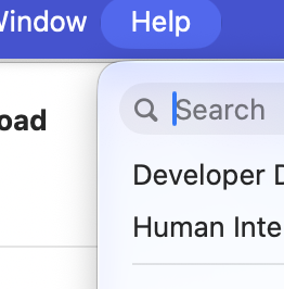
Compare this cool, normal search field that Apple finally managed to deliver:

1782281102173.png


To this glassified filth that doesn't even look like a text field:

1782281036916.png


Came straight from experiments of an excited teenager who discovered Photoshop in the late 90s and thought that all those filters are sooo cooooool just wow wow.

This drivel had its place in the early 2000s, it's died out naturally, and it's great it did. Who the hell creates this kind of UI these days? Apple decided to revive this garbage for reasons that are impossible to comprehend.
 
Compare this cool, normal search field that Apple finally managed to deliver:

View attachment 2640579

To this glassified filth that doesn't even look like a text field:

View attachment 2640578
This is a big issue with Liquid Glass, conceptually. I understand it being used on areas that are contextual and change within the program, but a text field is not a button and should be treated as an area waiting for content to be inserted - thus it should have depth (inset) not an outward facing bubble.
 
Last edited:
Not sure I see the problem, unless we're talking about that hideous Windows XP-blue the developer chose for the colour scheme.
 
Not sure I see the problem, unless we're talking about that hideous Windows XP-blue the developer chose for the colour scheme.

Obviously, personal taste and perception are always involved. If you don't see a problem with this liquid goo kitsch that marched here straight from the worst early-2000s UI nightmares, then you're only lucky:

1782292804261.png


Ironically, when it comes to specifically toolbars, as bad as this liquified monstrosity looks on Golden Gate, it's still an improvement to whatever semi-floating thingie they concocted on Tahoe for which a proper term is impossible to find:

1782293231836.png
 
Damned if they do, damned if they don’t.

Make everything flat and 2D and it’s boring, soulless, lifeless, Steve would never, insert whatever other insult you would like.
Add some whimsy 3D elements and it’s…
outdated, overproduced, uncool, cheap, forced, out of touch with reality, tasteless, ugly, heavy, pathetic, and otherwise idiotic.
Yeah, that.
 
This drivel had its place in the early 2000s, it's died out naturally, and it's great it did.
Yes, and now it’s something else’s turn to die out, and unfortunately it seems it’s the thing you like. That’s very unfortunate.

Wait another 10-15 years, it will be back.
 
Make everything flat and 2D and it’s boring, soulless, lifeless, Steve would never, insert whatever other insult you would like.

There are different ways to execute the flat design properly. And I consistently disliked Apple's overdoing the cheesy 3D thing since the early Aqua days (albeit not in its very beginning).

To give Apple credit, they eventually did right quite a few "flat" things. For example, I admire the colorful flat icons in System Settings. Their new rounded buttons in the alert dialogs are also great, in my view.

Back when Lion was released, I was happy they replaced those ridiculous "aqua" scroll bars with simple flat ones. (Although that was probably the only positive thing they did on Lion.)

That's why it's hard to comprehend what kind of switch exactly blew in their UI team's heads to introduce button's design that is so hopelessly outdated and otherwise ridiculous.
 
It's fine. I don't mind a change to the look after years of boring flat design.

“The look" is not worth discussion over the disappointing performance of Tahoe. Glad to see it's an improvement with GG.
 
I don't like the direction they're moving.
I hated the skeuomorphic era, now I hate the liquid glass era. Minimalism is the most successful solution for user interfaces.
You can almost get to minimalism in Golden Gate by sliding the Liquid Glass control all the way to the right, and then going into Accessibility and enabling borders (as the OP mentions). Couple that with setting your window corner radii to something close to square in Terminal, and you can get GG looking quite nice.
 
You can almost get to minimalism in Golden Gate by sliding the Liquid Glass control all the way to the right, and then going into Accessibility and enabling borders (as the OP mentions). Couple that with setting your window corner radii to something close to square in Terminal, and you can get GG looking quite nice.

To Apple's credit, it looks like they specifically invested time in improving the Show borders accessibility option. Maybe they realized people are really going to need it now.

Prior to Golden Gate, the 'borders' made macOS look pretty ghastly. Now they indeed make the OS look rather cool. And now we can also place this option in the menu bar for instant access.

And Apple keeps improving it. In the last beta, the window borders are now rendered in a pleasant gray color (as opposed to the pure black in the first two Golden Gate betas).
 
  • Like
Reactions: CrabQueenInc
Obviously, personal taste and perception are always involved. If you don't see a problem with this liquid goo kitsch that marched here straight from the worst early-2000s UI nightmares, then you're only lucky:

View attachment 2640621

Ironically, when it comes to specifically toolbars, as bad as this liquified monstrosity looks on Golden Gate, it's still an improvement to whatever semi-floating thingie they concocted on Tahoe for which a proper term is impossible to find:

View attachment 2640622
Tahoe really looks better to you here?

This just illustrated how much I loathed every single software launched at WWDC25, personally.

Still prefer pre-glass design, though.
 
Register on MacRumors! This sidebar will go away, and you'll see fewer ads.