Become a MacRumors Supporter for $50/year with no ads, ability to filter front page stories, and private forums.

MacRumors

macrumors bot
Original poster
Apr 12, 2001
67,633
38,052


Apple is going to unveil iOS 19 in just about two months at its June WWDC event, and rumors suggest that it's going to bring a big change to the iPhone's design. It's been described as the most notable design overhaul since iOS 7, so it should be an exciting update.
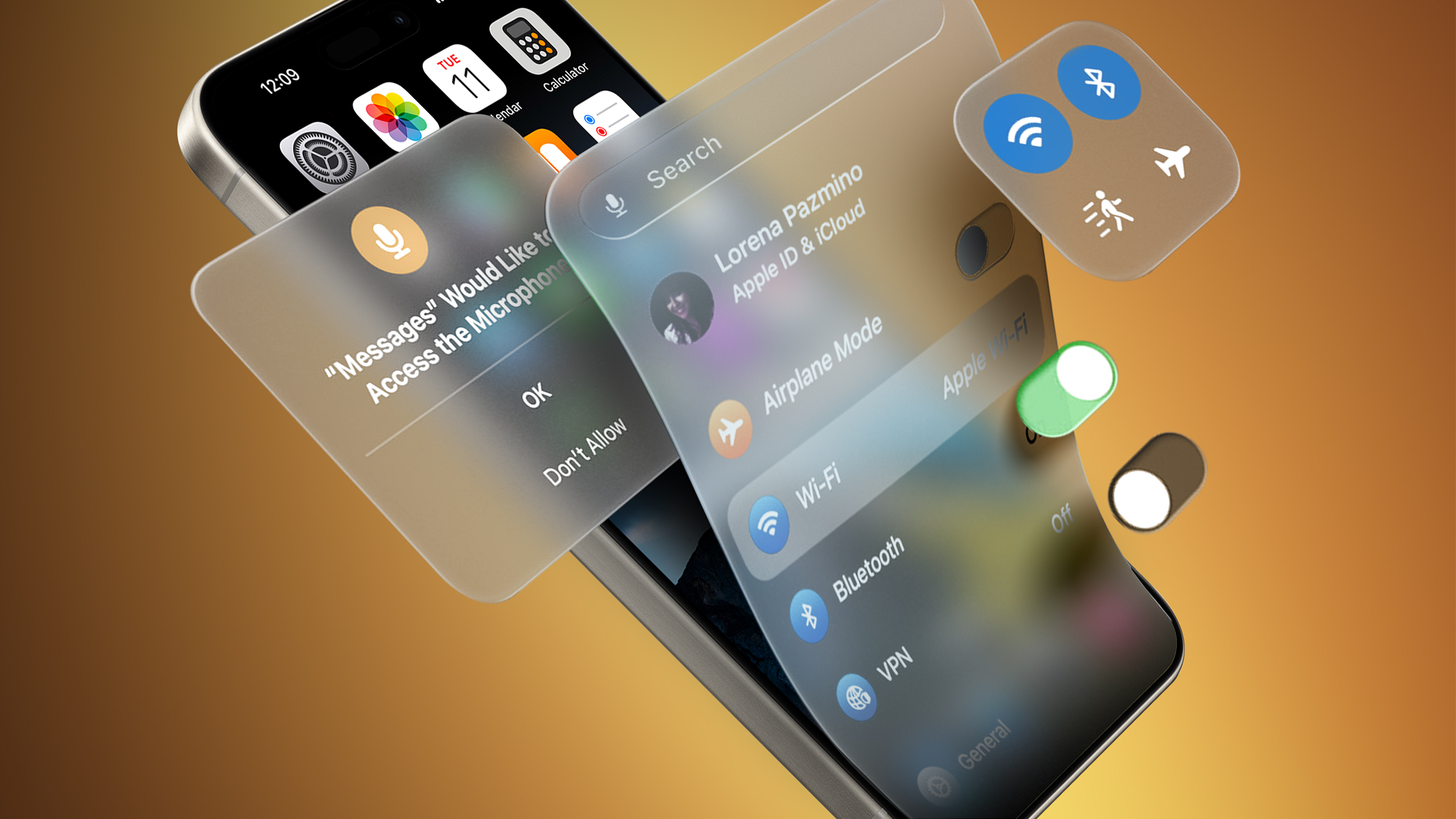
iOS-19-visionOS-UI-Elements.jpg

We've rounded up everything we've heard so far about the design changes coming to iOS 19.
  • visionOS-like design with translucency - iOS 19 is inspired by visionOS, which has an emphasis on translucency and UI elements that kind of fade into the background to put the focus on content. iOS 19 could lean heavily into that translucency, with Apple also opting for a floating look for navigation bars, windows, and other parts of the UI.
  • A glassier look - Remember the Aqua Mac interface? iOS 19 has been described as having glass effects or as being glossy, with menu elements that can "reflect" light based on iPhone tilt.
  • Subtle lighting effects - The "glassy" look involves subtle lighting changes, such as a slight glint for some UI elements when you move the iPhone. The Flashlight and Camera controls on the Lock Screen reportedly have a glass-like sheen that shimmers with movement, for example.
  • More rounded, expanding buttons - Along with a soft, floating look, navigation bars and buttons could have more rounded edges that blend better with the content behind them. In the Photos app, for example, photos could be full screen with controls in a slimmed down menu bar at the bottom rather than a full navigation strip. Haptic Touch menus, Control Center options, and permission prompts apparently have more rounded corners, too.
  • Pill-shaped tab bars - Many apps like the App Store, Apple Music, Apple TV, Photos, Phone, and more have been described as having pill-shaped tab bars at the bottom for accessing controls. There's also less transitioning. Search, for example, doesn't have its own dedicated interface, and instead expands out from the tab bar.
  • Round app icons, maybe - Leaker Jon Prosser says that Apple is going to make the iPhone's icons rounder, though he is unclear if they will be entirely circular or some kind of cross between a circle and the current squircle.
  • Simplified navigation and controls - Apple wants to make it easier to navigate through apps, System settings, and more, so expect a more streamlined experience.
  • Cross-platform cohesiveness - These design changes aren't just coming to iOS - iPadOS and macOS will also get the same overhauled look, so it will be less jarring going from a Mac to an iPhone and vice versa.
Read More

We're keeping track of the iOS 19 rumors in our dedicated iOS 19 roundup, which also has details on Apple Intelligence features, new app capabilities, compatibility, and more.

Article Link: All the Design Changes Rumored for iOS 19 So Far
 
visionOS has good reasons for it’s translucent UI elements and glass pane effects.

But in a phone UI, elegant simplicity really is better than flashy effects. Shiny glass UI elements may be pretty, but they distract from content. Go too far and they become garish.

Let’s hope Apple keeps things simple and subtle!
 
Last edited:
visionOS has good reasons for it’s translucent UI elements and glass pane effects, but iOS can’t say the same.

Elegant simplicity really is better than flashy effects when it comes to UI elements. Let’s hope Apple keeps things simple and subtle!
The line between form and function is always a fine one and a lot can be subjective as to what is the better route to take but I'm also someone that gets tired of the same design for too long regardless of how much I may have liked it or have found value in it when it was introduced so I'm all for this revised look until this too gets to the point of stagnant.
 
Will there be anything useful too… i mean functionality is what improves things, design is really just an add-on! How about dual app support and real external display support? How about Stage Manager that actually works on an iphone. How about giving us an archive feature for iMessage? Those would all be useful improvements.
 
  • Like
Reactions: PowerButton
Maybe Apple will come up with a more unified design for their app icons. Currently they are all over the place. Even the two new apps for the Vision Pro have a completely different icon style.
 
🥱It’s boring and nothing special just as the iPhone 17 will more than likely be. Apple needs to focus on software bugs and AI integration with Siri. Apple use to be a company ahead of its competitors but that doesn’t seem to be the current reality. They are behind in AI and are as boring as Samsung and Google no innovation here.
 
Perfectly willing to wait and see but, on paper at least, I don't see a single change I'd consider an improvement (and some, like shimmering effects and other animations, I'd dread) except, maybe, streamlined navigation (will believe it when I see it) and greater consistency across platforms, both of which are something Apple could do with the existing user interfaces.

Hoping Cuptertino lets us keep the old interface if we want but expecting to be disappointed.
 
IMHO, a welcome departure from the boring, flat and unintuitive design that has overstayed its welcome (if it was ever welcome, I’ve been waiting almost 15 years for it to go away).
You sound sure that it'll get less flat than more flat. I'm hoping you're correct. I'm feeling the opposite. :(
 
Sounds like the new UI will be awesome... I'm glad my iPhone 11 Pro will (maybe) get one last really good iOS update before Apple abandons it 🥹
 
  • Like
Reactions: nortonandreev
The Apple Silicon chips have a lot of power, it sounds like Apple is going to use some of that to make the OS appear nicer. I wouldn't mind going back to Aqua, as an original OS X user I still think it was a really nice OS overall and perhaps the best looking one ever. A modernized version of it that works smoothly wouldn't be a bad thing, but they also need to think about the functionality and make sure they take care of the stuff under the hood as well.

We should get a look at this in two months, we'll see then if it's actually a good idea.
 
I’m trying my best to force myself to use Stage Manager. I hope they make advances (e.g. add close/minimise/fullscreen buttons to the bar)
 
Anyone that uses Apple Cash have seen the “holographic print” of the dollar amount shimmer from the light that’s most certainly NOT hitting it when you tip the phone. It’s a cool effect. I wonder if they’ll environmentalize that by having, maybe not a full camera, but a low res imager that just captures the colors in which direction so that they can make those colors bounce inside the interface.
 
Register on MacRumors! This sidebar will go away, and you'll see fewer ads.