I like Mail 2.0 much better than v1.3. It's more functional and looks better. I hated the drawer.
Got a tip for us?
Let us know
Become a MacRumors Supporter for $50/year with no ads, ability to filter front page stories, and private forums.
Am I the only one that likes mail 2.0?
- Thread starter jaseone
- Start date
- Sort by reaction score
You are using an out of date browser. It may not display this or other websites correctly.
You should upgrade or use an alternative browser.
You should upgrade or use an alternative browser.
That's not the same...bobx2001 said:window > activity viewer
Now if you could "dock" the Activity viewer window (or at least float it on top) it could be a substitute, but what use is that window when it's hidden under the main window? (And since I, as many others have a 1024x768 screen, there isn't too much space for both windows...
 )
)Normally, it's the whiny people who are the most vocal. If the program works as expected, you'll likely not hear about it. That's why reading forum posts to make judgements about a program's appeal is useless.jaseone said:Throughout the various "Tiger sucks" or "Tiger isn't ready posts" I've seen many people complain about Mail 2.0 but personally I'm actually feeling the Mail 2.0 love!
I used to have Mail.app automatically move all my messages to folders on a local IMAP server so they would be easier to retrieve remotely, but Tiger's mail screws this up enormously, duplicating about half the messages. (I was using Mail.app rather than a dedicated POP program in order to take advantage of Apple's spam filter.) 10.4.1 didn't fix the IMAP trouble.
Fortunately I don't need the remote access now and moving over to "local" folders works around the problem, but the time and aggravation required to deal with it wasn't welcome
Fortunately I don't need the remote access now and moving over to "local" folders works around the problem, but the time and aggravation required to deal with it wasn't welcome
Coming from outlook on my pc I found mail basic at first but its grown on me I like the basicness now
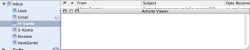
Yeah, but Apple took something that was nicely integrated into the UI and put it into an obscure, separate place. It's like an auto manufacturer removing the air vents from a new model car and giving you a small fan you can bolt onto your dashboard. Not a perfect analogy, but I think it makes the point.bobx2001 said:window > activity viewer
Just an update - I filed a Bug Report to Apple on Radar pretty much as soon as Tiger came out about the lack of status bar, and it's been labelled as "Duplicate". It's evidently annoyed a few people, and I'm hoping that as Apple obviously know about it, it will come back in a later version of Tiger.
I think it's interesting that someone said they swapped from Entourage; maybe too many people viewed mail as part of the operating system instead of a separate application, for Apple's liking. They are putting development effort into it and obviously want people to feel they have many programs bundled so they feel they have value for money.
For whatever reason I feel the new icons fail to effectively communicate their purpose - 10.3's did this quite well. I think they just need to be tweaked and made a bit bigger the latter, of course, might just be because I'm getting used to my new 20inch's res from a 17inch CRT!
For whatever reason I feel the new icons fail to effectively communicate their purpose - 10.3's did this quite well. I think they just need to be tweaked and made a bit bigger the latter, of course, might just be because I'm getting used to my new 20inch's res from a 17inch CRT!
I generally like the interface of Mail 2.0. the only issue I had at first was the mailboxes on the left, as I always had the drawer open on the right, but I'm fine with it now.
It's a much cleaner, tidier look than Mail 1.2 (1.3?, not near machine with Panther...), as I genrally feel all of Tiger is.
It's a much cleaner, tidier look than Mail 1.2 (1.3?, not near machine with Panther...), as I genrally feel all of Tiger is.
I actually prefer to have all the mailboxes to the left (and those who don't like them, just hit shift-cmd-M to hide/show them). The drawer was butt ugly, and I never really liked having it on the right (but having it on the left was even worse).
Mitthrawnuruodo said:The drawer was butt ugly, and I never really liked having it on the right (but having it on the left was even worse).
I'd rate the draw dropping (
) in Mail 2.0 as the single best difference. I hope they do the same with iCal soon.Did anyone here suggest the following (I haven't carefully read all the posts): The fact that Apple has introduced such variety into the OS suggests that they are working on offering customizing features/skins? For years people on these boards have been howling for a built-in feature of this nature.
Well, I like Mail 2.0 I don't love the icons, but other than that everything seems good. I'm glad Apple got rid of the drawer, and I like it on the left. It makes more sense to me, since the sidebar is also on the left in the Finder. Logically for the most of the world, it goes from biggest to smallest in a left-right manner.
I also noticed the missing status thingy, wasn't too bothered by it, but I do wish Apple left that in there, it came in useful from time to time.
I don't love the icons, but other than that everything seems good. I'm glad Apple got rid of the drawer, and I like it on the left. It makes more sense to me, since the sidebar is also on the left in the Finder. Logically for the most of the world, it goes from biggest to smallest in a left-right manner.I also noticed the missing status thingy, wasn't too bothered by it, but I do wish Apple left that in there, it came in useful from time to time.
Mail 2.0 is a big improvement on Mail 1.0 which really was hideous. I think some people just got used to the sight of it
Only quibbles:
You can't compose in HTML
Can't compress attachments (useful if you're sending files to PC land)
Activity viewer looks a bit awkward
I switched over from Entourage and haven't regretted it - yet
Only quibbles:
You can't compose in HTML
Can't compress attachments (useful if you're sending files to PC land)
Activity viewer looks a bit awkward
I switched over from Entourage and haven't regretted it - yet
I never ran Panther, because I just got my Mac recently and it had Tiger pre-installed. So, I do not have any experience with Mail before version 2.0. With that said, I will say that Mail 2.0 works pretty well for what I use it for.
The only problem that I have had with it is that Smart Mailbox messages are included in the overall mailbox view, so you end up seeing duplicate messages.
The only problem that I have had with it is that Smart Mailbox messages are included in the overall mailbox view, so you end up seeing duplicate messages.
Kerry Sanders said:The only problem that I have had with it is that Smart Mailbox messages are included in the overall mailbox view, so you end up seeing duplicate messages.
Mmmm...I thought that was sort of the point. If you want the message to only exist in the secondary folder, can't you make it a regular folder and use rules to move the message into it in much the same way the smart mailbox would?
Not a big problem (see my sig)inigo said:You can't compose in HTML
Zip them before attaching (built into Finder, just right/ctrl-click), and set Mail to send Windows friendly attachments (Edit->Attachments->Always send...).inigo said:Can't compress attachments (useful if you're sending files to PC land)
Say with me: We want the status bar back!inigo said:Activity viewer looks a bit awkward
The sidebar style brings it into like with iTunes, iCal, iPhoto and a bunch of others, No overall status bars just like in iCal etc.- the sidebar acts to provide feedback on what mailboxes are being accessed etc.and what mail is being retrieved (the clock symbol)
Personally I'm not bothered about the activity thing, I always found myself opening the dedicated window anyway.
Mail 2 is much better than the previous versions, silly icons aside. Smart mailboxes are very useful, junk mail filters seem better, it's pretty nippy, handles accounts and rules better and i like the grayish look of it.
If all the apps were like that across the board I wouldn't mind - you can tell a lot easier which window is "active". Brushed metal can me sometimes. Apple really do need to be more consistent with app GUIs.
Personally I'm not bothered about the activity thing, I always found myself opening the dedicated window anyway.
Mail 2 is much better than the previous versions, silly icons aside. Smart mailboxes are very useful, junk mail filters seem better, it's pretty nippy, handles accounts and rules better and i like the grayish look of it.
If all the apps were like that across the board I wouldn't mind - you can tell a lot easier which window is "active". Brushed metal can
me sometimes. Apple really do need to be more consistent with app GUIs.
Register on MacRumors! This sidebar will go away, and you'll see fewer ads.